Monitor Web App & API Protection
Objective
This document provides instructions on how to monitor your Apps and APIs from a security standpoint. F5® Distributed Cloud Services provides the Web App and API Protection (WAAP) workspace to help you mitigate application threats and vulnerabilities across multi-cloud and edge environments. WAAP provides a web application firewall (WAF), DDoS mitigation, bot defense, API security, and Client-side defense.
Using the instructions provided in this document, you can assess your current security situation and dive into details for areas of concern.
Prerequisites
-
An F5 Distributed Cloud Account. If you do not have an account, see Getting Started with Console.
-
One or more applications deployed on F5 Distributed Cloud sites or network. If you do not have applications deployed, see vK8s Deployment.
-
An HTTP load balancer with one or more security features enabled. If you do not have an HTTP load balancer, see Create HTTP Load Balancer. See App Security and Advanced Security for information on enabling various security features.
Monitor Web App and API Protection
The Distributed Cloud Platform offers two types of monitoring for WAAP: performance monitoring and security monitoring. Performance monitoring offers operational information such as metrics, traffic, alerts, etc. Security monitoring offers security related information such as threat intelligence, bot traffic, DDoS activity, attack sources, and more.
From the Home page or the Select Workspace drop-down menu, select the Web App & API Protection workspace and then select your namespace from the drop-down list of namespaces. The monitoring options are in the Overview section at the top of the left navigation panel.
The following sections show how to see detailed information on the monitoring options.
Explore Security Monitoring
Select Overview > Security to see the security page that provides information on your security posture and the threats you are facing. At the top is a selector allowing you to choose to see the page with information based on just Distributed Cloud Delivery Resources (Distributed Cloud load balancers and CDN distributions) or All Delivery Resources (adds BIG-IP and NGINX servers). There will also be some page differences between the two choices, but all possibilities are covered below.
Note: for more information on monitoring NGINX server blocks, see Monitor Security for NGINX Service Discoveries.
With Distributed Cloud Delivery Resources selected, you will see three tabs, Dashboard, Malicious Users, and Threat Campaigns offering different views of the state of your security. With All Delivery Resources selected, only the dashboard tab is shown.
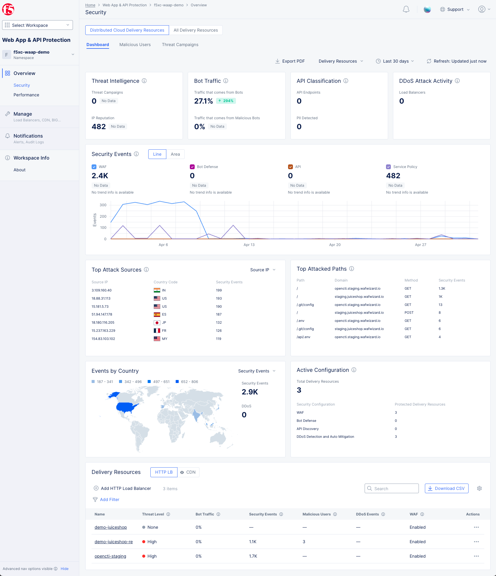
Figure: WAAP Security Dashboard
General Page Options
The Security pages consists of a number of widgets that display information related to the title at the top of the widget. For example, the API Classification widget only shows information related to your API endpoints. Above the widgets is a set of options that relate to all widgets below (unless otherwise noted).
-
Export PDF will allow you to record and/or share the information on the Security Dashboard.
-
The Delivery Resources drop-down menu determines which delivery resources to use for the information shown in the dashboard. The delivery resources will be grouped by the categories HTTP Load Balancers, CDN Distributions, BIG-IP Virtual Servers, and NGINX Server Blocks. You can use the drop-down menu to select one to five delivery resources. If no delivery resources are selected, then data will be shown for all delivery resources, which is the default.
-
The time drop-down menu allows you to show data only for the specified time. This is convenient for assessing your "current" security situation or looking at longer term trends. You can also look at a specific time frame by selecting Custom, which can cover any time frame with the last 30 days.
-
The Refresh option updates the information shown in the dashboard.
Dashboard
The dashboard tab is displayed by default and offers a snapshot view of your entire security monitoring information. The following list provides overview on the dashboard and the widgets it offers:
-
Threat Intelligence display the number of threat campaigns detected and attacks mitigated based on IP reputation. This is not shown when All Delivery Resources is selected.
-
Bot Traffic shows the percentage of total traffic coming from Bots (good, suspicious, or malicious) and the percentage of total traffic that comes from malicious bots. This is not shown when All Delivery Resources is selected.
-
API Classification shows a count of the total number of API endpoints as well as the number of endpoints with Personal Identifiable Information (PII). These counts show the current state and do not take into account the date/time selected at the top of the page.
-
DDoS Attack Activity shows the number of load balancers that have experienced level 7 DDoS attack activity. This is not shown when All Delivery Resources is selected.
-
Security Events shows the trend of security events over time. Select Line or Area to to view the information in either a line or area graph. Select any event type above the graph to display or hide that type of event. Hover over the graph to see information for that time frame. Click and drag within the graph to zoom into that time frame, and use the Reset button at the top (next to the Refresh button) to return to the original time frame (Zoom back out).
-
Top Attack Sources shows a list of the sources with the most security events. Use the top-right drop-down menu to select top attack sources based on IP address, ASN (Autonomous System Number), or TLS Fingerprint.
-
Top Attacked Paths shows a list of paths that being have been attacked the most, as well as the domain, HTTP method, and security events.
-
Events by Country shows the security events arranged in a map view. Use the Security Events drop-down filter to change the section to show DDoS events.
-
Active Configuration shows the total number of load balancers. Out of these load balancers, it shows how many have WAF, Bot Defense, API Discovery and DDoS Detection configured for protection. This information is based on the current configuration and does not take into account the date/time frame selected at the top of the page.
-
Delivery Resources at the bottom of the page shows a table of delivery resources in the namespace along with summary information for a number of security categories.
- Use the selector at the top to choose the type of delivery resources to show in the table: HTTP LB, CDN, BIG-IP, or NGINX.
- Some delivery resource selections allow you to go through the creation process here.
- HTTP LB: Click Add HTTP Load Balancer to create a new load balancer. For details on creating a load balancer, see HTTP Load Balancer.
- CDN: Click Add CDN Distribution to create a new CDN distribution. For details on creating a CDN distribution, see Configure CDN Distribution.
- Enter a string in the Search field to only see load balancers with that string shown in the load balancers table.
- Click Download CSV to download a CSV file of the load balancer table contents. The CSV file includes all load balancers and all columns of data, not just what is showing in the table which may be limited by a search string or your filters.
- Click the gear icon ( ⚙ ) to select which summary information is shown in the table columns.
- Click the name of a delivery resource in the Name or Server Name column to go to the security monitoring page specific to that resource. For more details on load balancer specific security monitoring, see Monitor HTTP Load Balancer.
- Click Add Filter to limit which resources you see in the table based on state or metrics in the resource.
Malicious Users
The Malicious Users tab provides a view of malicious users for the entire namespace. You can zoom in on a particular malicious user and navigate to individual load balancer malicious users page from there.
Note: A malicious user is identified when a risk score is assigned to the user based on the user activity. A risk score is computed based on the malicious user detection configuration and this computation takes into account all the configuration parameters (such as login failure threshold and forbidden activity) enabled in the malicious user detection settings. Depending on the risk score, a threat level is attached to a malicious user and mitigation actions are applied based on the configuration set for each threat level. The risk score for a user is decayed over time, if no further suspicious activity is observed.
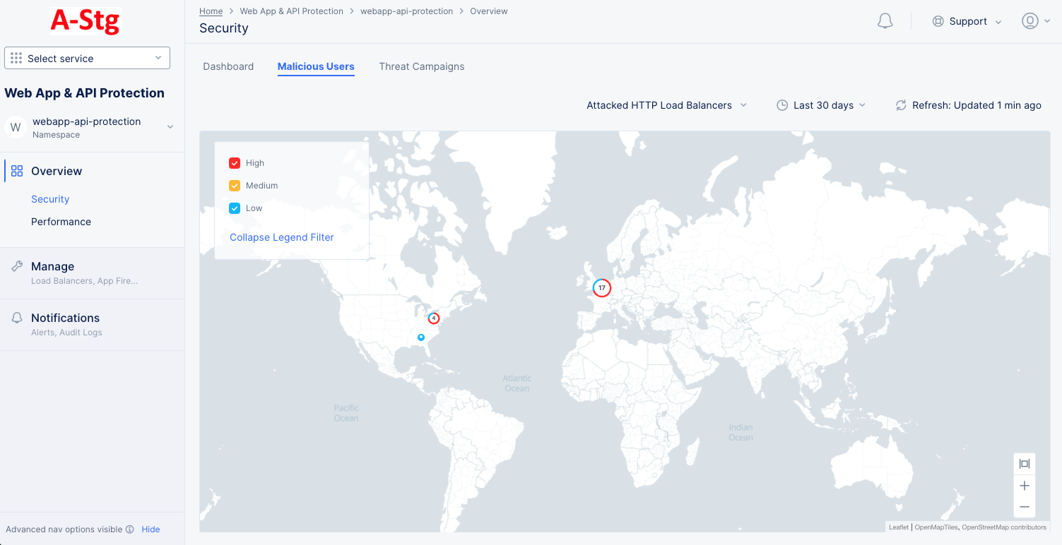
Figure: Malicious Users Map
Note: The malicious users in a geographical location are shown as collection of nodes with threat-level indicated in different colors. You can check the legend filter to find severity versus color mapping.
-
The data shown is by default for all HTTP load balancers in the namespace. You can use the Attacked Load Balancers filter on the top of the page to limit the view to a specific set of load balancers. Similarly, you can use the time filter to display the insights for a specific time interval.
-
Place the mouse pointer over a node group to view details of malicious users for that location. Number of malicious users and corresponding threat-levels are displayed.
-
Click on a node group to display all malicious users in a group represented as collection individual nodes. Place mouse pointer on any individual node to view the user's identifier, threat-level, and risk score.
Note: The user identifier is based on the configured user identification such as IP address, Cookie, etc.
-
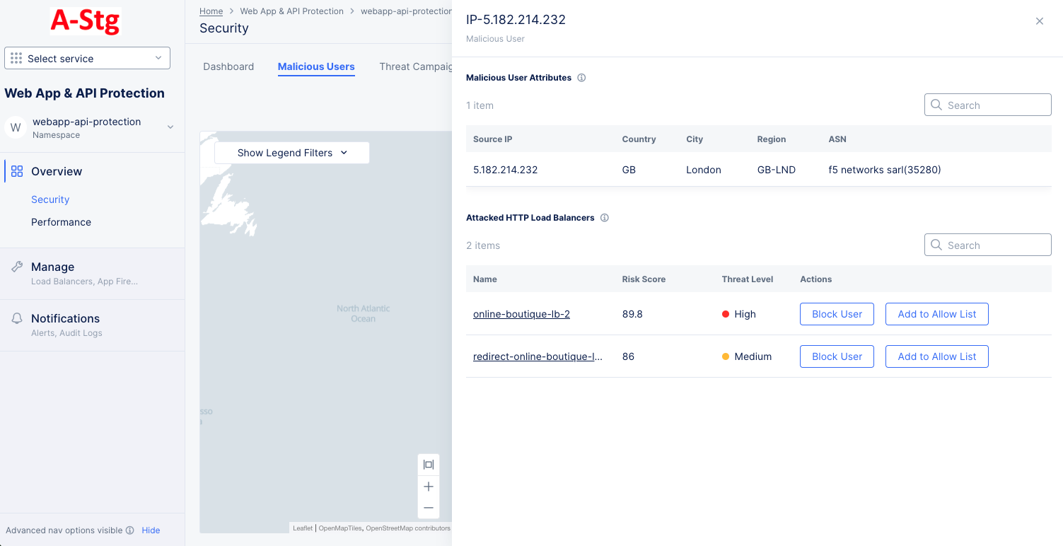
Click on any malicious user node, and details for that user are displayed in a modeless window. The details include user identifier, attacked load balancers, and user attributes such as source IP, country, region, etc.

Figure: Malicious User Details
- Select Block User or Add to Allow List to add user to deny list or allow list respectively. This opens the associated load balancer's client blocking rule section or trusted client rules section with name and IP address populated. In case of trusted client rule, the Skip Malicious Users action is populated. Click Apply to complete enabling the rule on the load balancer.
-
Click on any of the attacked load balancers in the details window. This will switch to the Malicious Users tab of that load balancer's security monitoring page with the view filtered to display the data for that particular user.
Threat Campaigns
The Threat Campaigns tab opens a Sankey chart showing the threat campaigns run against load balancers and their source IP addresses.
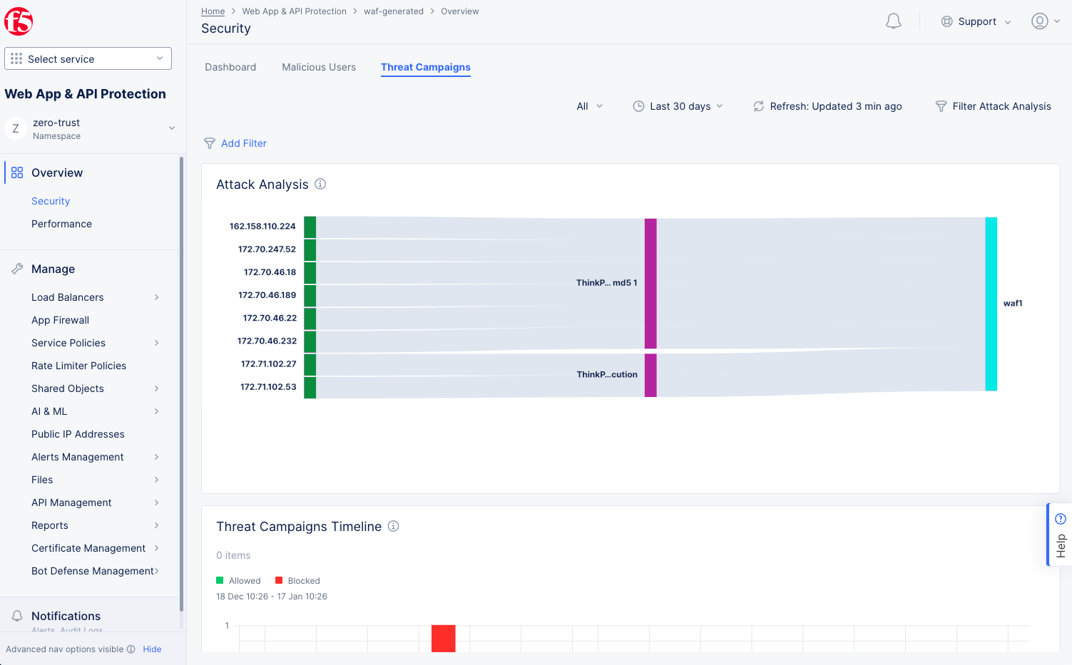
Figure: Threat Campaign Insights
Note: The threat campaigns insights also displays in graph view beneath the Sankey chart. Here, the graph shows allowed and blocked statistics.
-
The data shown is by default for all HTTP load balancers in the namespace. You can use Add Filter on the top of the page to limit the view to allowed or denied requests. Similarly, you can use the time filter to display the insights for a specific time interval.
-
Place the mouse pointer over any bar section in the middle of the chart to view name of threat campaign, associated source IP addresses, and destination load balancers highlighted in the chart. Click on the bar to view more details for that threat campaigns in a modeless window. Details include risk, attack type, description, references, etc.
-
Click on any IP address to the left of the chart to display more details for that IP address. The following details are displayed:
- Source IP address.
- Total requests from the source.
- Total security events from the source.
- Breakdown of security events such as WAF events, Bot defense, service policy, etc.
- HTTP Load Balancers to which the attacks are made.
-
Click on an HTTP load balancer in the details window. This switches the view to Security Events view of load balancer security monitoring. The security events view displays filtered view of the event related to the source IP address for the time frame set in the threat campaigns monitoring view.
-
Click on the Add to Blocked Clients button on the details window to add user to deny list. This opens the associated load balancer's client blocking rule section with name and IP address populated. Click Apply to complete creating the client blocking rule.
-
Click on the Filter Attack Analysis filter on top right of the threat campaigns monitoring page to display forensics view with advanced filters. The following is a list of guidelines to use these filters:
-
Select any of the source IPs in the Top src_ip section and click Apply to filter the chart and the graph for that source IP. You can also click the edit option to change the metric from src_ip to country. The section changes to Top country and you filter the chart to display chart for specific country.
-
Select any of the threat campaigns in the Top threat_campaigns.name section and click Apply to filter the chart and the graph for that threat campaign.
-
Select any of the load balancers in the Top vh_name section and click Apply to filter the chart and the graph for that load balancer.
Explore Performance Monitoring
In the Web App & API Protection workspace, select Overview > Performance to see the performance page with three tabs offering different views of the state of your security performance.
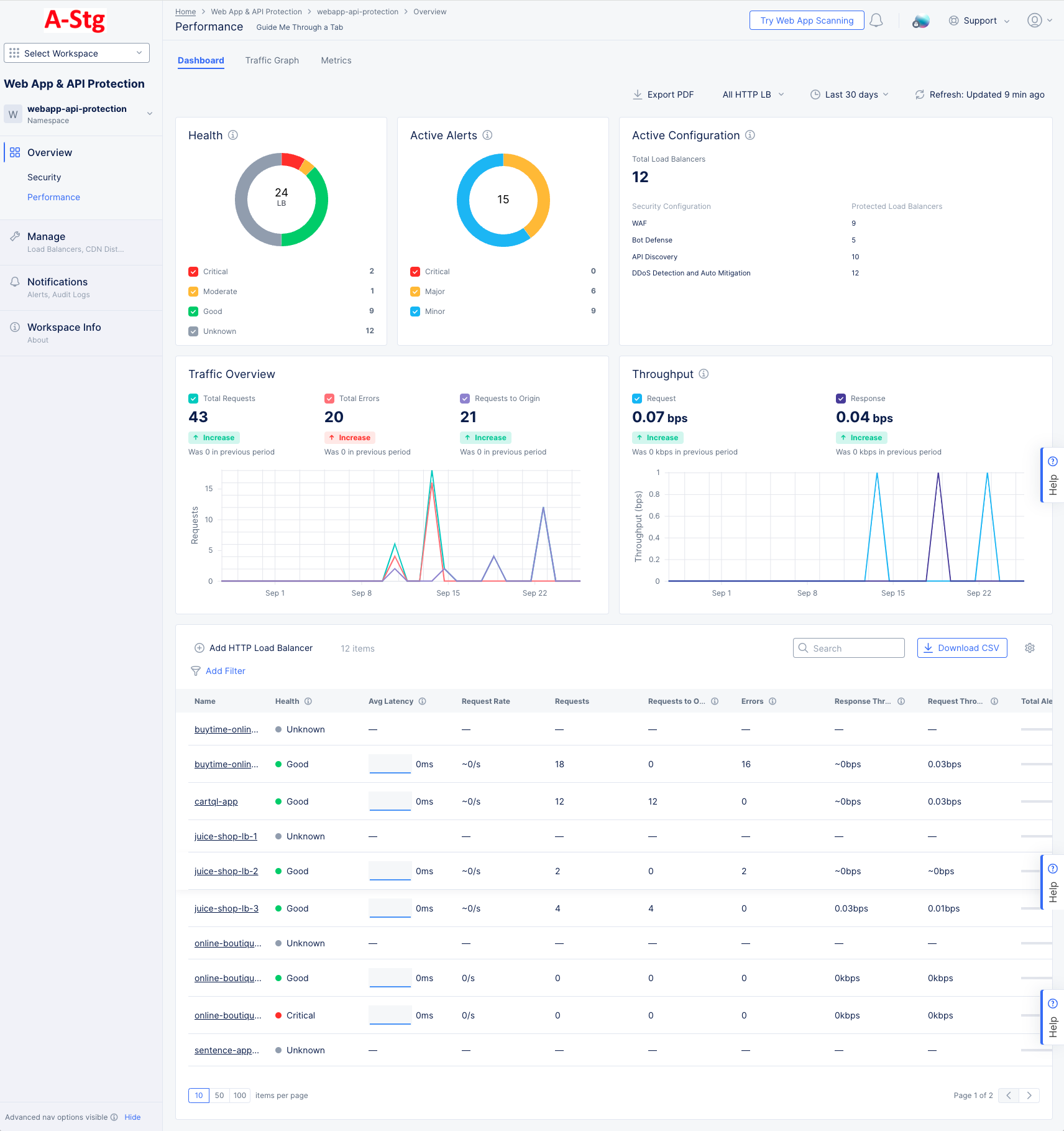
Figure: WAAP Performance Dashboard
General Page Options
Each tab consists of a number of widgets that display information related to the title at the top of the widget. For example, the Health widget only shows information related to health. Above the widgets is a set of options that relate to all widgets below (unless otherwise noted).
-
Export PDF will allow you to record and/or share the information on the Security Dashboard.
-
The All HTTP LB drop-down menu determines which load balancer(s) to use for the information shown in the dashboard. You can use the drop-down menu to select one to five load balancers. If no load balancers are selected, then data will be shown for all load balancers, which is the default.
-
The time drop-down menu allows you to show data only for the specified time frame. This is convenient for assessing your "current" security situation or looking at longer term trends. You can also look at a specific time frame by selecting Custom, which can cover any time frame with the last 30 days.
-
The Refresh option updates the information shown in the dashboard.
Dashboard
The dashboard tab is displayed by default and offers a snapshot view of all performance monitoring information. The following list provides overview on the dashboard and the widgets it offers:
-
Health displays a donut chart showing the health of your load balancers. The donut colors correspond to the colored checkboxes below and provide a visual percentage of the health states of your load balancers. You can turn individual states on or off with the checkboxes. The number in the center of the donut is the number of load balancers shown in the donut (which can change with use of the checkboxes).
-
Active Alerts displays a donut chart showing the states of your active alerts, regardless of the selected time frame. The donut colors correspond to the colored checkboxes below and provide a visual percentage of the health states of your load balancers. You can turn individual states on or off with the checkboxes. The number in the center of the donut is the number of active alerts shown in the donut (which can change with use of the checkboxes).
-
Active Configuration displays the total number of load balancers at the top. Below it shows a list of the different types of security configurations and how many of your load balancers are protected by that configuration. This content is based on your current configuration and not affected by the selected time frame.
-
Traffic Overview shows three metrics for the selected time frame: the total number of requests, the number of requests with errors, and the number of requests to origin (requests that passed through the load balancer and to the origin). The graph below shows a timeline for the receipt of those requests. The colored checkboxes allow you to turn on or off any category in the graph.
-
Throughput shows the total number of requests and requests with errors received during the time frame. The graph below shows a timeline for the receipt of those requests. The colored checkboxes allow you to turn on or off either category in the graph.
-
Load Balancers at the bottom of the page shows a table of load balancers in the namespace along with summary information for a number of performance categories.
- Click Add HTTP Load Balancer to create a new load balancer. For details on creating a load balancer, see HTTP Load Balancer.
- Enter a string in the Search field to only see load balancers with that string shown in the load balancers table.
- Click Download CSV to download a CSV file of the load balancer table contents. The CSV file includes all load balancers and all columns of data, not just what is showing in the table which may be limited by a search string or your filters.
- Click on the gear icon ( ⚙ ) to select which summary information is shown in the table columns.
- Click on the name of a load balancer go to the performance monitoring page specific to that load balancer. For more details on load balancer specific performance monitoring, see Monitor HTTP Load Balancer.
- Click Add Filter to limit which load balancers you see in the table based on state or metrics in the load balancer.
Traffic Graph
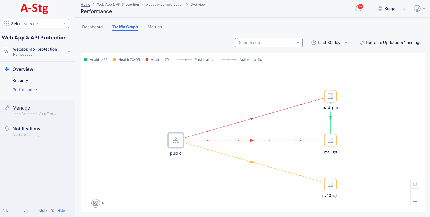
Figure: WAAP Traffic Graph
Select the Traffic Graph tab to view the monitoring page for traffic from requestor to origin server. The following information is displayed:
-
The view shows a graphical representation where the traffic trend is presented between the public and the origin servers. Lines with an arrow in the middle represent past traffic. Dots moving on lines represent active traffic. Color represent the health of the server based on application responses.
-
Hover the mouse pointer over a traffic line to view details for that traffic.
-
Hover the mouse pointer over a server to view details for that traffic through that server.
Metrics
Select the Metrics tab to load the WAAP application metrics view:
The metrics present the trend of the following metrics in graph view over the selected time frame:
- Various rates including requests, connections, and errors
- Throughput for both upstream and downstream
- Various latency measurements including client and server Round-Trip Time (RTT), app latency, and connection duration.
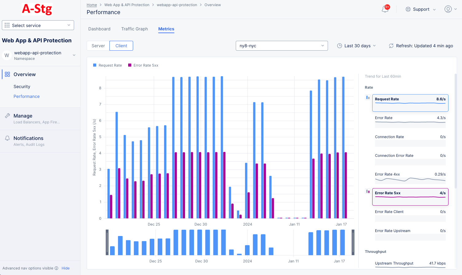
Figure: WAAP Performance Metrics
Note: The metrics are grouped into the fields Rate, Throughput, and Latency. A field may have one or more metrics.
-
Select the Site/RE or site edge from the drop-down menu to see the metrics for that entity in the graph.
-
Use the Server / Client selector to show one or the other in the graphic.
-
Hover over a metric on the right-hand side and click either the blue bar or the magenta bar to see that metric in the graph. Hover over another metric and click the opposite color bar to see both in the graph.
A red bar indicates a time frame where the request rate is outside the confidence window, which is shown in light blue as part of the graph background.
You can select any two metrics under a field such as Rate to display the combined graph for them. To do this, do the following:
Explore Tenant Monitoring
Tenant monitoring allows you to view and search configurations and dashboards across all your namespaces without the need to select a specific namespace. This is often used by SecOps to get an aggregate view of the tenant as a whole.
Note: The various tenant-level capabilities are restricted to administrators. You will need to be assigned f5xc-waap-admin or ves-io-admin-role on the system namespace (at a minimum) to view/use the Security and Performance dashboards as well as the Tenant Search. You will also need to have f5xc-waap-admin or ves-io-admin-role on any application namespaces where you need to be able to edit configuration.
In the Web App & API Protection workspace, select the System namespace. This will change the primary navigation to show the Tenant Overview section. If you see any lock symbols ( 🔒 ) then your current role does not allow you to see some or all of the Tenant Overview information.
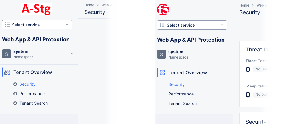
Figure: System Namespace
The Tenant Overview section shows Security, Performance, and Tenant Search options.
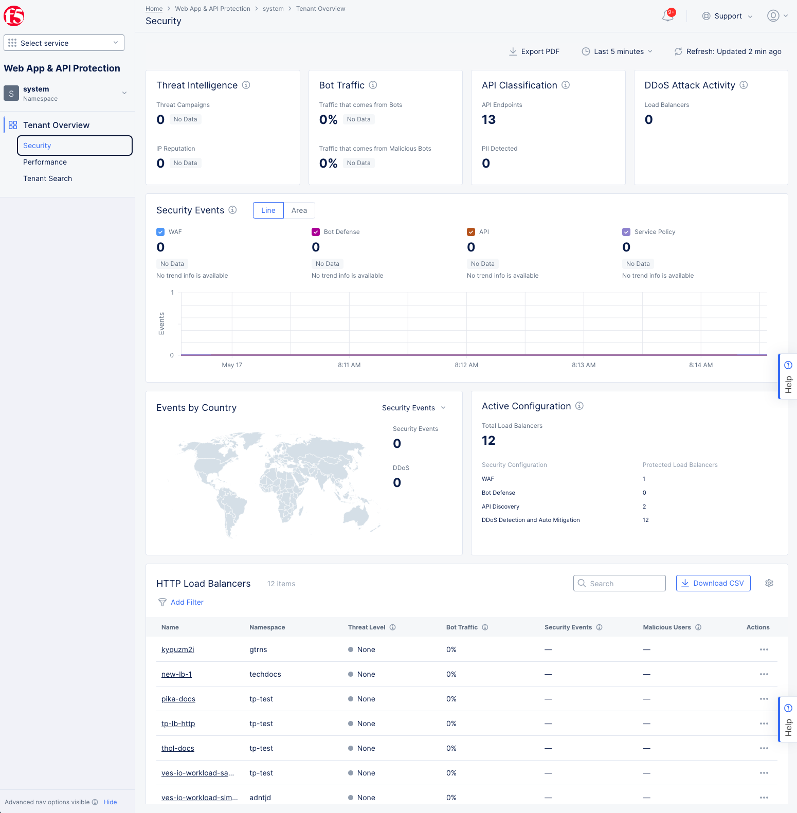
Figure: WAAP System Overview - Security page
The Tenant Overview section in the System namespace provides the same type of information as the Overview section in the application namespaces, except that the data shown is aggregated from the entire tenant. Data shown on the Overview > Security and Performance pages is only from the selected namespace (shown at the top of the left navigation pane), whereas data shown on the equivalent pages in the Tenant Overview section comes from all the namespaces in the tenant.
At the bottom of the Tenant Overview page, there is a full list of all the load balancers in your tenant. Because this list shows load balancers for all namespaces, there are additional columns available to give a better understanding individual load balancer setups. The Namespace column is on by default, but by using the gear icon ( ⚙ ), you can show a number of policy and rules columns, such as WAF LB Policy Name, WAF Exclusion Rules, Data Guard Rules, IP Reputation and more.
In conjunction with the filtering capability in the HTTP Load Balancers list, you can quickly identify security concerns such as load balancers that
- Do or don't have WAF enabled,
- Have or don't have WAF exceptions configured,
- Have specific WAF exceptions matching a signature ID or CVE, or
- Have or don't have a service policy applied.
For specifics the Security and Performance pages, refer to the following sections, keeping in mind that as part of Tenant Overview, all namespaces are included.
Tenant Overview > Security - See Explore Security Monitoring
Tenant Overview > Performance - See Explore Performance Monitoring
Tenant Overview > Tenant Search
The tenant search page allows you to search for a variety of metrics or concerns across the entire tenant. For example, a particular request was blocked and you have the request id, but you don't know which namespace or load balancer blocked that specific request. Tenant search allows you to search at a global level to find exactly which load balancer in which tenant blocked the request.
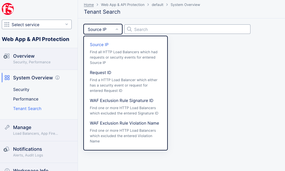
Figure: WAAP Tenant Search
There are four different ways to search across your tenant:
-
Source IP - Enter a source IP (e.g. 11.2.3.4) to find all load balancers which had requests or security events from that source IP. A source IP can be the initial requester or a proxy, such as a load balancer, a CDN, or WAF.
-
Request ID - Enter a source IP (e.g. 11.2.3.4) to find all load balancers which had requests or security events from that request IP. A request ID is the initial requester (stored in the X-Forwarded-For header in the case of a proxy), not the IP of a proxy.
-
WAF Exclusion Rule Signature ID - Enter a signature ID (e.g. 200101867 for cross-site scripting) to find all load balancers which had requests or security events with that signature ID. A signature ID identifies a rule or pattern a specific attack. For more information on signature IDs, see Attack Signatures.
-
WAF Exclusion Rule Violation Name - Select a violation name from the drop-down list (e.g. Illegal filetype) to find all load balancers that blocked a request due to that named violation.
Once you have searched and found one or more load balancers in the list below the search, you have a number of possible actions:
- Click on a load balancer name to go to that specific load balancer's dashboard where you can filter for that specific event.