Monitor HTTP Load Balancer
Objective
This document provides instructions on how to monitor your HTTP load balancer. F5® Distributed Cloud Services provide for load balancing and proxy capabilities, letting you control the flow of application and API traffic between services, to the Internet, and from clients on the Internet. To learn more about how load balancing and service mesh, see Load Balancing and Service Mesh.
Using the instructions provided in this document, you can check various views that present HTTP load balancer monitoring information such as statistics, events, etc.
Prerequisites
-
An F5 Distributed Cloud Account. If you do not have an account, see Getting Started with Console.
-
One or more applications deployed on F5 Distributed Cloud sites or network. If you do not have applications deployed, see vK8s Deployment.
-
An HTTP load balancer configured for an application. If you do not have an HTTP load balancer, see Create HTTP Load Balancer.
Monitor Load Balancer
The Distributed Cloud Platform offers two types of monitoring for HTTP load balancers: applications monitoring and performance monitoring. Performance monitoring offers operational information such as metrics, events, alerts, etc. Security monitoring offers security related information such as suspicious users, security events, API discovery, and more.
The following steps show how to see detailed information using both types of monitoring.
You can also monitor your load balancer from Web App & API Protection (WAAP) workspace. The WAAP workspace provides both security and performance dashboards, and you have the ability to record or share the current state of your load balancer in a PDF. For more information, see Monitor WAF Operation.
Monitor All Applications and Load Balancers
Load balancer monitoring is covered by the Multi-Cloud App Connect workspace. Select that workspace from the home page or the Select workspace drop-down menu. Then select your namespace from the drop-down list of namespaces. To start monitoring, select Overview and then either Applications or Performance.
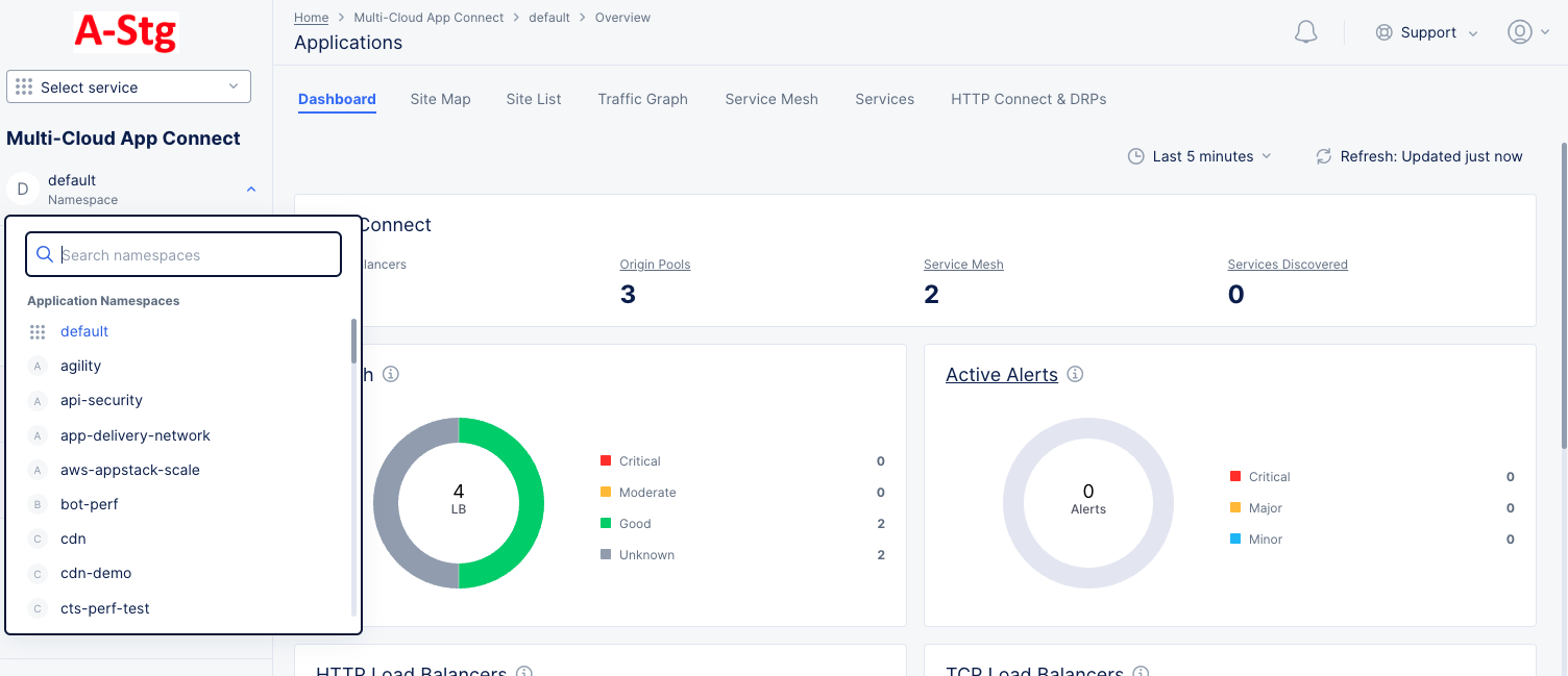
Figure: Navigate namespace
Applications
Applications monitoring can be done in different ways. This page provides a number of tabs to give you different points of view when exploring your applications.
Dashboard
The Applications Dashboard tab provides a number of widgets that show overview information on various topics related to all your load balancers in the current namespace. Each widget is discussed below.
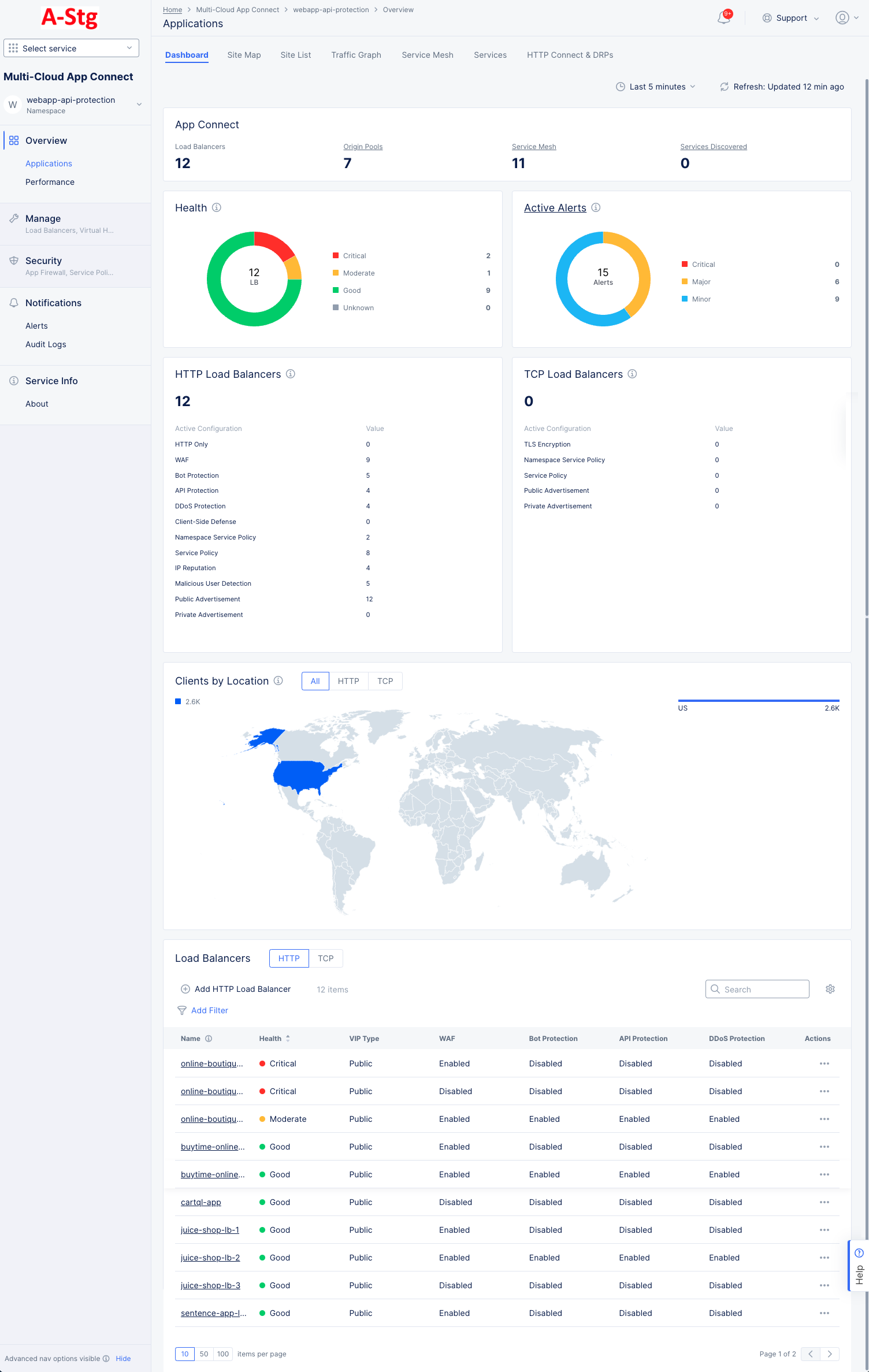
Figure: Applications Dashboard
-
App Connect shows an overview of your application connections including counts for your load balancers, origin pools, service meshes, and services discovered. Click Origin Pools to see a list of your origin servers and to manage or origin pools. Click Service Mesh or Services Discovered to go the Service Mesh or Services tabs, respectively.
-
Health shows the current status for all of your load balancers. The donut graph shows the total number of load balancers in the center, and the colors of the donut represent the health status for your load balancers. The table to the right of the donut show the meaning of the colors and the number of load balancers in each state.
-
Active Alerts shows the number of current active alerts and categorizes them by criticality. The donut graph shows the total number of active alerts in the center, and the colors of the donut represent the percentage of alerts in each alert category. The table to the right of the donut show the categories for the colors and the number of load balancers in each category. Click Active Alerts to go to the Alerts page for more details.
-
HTTP Load Balancers shows the total number of HTTP load balancers and how many are actively configured for each of a number of features.
-
TCP Load Balancers shows the total number of TCP load balancers and how many are actively configured for each of a number of features.
-
Clients by Location shows a world map with countries colored by the number of clients accessing public load balancers. Select HTTP to see HTTP traffic, TCP to see TCP connections, or All to see a summation of both. The bar chart to the right of the map shows the same information by country name.
-
Load Balancers shows a list of your load balancers along with some overview information for each load balancers. Click a load balancer name to monitor a single load balancer—See Explore Performance Monitoring for a Load Balancer. Use Add Filter to limit which load balancers are shown in the table. Use Search to only show load balancers that match the search string (in any column). Use the HTTP|TCP selector to switch the type of load balancers listed. Click the gear icon ( ⚙ ) to see different column data in the table.
Site Map
The Site Map tab shows all your sites displayed on a world map, including some status information.
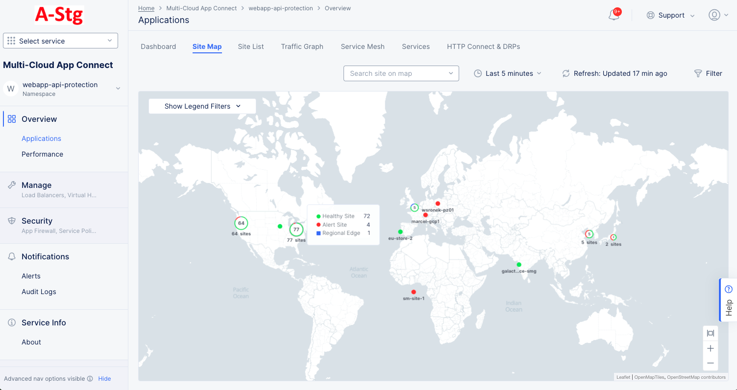
Figure: Sites Map
The map shows your sites and regional endpoints as symbols on the map giving both location information and health status.
| Map Symbol | Represents |
|---|---|
 | Registration |
 | Healthy Site |
 | Warning Site |
 | Alert Site |
 | Regional Edge |
 | An encircled number icon indicates quantity of sites and/or edges represented by the circle, and the circle colors indicate the statuses shown above in this table. This example represents two regional edges, one healthy site, and one warning site. |
Interact with the map:
- Use the Show Legends Filters dropdown menu to filter the symbols shown.
- Use the Search Site on map dropdown to find a specific site or regional edge. You will also see the site details panel (Shown below).
- Hover the cursor over a symbol to see details for that site or group of sites.
- Click on a numbered circle to zoom in and see the associated sites and/or regional edges.
- Click on a site or regional edge to see the details panel (Shown below).
- Click Edit Site to make changes to the site configuration.
Site details panel:
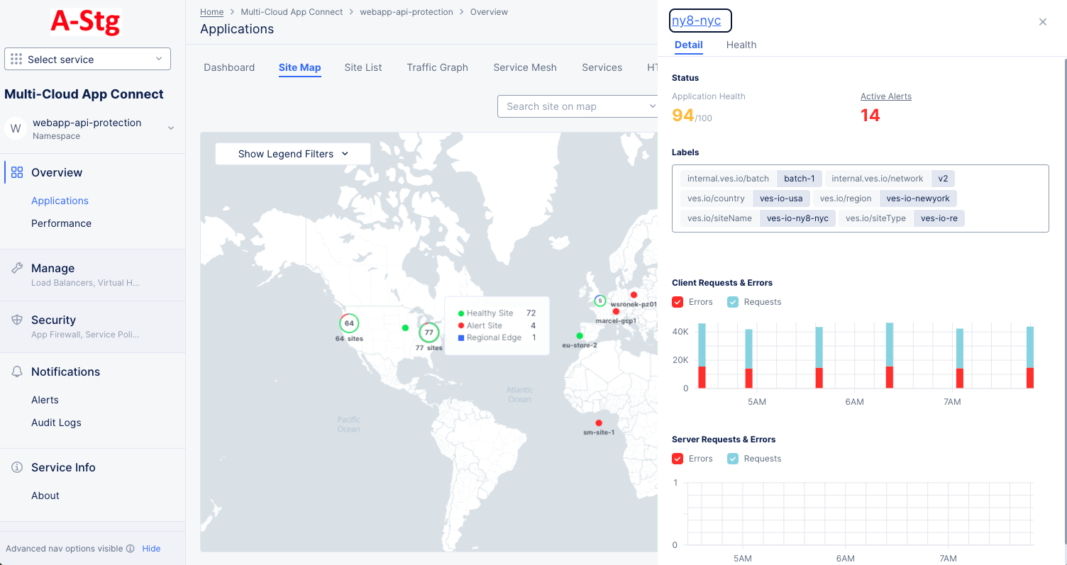
Figure: Site Detail Panel
The Detail tab provides some details about the site or regional edge, and the Health tab provides an overview of the site's health. Click the site name in the side panel for an in-depth look at the site. See Explore Site.
Site List
The Site List tab has two sections: the top section shows how many sites and alerts you have, and the bottom section shows a list of your sites along with some overview information for each site.
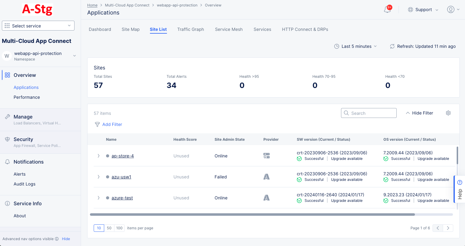
Figure: Site List
Interact with the site list:
- Click a site name to monitor a single site.
- Click the right arrow ( > ) left of a site name to see site details in either JSON or YAML format. Click the down arrow ( v ) to hide the details.
- Use Add Filter to limit which sites are shown in the table.
- Use Search to only show sites that match the search string.
- Click the gear icon ( ⚙ ) to see different column data in the table.
- Use the page controls at the bottom of the list to control how many sites to see on a page and to change pages.
Traffic Graph
The Traffic Graph tab provides a visual representation of the traffic for your sites.
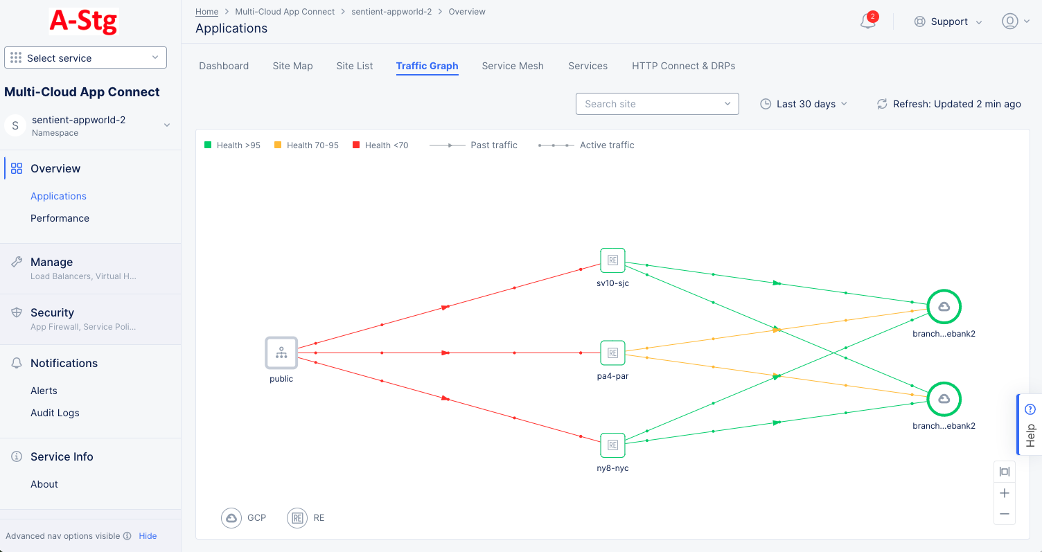
Figure: Site Traffic Graph
Interact with the traffic graph:
- Hover over a node in the graph or a line between nodes to see the application health and metrics for requests, connections, and errors in a sidebar.
- Click on a node to see details for that site. The Details tab in the sidebar shows the current health status, active alerts, labels, and graphs for client and server requests and errors. The Health tab shows a number of health related metrics. Click on a health metric value to see the trend for that metric for this site.
Service Mesh
The Service Mesh tab shows a widget for each of your service meshes. Each one shows the name and some basic information about the mesh. Click on the name of a mesh to see details for that service mesh.
Services
The Services tab lists the services and shows other information such as type, endpoints, service discovery, site, and more.
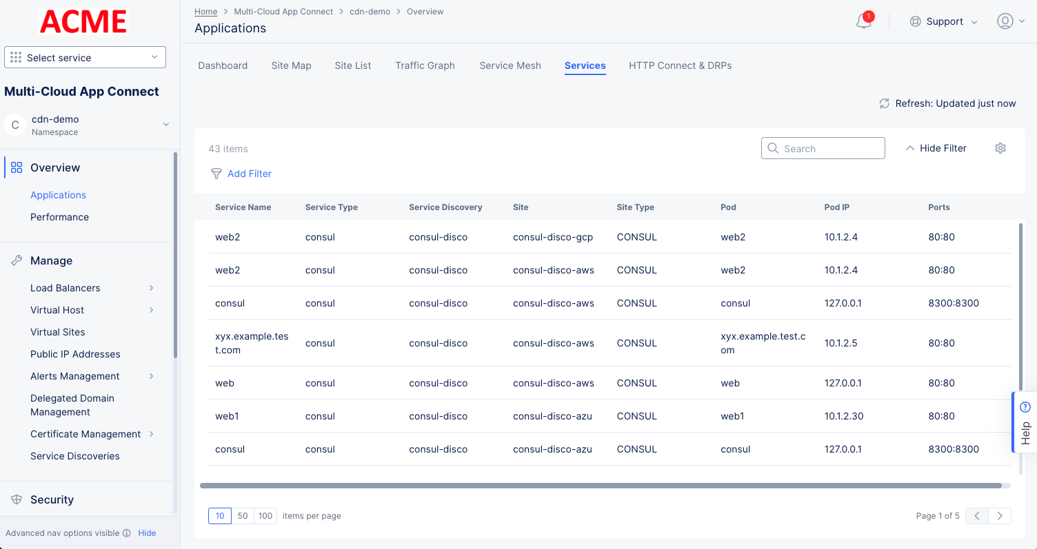
Figure: Site Traffic Graph
HTTP Connect & DRPs
The HTTP Connect & DRPs tab shows a widget for each of your Dynamic Reverse Proxies (DRPs). Each one shows the name and some basic information about the DRP.
- Click on the name of a DRP to more details on the DRP dashboard tab.
- Click on a metric title to see the trend for the metric on the DRP metrics toolbar.
- Click the three dot menu ( ••• ) on the right to manage your DRPs configuration.
Performance
You can also look at performance in different ways. The tabs on this page give you different points of view for evaluating performance.
Dashboard
The Performance Dashboard tab provides a number of widgets that show overview information on various topics related to all your load balancers in the current namespace. Each widget is discussed below.
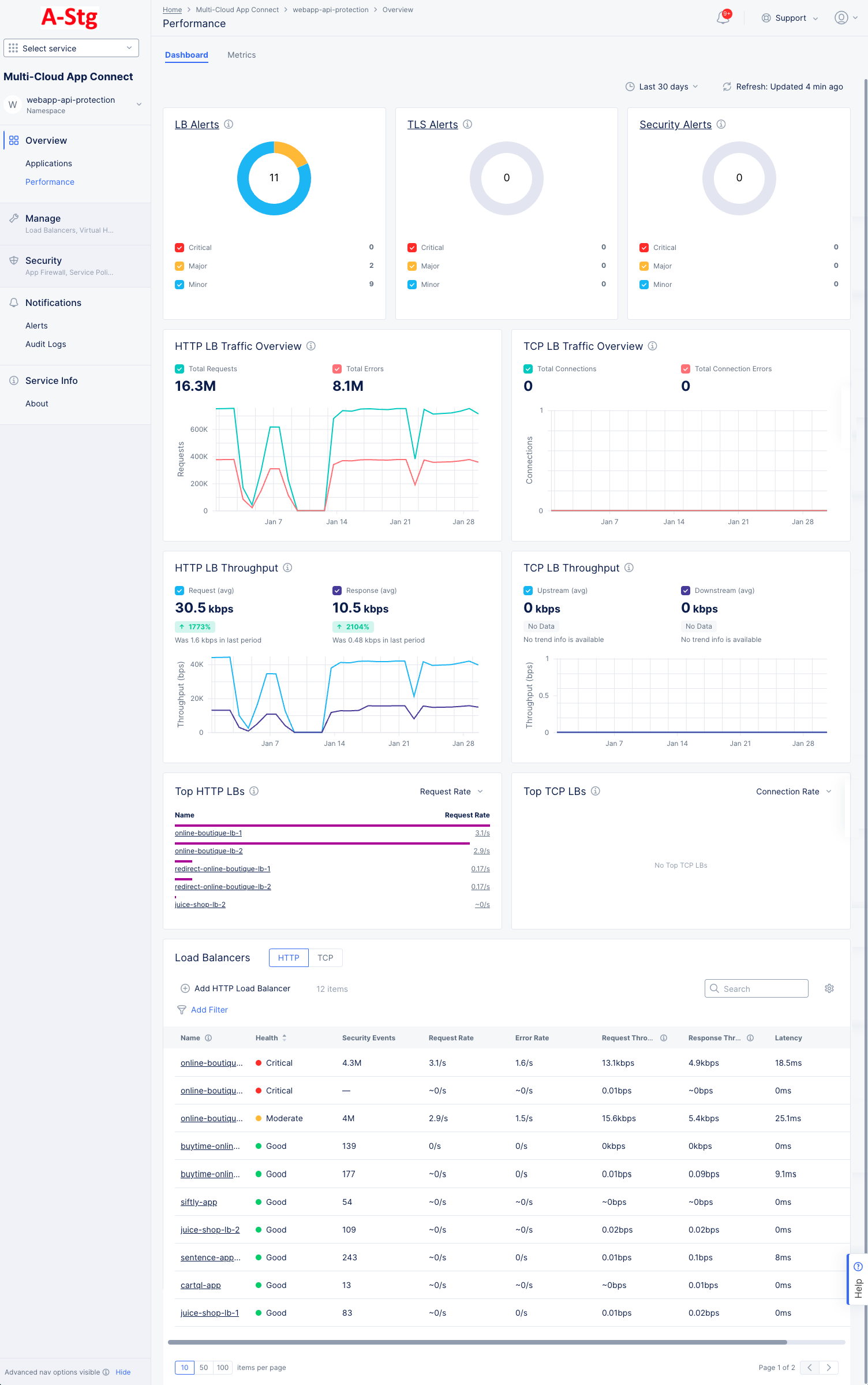
Figure: Performance Dashboard
-
LB Alerts, TLS Alerts, and Security Alerts each shows the number of current active alerts and categorizes them by criticality. The donut graph shows the total number of active alerts in the center, and the colors of the donut represent the percentage of alerts in each alert category. The table below shows the categories for the colors and the number of alerts in each category. Click the alerts title to see the alerts on the Alerts page.
-
Http LB Traffic Overview, TCP LB Traffic Overview, HTTP LB Throughput, and TCP LB Throughput each shows the trend of the metric. The graph shows two metrics with different colored lines to allow comparison, for instance Total Requests vs. Errors and Average Request vs Average Response. Similarly, colored checkboxes allow you to show/hide a metric.
-
Top HTTP LBs and Top TCP LBs each shows the top load balancers as measured by a selected metric. Use the drop-down menu in the upper right corner of the widget to select the metric. The values shown are the average of that metric over the selected time frame at the top of the page.
-
Load Balancers shows a list of your load balancers along with some overview information for each load balancers. Click a load balancer name to monitor a single load balancer—See Explore Performance Monitoring for a Load Balancer. Use Add Filter to limit which load balancers are shown in the table. Use Search to only show load balancers that match the search string (in any column). Use the HTTP|TCP to switch the type of load balancers listed. Click the gear icon ( ⚙ ) to see different column data in the table.
Metrics
The Metrics tab presents trends for various rates, throughput, and latency in a bar chart format over the page's selected time frame. The metrics are displayed in graphs representing the trend over a period of time (default 1 hour).
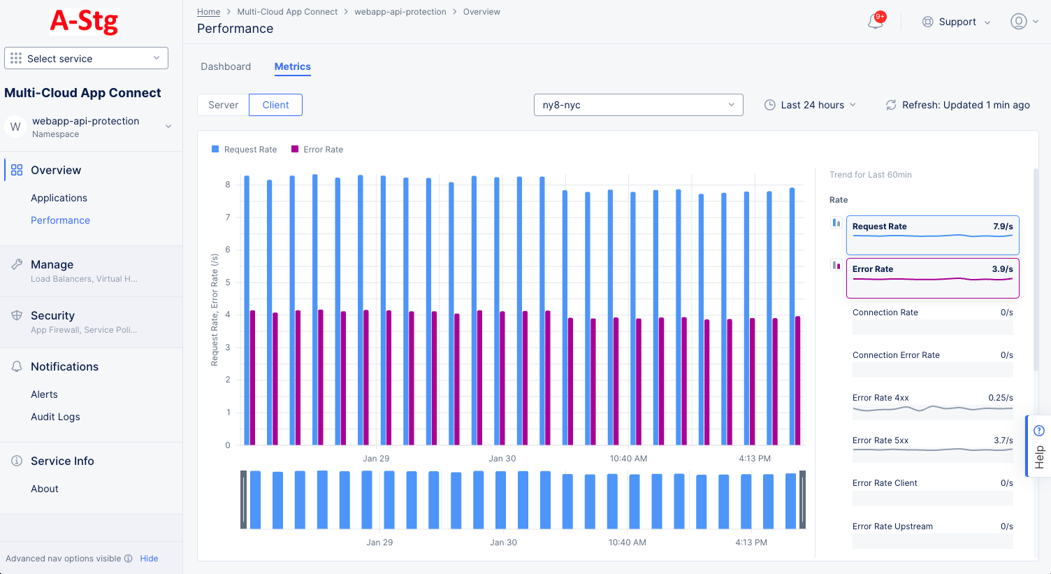
Figure: Performance Metrics
-
Use the Server|Client selector to choose which to show on the page.
-
Use the drop-down menu to select which Site/RE or Site Edge to use for metric data.
-
Use the time drop-down menu to select the time frame for chart. You can also drag the gray sliders at the bottom of the chart to zoom into a time frame. Click Reset to return to the time frame prior to dragging the sliders.
-
Click the Refresh button to get the latest data.
-
Hover over a bar in the chart to see the value(s) for that bar.
-
Hover over a metric to the right of the chart to see its bar buttons. Click the blue or magenta bar button to see that metric in the chart. Note that only one blue metric and one magenta metric can be shown at a time and that the two metrics selected must come from the same grouping (you can't show a rate and a throughput).
Find a Specific Load Balancer
Step 1: Select the namespace where the load balancer is configured.
-
Select the Multi-Cloud App Connect workspace.
-
Select your namespace from the drop-down list of namespaces.
Figure: Navigate namespace
Step 2: Navigate to the load balancer monitoring.
- Select Overview > Applications or Overview > Performance on the configuration menu to view the Application or Performance dashboard, respectively.
- Scroll down the Load Balancers section to see a list of load balancers. Each load balancer is shown in a table row with some high-level information about the load balancer.
- Click the name of the load balancer you want to monitor. The Dashboard tab will show by default.
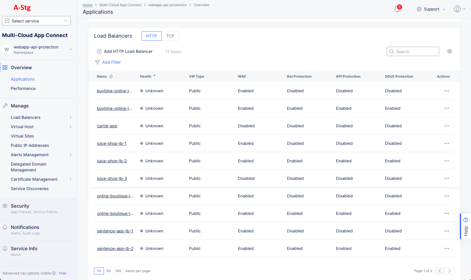
Figure: Load Balancer Monitoring
Explore Performance Monitoring for a Load Balancer
Select Performance Monitoring for your load balancer in the load balancer monitoring page. The Dashboard tab is displayed by default.
In the various monitoring tabs, one or more common options are available to use. The following list describes commonly available options:
- Time interval selector to apply from a list of intervals. You can also set a custom 24-hour interval.
- Refresh option refreshes the information displayed on the page.
- Filter option to apply filters to the displayed information.
- Search option to search for specific information.
The following entries describe the various tab views available for performance monitoring:
Dashboard
The dashboard tab offers a snapshot view for entire performance monitoring information. The performance monitoring dashboard shows overview sections such as health, alerts, metrics, clients, devices, policy, security, cacheable content etc. Some sections contain links to more details. For instance, selecting the section name Active Alerts will display the alert tabs where you can see much more information about these and other alerts.
The Performance Dashboard also includes a Cacheable Content Widget to help identify the percentage of cacheable content. Leverage these insights to determine which Load Balancers can benefit from CDN caching and enhance the application performance.
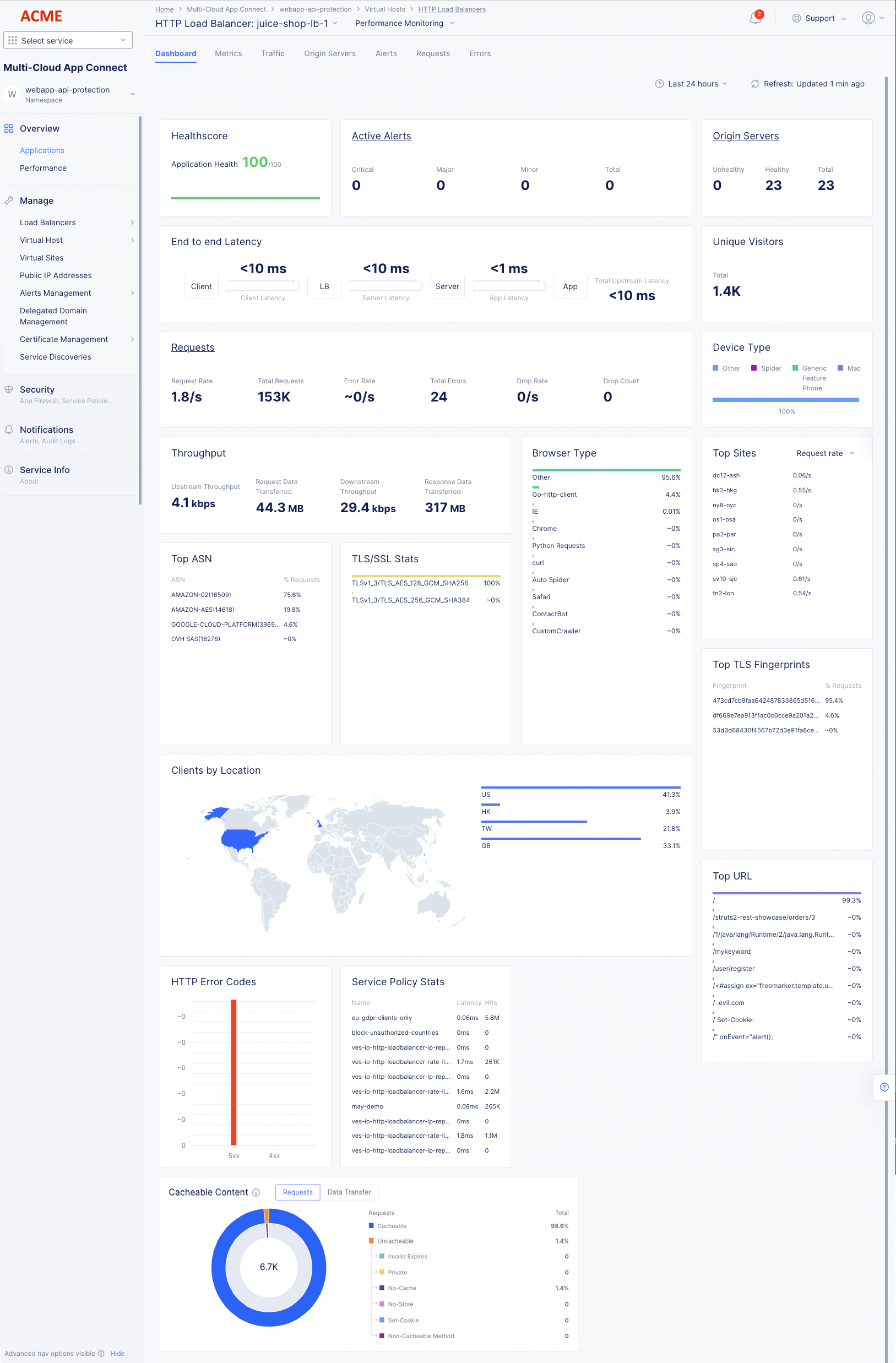
Figure: Load Balancer Generic Monitoring Dashboard
The following list provides overview on the dashboard and the various sections it offers:
- Metrics include requests, throughput, and latency. However, you can filter the Top Clients view to display error rate also.
- Client information includes details such as top clients, TLS fingerprints, client location, etc.
- Device information includes device type and browser type.
- Security information includes details such as top ASN, TSL/SSL statistics, URLs visited, service policy, etc. Also, HTTP error code trend is presented.
- Cacheable content includes details about the number of requests and data transfers that are eligible for caching. It also displays details about requests that are not eligible for caching with the reason for the requests being considered non-cacheable as follows:
| Category | Description |
|---|---|
| Expires | These responses cannot be cached because there is an Expires header with the value as Zero/Negative. |
| Private | These responses cannot be cached because there is a Cache-Control header with the value as Private. |
| No-Cache | These responses cannot be cached because there is a Cache-Control header with the value as No-Cache. |
| No-Store | These responses cannot be cached because there is a Cache-Control header with the value as No-Store. |
| Set-Cookie | These responses cannot be cached because there is a Set-Cookie header in the response from the origin. |
| Non-cacheable Method | These responses cannot be cached because the requested method is not supported for caching. |
| Cacheable | Cacheable content. |
Metrics
Select the Metrics tab to load the load balancer application metrics view:
The metrics present the trend of the following metrics in graph view over a default or configured time interval:
- Health score in terms of percentage.
- Request Rate, Error Rate, and Drop Rate.
- Latency.
- App Latency.
- Client and Server Round-Trip Time (RTT).
- Connection Duration.
- Upstream and Downstream Throughput.
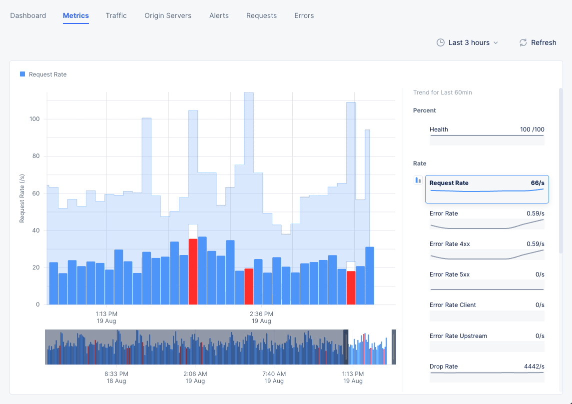
Figure: Load Balancer Metrics
Note: The metrics are grouped into fields such as Rate, Throughput, etc. A field may have one or more metrics.
Select a metric from the available fields on the right-hand side to display its trend. Hover your mouse pointer over a graph bar to view information specific to the time interval of that bar. You can also select the bar to switch to Requests tab.
A red bar indicates a time frame where the request rate is outside the confidence window, which is shown in light blue as part of the graph background.
You can select any two metrics under a field such as Rate to display the combined graph for them. To do this, do the following:
- Each metric has two small graph bar buttons to its left arranged in a vertical stack. Select a metric under one field.
- Select the lower graph button for the other metric of the same field to display combined graph.
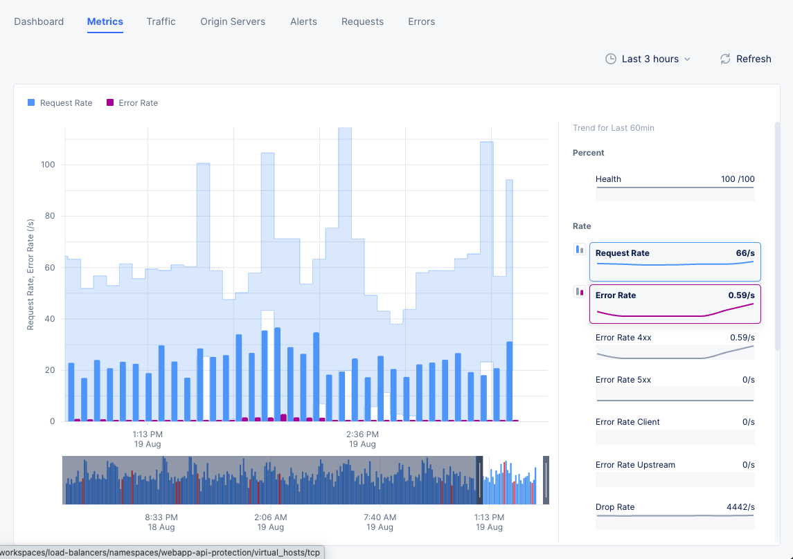
Figure: Combined Trend for Two Metrics
Note: Select Last 1 hour dropdown on the upper right end of the dashboard and select a time interval to inspect your site dashboard for that interval. The default for this is one hour and maximum allowed interval is 24 hours. You can customize the interval by selecting the Custom option and choosing date range. This can also be set graphically by adjusting the controls beneath the main graph.
Traffic
Select the Traffic tab to view the monitoring page for traffic from requestor to origin server. The following information is displayed:
-
The view shows a graphical representation where the traffic trend is presented between requestor and origin server. The representation shows sections for the trend of traffic from requesting site to load balancer and then from load balancer to origin server.
-
Hover mouse pointer over any border bar to view details of the entity represented by that bar. For example, select the bar representing origin servers to view detailed information on the applications at those origin servers.
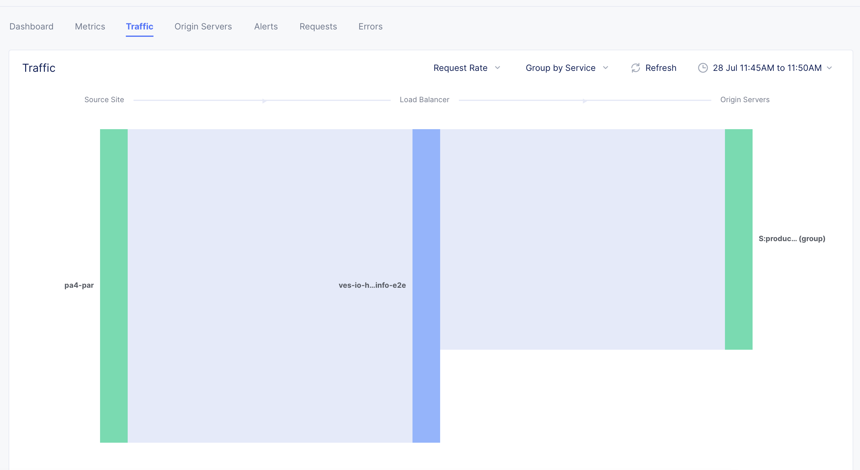
Figure: Load Balancer Traffic View
- Hover mouse pointer over any section to view details such as source, target, and request rate.
- Select the Request Rate filter above the graphical representation and select Response Throughput to change the details to show response throughput instead of requests.
- Select the Group by Service filter and select an option to change the origin server details. For example, if you select Group by Site, the bar representing origin server shows the site of origin server upon hovering mouse pointer over it.
Origin Servers
Select the Origin Servers tab to view the monitoring information for origin servers. In this view, you can see the list of origin servers for your load balancer and metrics associated with the origin server.
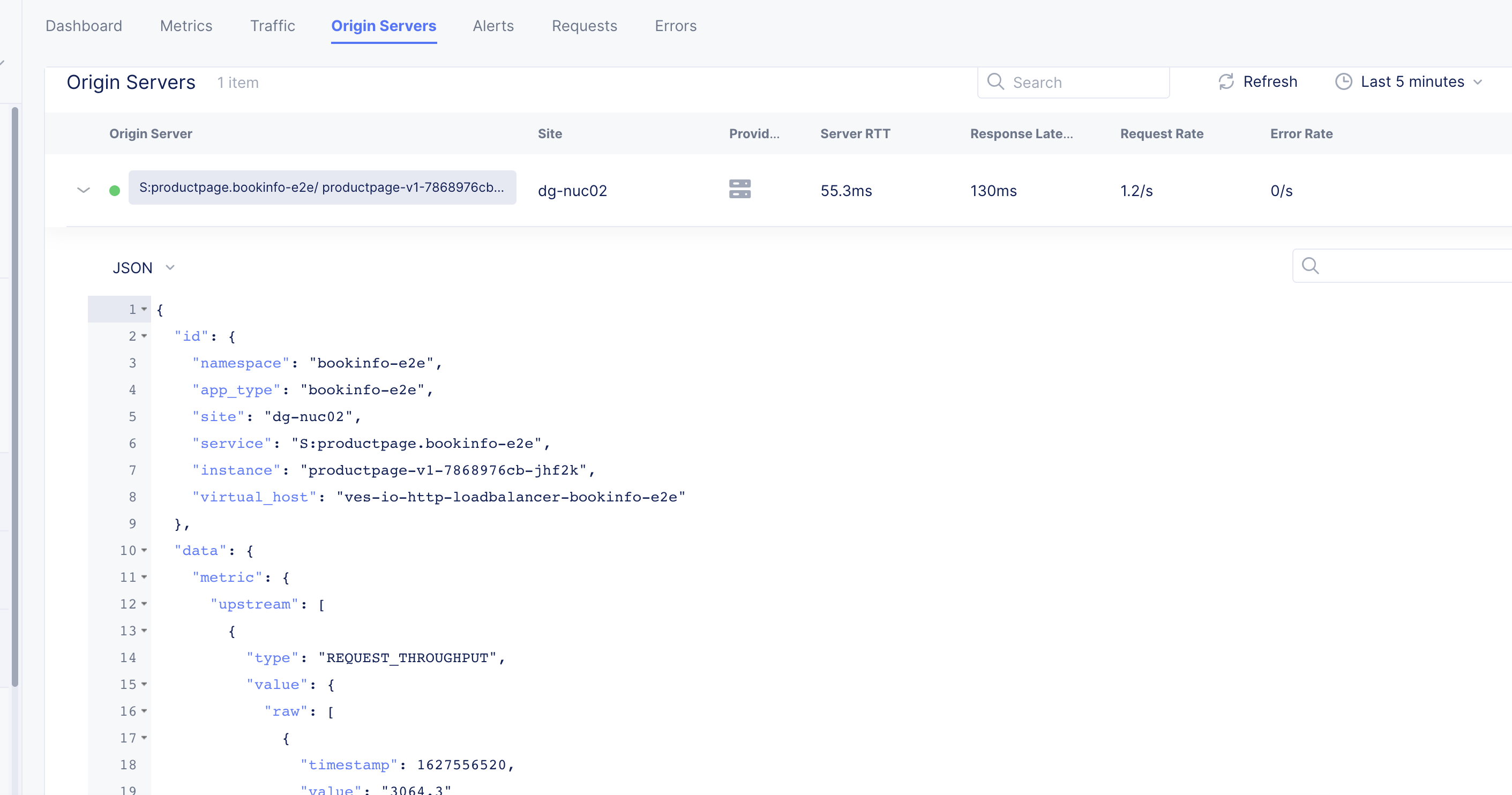
Figure: Load Balancer Origin Servers
Select > for an origin server entry to view its data in JSON format.
Alerts
Select the Alerts tab to load the alerts view. The active alerts are displayed by default.
You can filter the display for alerts of a specific severity using the severity selection options. All severity types are selected by default. Select a severity selection option to hide the alerts for that severity. You can again select it to display alerts for that severity.
Note: Severity selection options are color-coded and located beneath the Add filter option.
Use the toggle selection and select All Alerts to view alerts. The All Alerts view shows graph for alerts over a specific period. The list of alerts is displayed beneath the graph.
Hover mouse pointer over a graph bar to view the alerts information specific to the time interval in which the bar is generated. Selecting the bar updates the graph and the list beneath the graph for the interval in which the bar is generated.
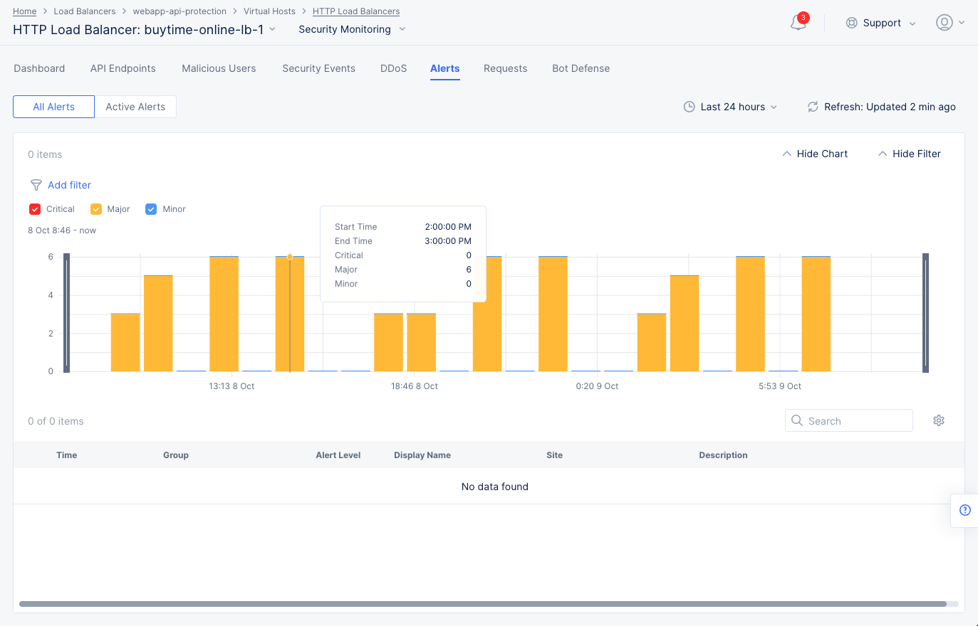
Figure: Load Balancer Alerts
Note: You can also set a time interval in the All Alerts view to display alerts over a specific period of time.
Select > for any alert entry to display its details in JSON format.
Requests
Select the Requests tab to load the view for the trend of sampled HTTP requests.
The requests are displayed in a graphical trend as well as in a list for the default or specific time interval. Select > for any listed request to display detailed information in JSON format. Use the Hide Chart option on the top right side of the page to hide the graph and display only list entries.
Note: The system performs rate adaptive sampling to guarantee that a fair number of logs are stored even when the traffic loads are high.
Note: A custom time frame must be within the last 7 days, which is the log retention limit.
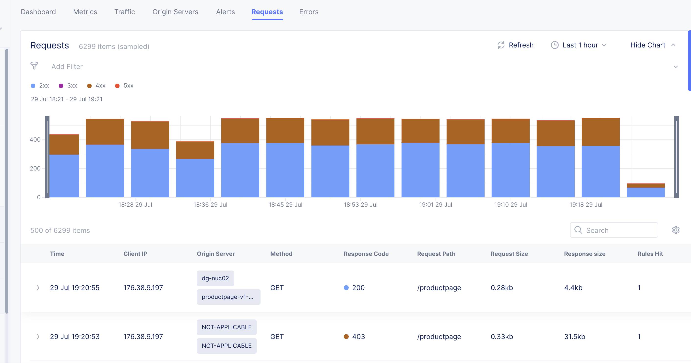
Figure: Load Balancer Requests View
You can apply filters to display the trend for specific HTTP codes. For example, de-select all and select only 2xx to display the requests for HTTP code 2XX.
You can apply filters to the display using the Forensics option at the right of the graph to show the Forensics side panel. Select a filter and select Apply to filter the display accordingly. You can also include more filter options by editing the default options and adding more from the displayed list.
Note: You can apply filters using the Add Filter option located above the requests graph.
Errors
Select the Errors tab to load the view for the trend of client or origin server errors.
The errors are displayed in a graphical trend for the default or specific time interval. You can adjust the time interval either using the drop-down selector located on the top right side of the page or using the controls beneath the graph.
Explore Security Monitoring for a Load Balancer
Switch to security monitoring view. This can be done in any of the following two ways:
-
Use the Performance Monitoring drop-down option in the performance monitoring view to select Security Monitoring option.
-
Navigate to the Overview > Applications page. Scroll down to the Load Balancers section, and click on the name of your load balancer.
In the various monitoring tabs, one or more common options are available to use. These options are typically just below the tab names or at the top of tables and graphs. The following list describes commonly available options:
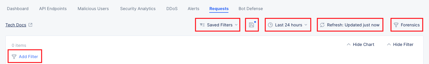
- The Save Current Filter Settings option ( 💾 ) allows you to save current filter settings to a saved configuration. The blue dot in the icon indicates that you have changed the current filter state. Press the icon to update the existing state or save to a new named state. Note that colored checkboxes in graphs that select types of data to display are not part of the saved filter.
- The Saved Filters option shows the name of the current filter in use. If no filters are being used (the default state) the option will show Saved Filters. Click the Filter List icon to drop down some options:
- Enter a string in the Search field to find filter names with that string.
- Select My Filters or Others to change the list of filters displayed.
- Select a filter to apply from the list of filters.
- Click Restore Defaults to undo the current filter state and return to the defaults.
- Click View More Details to see a larger, more detailed list of saved filters.
- The Export PDF option allows you to save a PDF of this page.
- The Time interval selector ( 🕒 ) to apply from a list of intervals. You can also set a custom 24-hour interval.
- The Refresh option refreshes the information displayed on the page.
- The Add Filter option to apply filters to the displayed information.
- Enter a string into the Search field to limit the content displayed to entries containing that string.
- Some graphs offer a Forensics option, allowing you to apply specialty filters to the display using the Forensics side panel. Select a filter and select Apply to filter the display accordingly. You can also include more filter options by editing the default options and adding more from the displayed list.
The following sections describe the various tab views available for security monitoring:
Dashboard
The dashboard tab displayed by default offers a snapshot view for entire security monitoring information for this load balancer. Dashboards show various security details such as security events by type and country, sources of events, API endpoint targets, DDoS, Bots, etc.
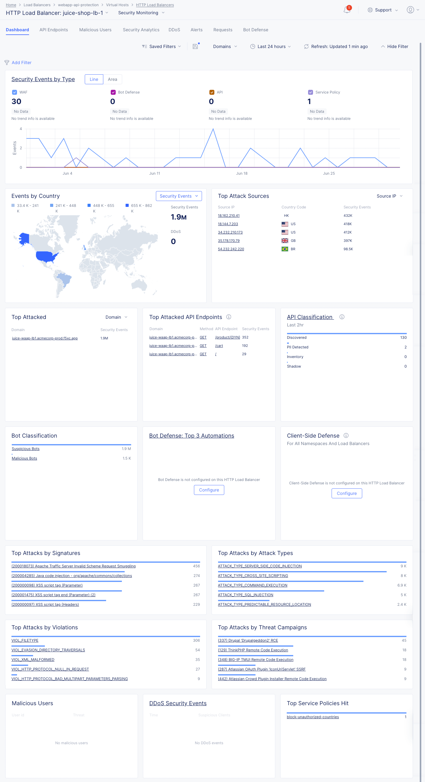
Figure: Security Monitoring View
The following list provides overview on the dashboard and the various sections it offers:
-
Security Events by Type section shows the trend of security events over time. Select Line or Area to view the information in either a line or area graph. Select any event type above the graph to display or hide that type of event. Hover over the graph to see information for that time frame. Select the section title, Security Events by Type to switch to the Security Analytics tab analyze these security events.
-
Security Events by Country section shows the security events arranged in a map view. Use the Security Events drop-down filter to change the section to show DDoS events. Select a location with hits to switch to the Security Analytics or DDoS tab showing the events from that country.
-
Top Attack Sources section shows a list of the sources with the most security events. Use the top-right drop-down menu to select top attack sources based on IP address, ASN (Autonomous System Number), or TLS Fingerprint. Select an item in the left column (IP address, ASN, or TLS Fingerprint) to examine those events in the Security Analytics tab.
-
Top Attacked section shows where the most security events have occurred by target. Use the drop-down menu in the upper-right corner switch between top domains or top paths being attacked. Select a domain or path from the list to view the security events for that particular target.
-
Top Attacked API Endpoints section shows a list of the domains and paths that being attacked the most, as well as the HTTP method associated with the security event. Select a domain, method, or path to see the specific events associated with your selection in the Security Analytics tab.
-
API Classification section shows the count of API endpoints by category. The data shown is not dependent on the selected date and time range. Select the section title to get a complete view in the API Endpoints tab.
-
Bot Classification section shows how many security events are caused by bots classified as suspicious. Select Suspicious Bots to see the events in the Security Analytics tab.
-
Bot Defense: Top 3 Automations (Last 24 hr) shows the top three Bot automation types. Bot Defense must be configured in each HTTP Load Balancer in order to see Bot automation types in the section. Select the section title to get a complete view in the Bot Defense tab.
-
Client-Side Defense section shows the complete security instance in the Client-Side Defense service for all namespaces and load balancers.
-
Top Attacks by Signature section shows which attacks as defined by their signature are being used against your app. Attack signatures are rules or patterns that identify attack sequences or classes of attacks on a web application and its components. You can look up signatures in the F5 Attack Signature database by the signature ID or other details.
-
Top Attacks by Attack Types section shows the primary methods of attack that are being utilized. Attack types are the rules or patterns that identify attacks or classes of attacks on a web application and its components, such as Cross-site Scripting or Server Side Code Injection.
-
Top Attacks by Violations section shows the top ways your security policy is being violated. Violations occur when some aspect of a request or response does not comply with the security policy.
-
Top Attacks by Threat Campaigns provide another view of the types of attacks being seen. Threat Campaigns are signatures of pervasive attacks that are often coordinated by organized crime and nation states. Threat campaign signatures are based on current “in-the-wild” attacks that exploit the latest vulnerabilities and/or new ways to exploit old vulnerabilities.
-
Malicious Users shows the list of users flagged as malicious, and shows information such as their user ID, risk score, etc.
-
DDoS Security Events shows the events flagged as DDoS events and suspicious clients. Select an entry in the time column to see more details in the DDos tab.
-
Top Policy Policies Hit shows the service policies ranked by policy violations for this load balancer.
API Endpoints
Select the API Endpoints tab to view the API endpoints and information on the various metrics associated with each API endpoint. API discovery is based on requests to specific endpoints.
At the top there are three checkboxes which determine the data shown on this page.
-
Inventory: These API Endpoints are defined per the user's API Definition and are known as API Inventory. They can also be discovered endpoints that you moved to Inventory.
-
Discovered APIs: These API Endpoints are discovered by Console using AI/ML and are based on traffic to them. The discovered API limit is 5000 endpoints per application.
-
Shadow APIs: These APIs are discovered but not in inventory.
The API Endpoints tab also provides a summary of all discovered endpoints for each domain. When you select a specific domain, schema and sensitive data are presented as learned for this specific domain. If multiple domains are selected, the presented schema is learned across all domains. You can see a summary of the following:
-
Top Attacked APIs: Presents the top three API endpoints with the highest percentage of attacks over traffic per endpoint.
-
Top Sensitive Data: Presents the top three sensitive types detected in maximum number of API endpoints. The widget represents only current state, not effected by selected time range.
-
Total API Calls: Presents the distribution of API calls by response codes.
-
Most Active APIs: Presents the top three API endpoints with the highest percentage of traffic over all detected API traffic for the load balancer.
The next section shows all of you API endpoints in one of two different forms. Use the Graph and Table buttons the view you want to see.
You can also select the Download API Spec option to download the API specifications in a machine-readable Swagger JSON file, and you have a button to Update Schema for changes you make in the Table view.
Note: For more information about API endpoints, see API Endpoint Discovery and Schema Learning.
Graph view
The graph view shows your API by segments and leaves in a railroad style diagram.
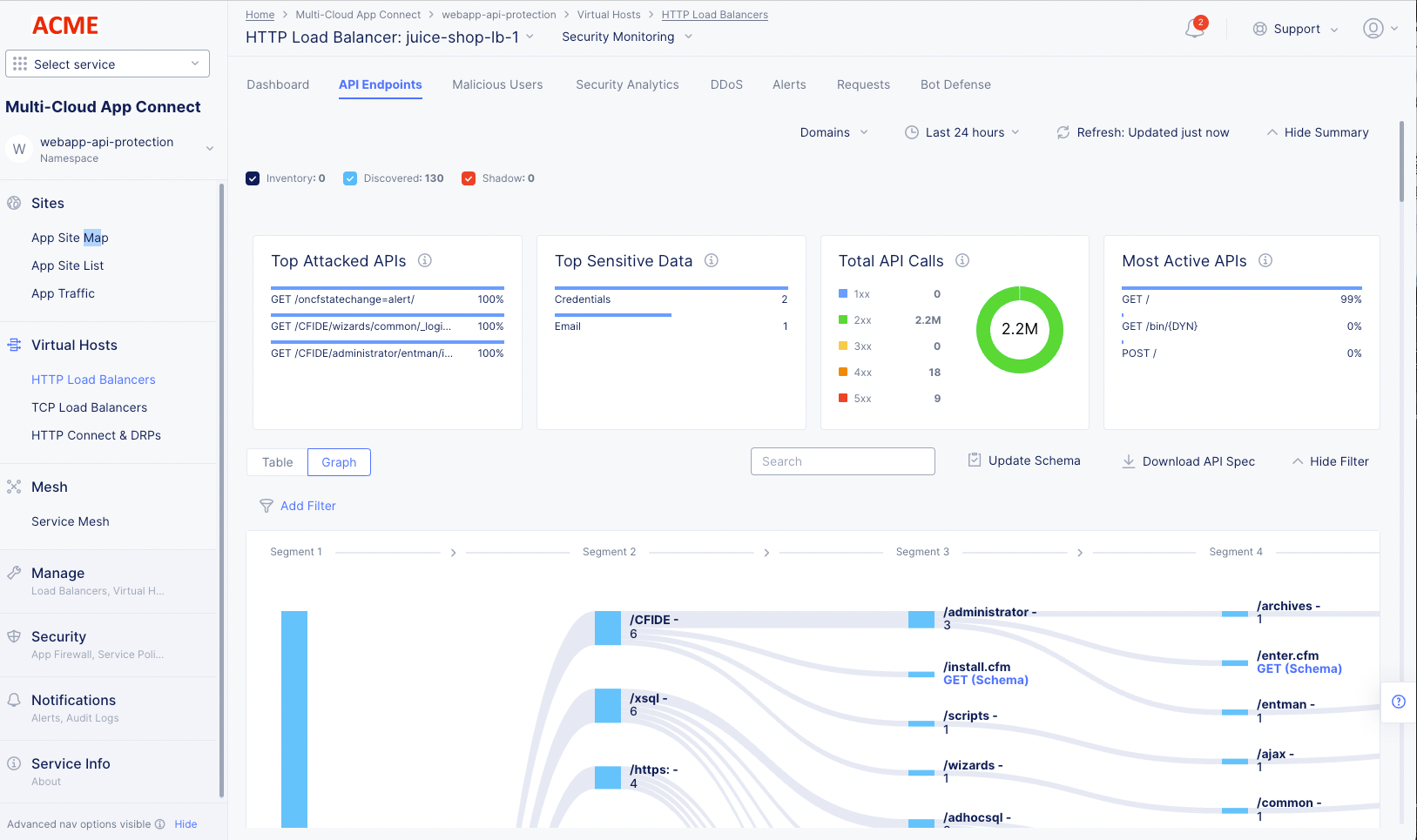
Figure: API Endpoints Graph View
-
Click a segment number at the top of the graph to toggle the display of all successive segments for all segments in that column.
-
Click an individual segment to toggle the display of all successive segments for that branch.
-
Click an HTTP request type or leaf to see Endpoint Details. More information is shown below.
-
Click a non-leaf element to hide all path information beyond that point.
-
Hover over a vertical or horizontal colored bar (including black) to see summary information for that portion of the path.
-
Click the Fit button in the lower right corner of the graph to toggle the zoom factor of the graph contents between fitting in the current view or possibly requiring scrolling to see all contents.
Table view
The table view lists the paths in the API (including the endpoint) in a table along with summary information in the columns. The endpoints are shown with domains grouped.
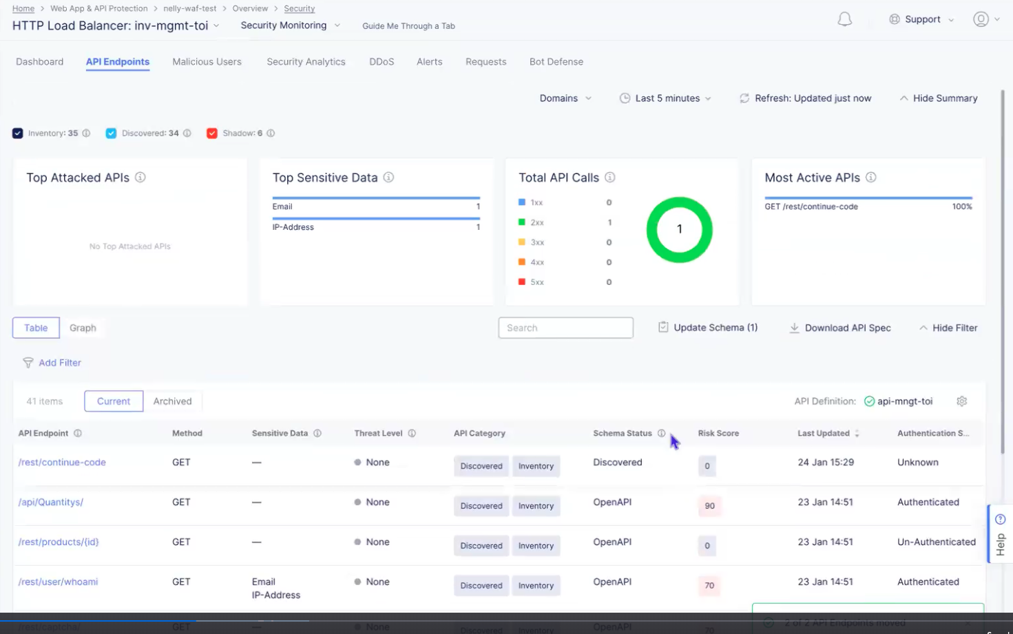
Figure: API Endpoints Table View
-
Use Search and Add Filter to limit what you see in the table.
-
View the API definition for this load balancer (green circled check mark). If there is a red circled x labeled Disabled, then you can click Enable next to it to select an existing API definition or you can add a new definition.
-
Click the gear icon ( ⚙ ) to see different column data in the table.
-
Select Current to see the API endpoints in your inventory as well as all discovered endpoints. Select Archived to see Deprecated and Non-API endpoints.
-
Click an entry in the API Endpoint column to see endpoint details. More information is shown below.
-
Click ... > Show Security Events to see any flagged requests for that endpoint in the Security Analytics tab.
-
Click ... > Edit Protection Rule to make changes to the protection rules for this endpoint. This selection will open the HTTP load balancer setup in the appropriate location allowing you to make changes to the endpoint protection rules.
-
Click ... > Edit Rate Limit to update the rate limiting for your app. This selection will open the HTTP load balancer setup in the security configuration section allowing you to adjust the rate limiting for your origin servers.
The following action menu (...) items are dependent on the contents in the API Category and Schema Status columns. These menu items will allow you to manage your API inventory. The table below shows the values in the two columns, the actions that are available, and the result of taking the action.
Click Update Schema to review and update the discovered schema changes you want to include in an inventory update. Schema changes occur when a discovered schema is different from the schema that is currently in the inventory. The number in parentheses shows the number of API endpoints with schema changes. Note that the update is limited to 10,000 bytes per endpoint.
| API Category | Schema Status | Action | Result |
|---|---|---|---|
| Discovered Inventory | OpenAPI | Remove From Inventory | Move the endpoint to the Discovered Shadow category. The endpoint will be moved to Deprecated once the discovered data is deleted (due to purging after the defined time to live (TTL) of discovered data). |
| Inventory | OpenAPI | Remove From Inventory | Deprecate an endpoint that came from an API spec (Archive). |
| Discovered Inventory | Discovered | Remove From Inventory | Remove a discovered endpoint from inventory and will get the Discovered Shadow category. This endpoint will be removed from the table only after the discovered data is deleted (expired TTL). |
| Discovered Shadow | Discovered | Move to Inventory | Add a discovered endpoint to the inventory. The endpoint is added with an empty schema, so there will be a difference with the discovered schema, and you may want to update the schema (see next table entry). |
| Discovered Inventory | Discovered Not-Updated | N/A | Click Not-Updated or Update Schema to review and update the discovered schema changes you want to include in an inventory update. |
| Discovered Shadow | Discovered | Mark as Non-API | Archive this endpoint because it is not part of the API. |
| Discovered Shadow | OpenAPI | Move to Inventory | Move endpoint back to Discovered Inventory |
| Deprecated | OpenAPI | Move to Inventory | Unarchive an endpoint. |
| Non-API | Discovered | Mark as API | Unarchive an endpoint. |
In either table view or graph view click an API endpoint (Name, HTTP Request, or leaf) to see Endpoint Details.
Endpoint Details
The Endpoint Details slide-out panel provides some specifics about the endpoint at the top of the panel.
Below are four tabs that give overview information, Discovered information (including sensitive data), Inventory OpenAPI, and the security posture for the endpoint.
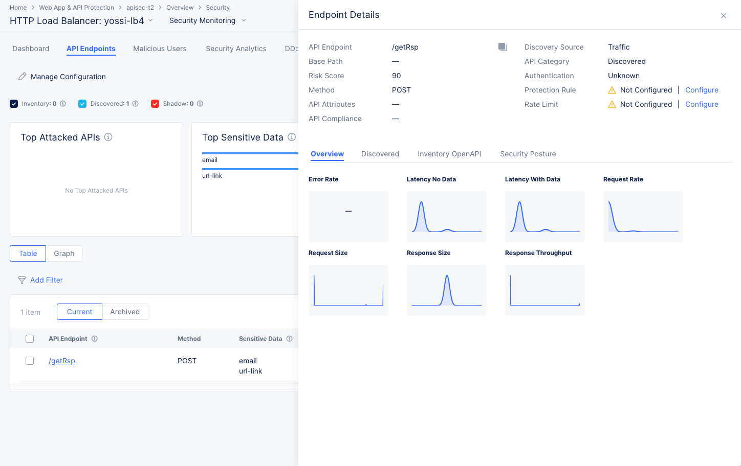
Figure: API Endpoint Details
-
The Overview tab shows trend data for various endpoint metrics.
-
The Discovered tab shows information that is discovered about the endpoint.
- If an endpoint's response contains sensitive data, it will be shown in the Sensitive Data table on the Discovered tab. You can create a masking rule by following these steps:
- In the Action column for the field you want to mask, click ... > Add Sensitive Data Exposure Rule. This will take you the Sensitive Data Exposure Rules page for that endpoint/field.
- Verify the contents of the form and then click Apply. Future responses from that endpoint and for the specified method(s) will have that field masked.
- If an endpoint's response contains sensitive data, it will be shown in the Sensitive Data table on the Discovered tab. You can create a masking rule by following these steps:
-
The Inventory OpenAPI tab shows endpoint information from your OpenAPI specification.
-
The Security Posture tab shows vulnerabilities with this endpoint.
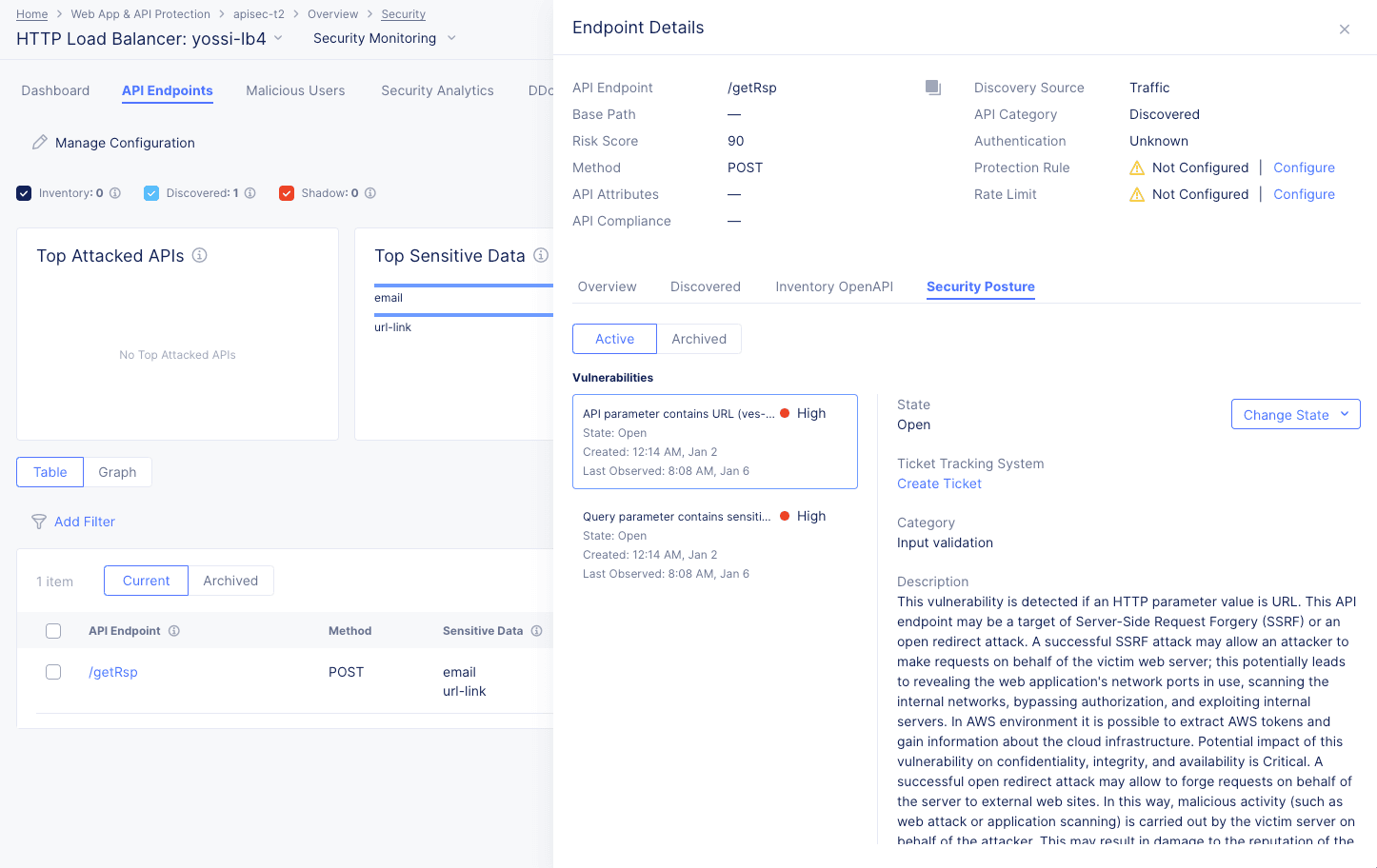
Figure: API Endpoint Security Posture
-
Each vulnerability listed is rated for severity and includes the state of the vulnerability, the category, description, risk score, and evidence of the vulnerability.
-
Control the state of the vulnerability using the Change State drop-down menu.
-
Use the Create Ticket button to track the vulnerability with your ticket tracking system. For details on creating a ticket using your ticket tracking system, see Integrate your ticket tracking system.
Note: Anyone who can see API Vulnerabilities can report tickets, regardless of the permissions required of a user in the ticket tracking system outside of F5. Also, only one ticket per vulnerability can be created.
-
Malicious Users
Select the Malicious Users tab to view trend and list of events flagged as malicious user activity.
The malicious users view shows a bar chart representing the trend of malicious user activity over a default or selected time frame. The view shows a graphical representation as well as a tiled list of users flagged as malicious (to the left side of the graph). Upon selection of a user entry from the left-side list, the graph on the right-side reflects that user's activity.
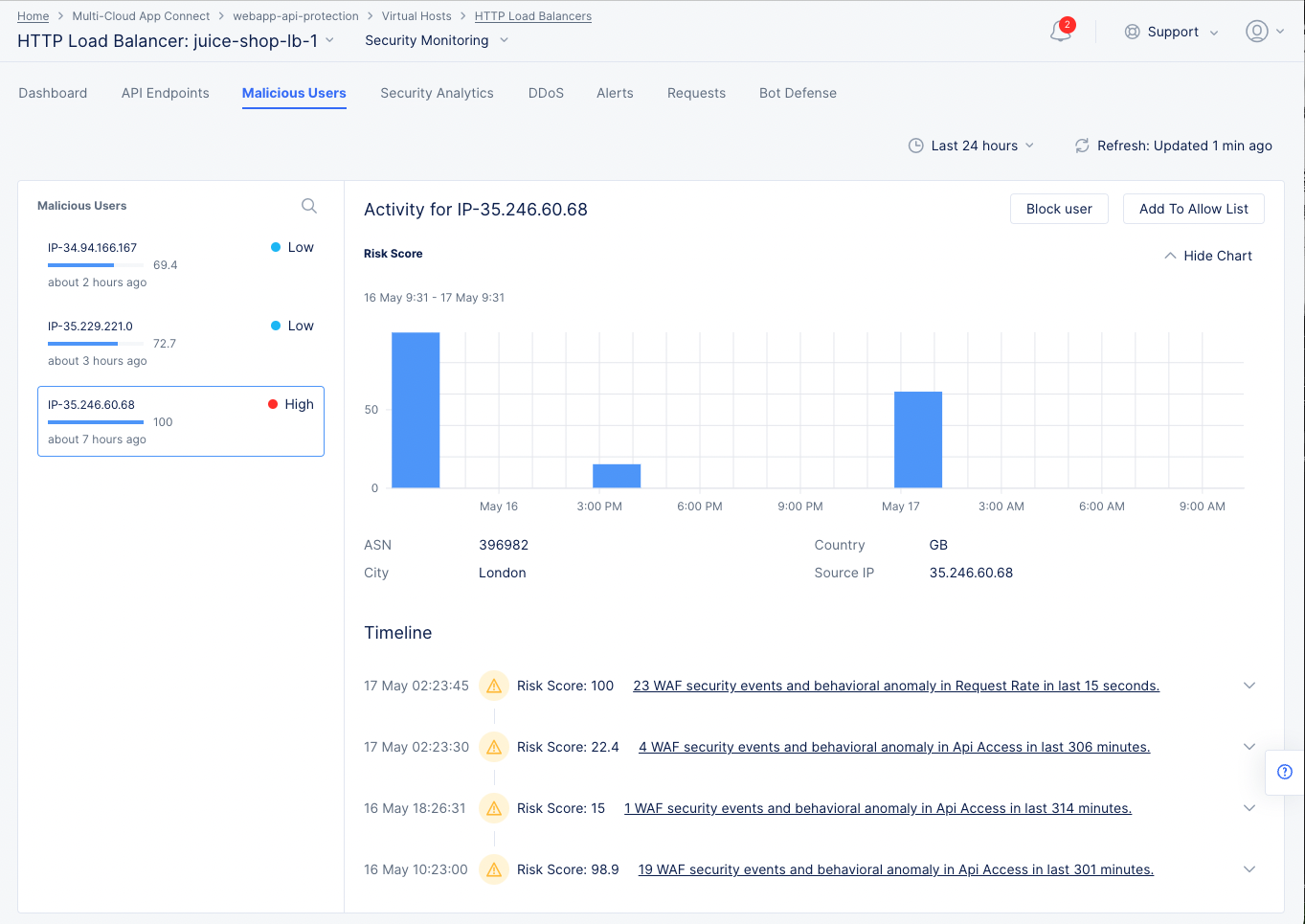
Malicious User Monitoring and Mitigation
The view also displays a timeline section beneath the graph where risk scores for a user over the selected time frame is displayed. The scores are categorized in terms of the severity of the events.
Malicious user mitigation is supported using the Block User option located on the top of the view. You can also use the Add to Allow List option to remove the user from the malicious users list.
Note: A malicious user is identified when a risk score is assigned to the user based on the user activity. A risk score is computed based on the malicious user detection configuration and this computation takes into account all the configuration parameters (such as login failure threshold and forbidden activity) enabled in the malicious user detection settings. Depending on the risk score, a threat level is attached to a malicious user and mitigation actions are applied based on the configuration set for each threat level. The risk score for a user is decayed over time, if no further suspicious activity is observed.
Security Analytics
Select the Security Analytics tab to load security analytics view, which can be viewed in two ways: Events and Incidents. Both of these views will show data for the time frame specified to the right of the Events/Incidents selector.
Events
Security events are individual violations of policy that may be attacks. The Events view shows security events over the time frame set above the view. This page also displays filters for various types of events that are represented in different colored check boxes corresponding to the different colored bars in the chart. Beneath the graph, the security events page displays the events in a list showing summary information for each event.
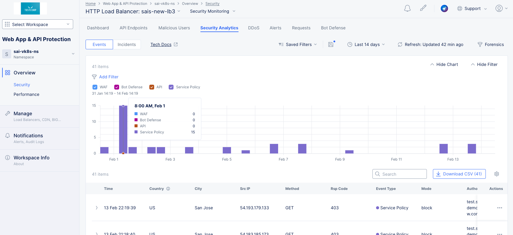
Figure: Security Analytics Page
Perform the following to analyze the security events:
-
Select the time interval drop-down list on the top right side of the page to select another time interval or specify a custom interval.
-
Select the Add Filter option and select a key-value pair to apply specific filters. You can select available key-value pairs. You can also choose a custom entry. Type a key, select Select Custom Key, type a value, and select Select Custom Value to apply a custom filter.
-
Check or uncheck a colored checkbox to select or deselect those events from being displayed in both the graph and the event list below.
-
Hover over a bar in the chart to get summary information for that time frame.
-
Enter a string in the Search field to only display table entries containing that string. Note that the search function only looks at the summary information in the table, not the complete event record.
-
Select the Download CSV button to download a CSV file containing the full content of each event record shown in the table. Using the Add Filter option will reduce the table contents and therefore reduce the size of the CSV file subsequently downloaded, as indicated by the row count shown in the Download CSV button. Using the Search option merely hides non-matching rows, so it does not affect the CSV download.
-
Click the gear icon ( ⚙ ) to see different column data in the table.
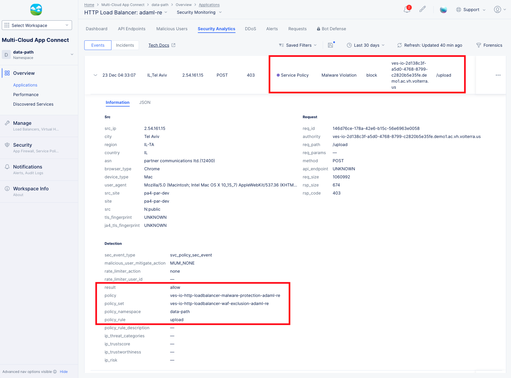
Note: If you have enabled the Malware Protection or Threat Mesh feature, or if you have set up sensitive data exposure rules (masking), be sure the events table shows the Event Name column in order to see which security events were triggered based on these capabilities.
-
Select > at the left of a list item to display the Information tab for that event in a fully expanded view. Select the JSON tab to obtain the information in JSON format.
-
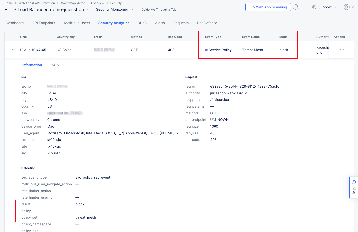
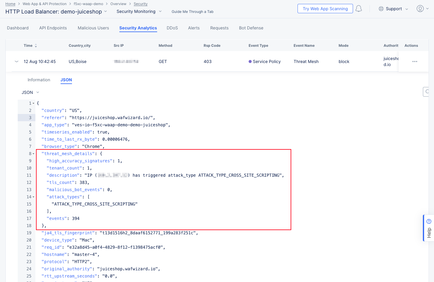
Threat Mesh details:
The Information tab shows more details, including that the block was due to a Threat Mesh violation. This means that the source IP has recently been blocked for an attack against this or another app. You can get more specifics on the attack by looking at the JSON tab and expanding the threat_mesh_details object: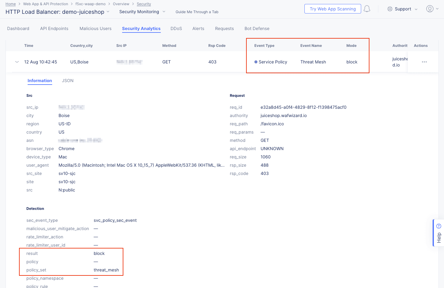
Figure: Security Events Details

Figure: Threat Mesh Event JSON
-
Malware Protection details:
The Information tab shows more details, including the policy and policy rule that triggered the event. You can get more specifics on the attack by looking at the JSON tab, entering "malware" into the search field, and expanding the malware_info object: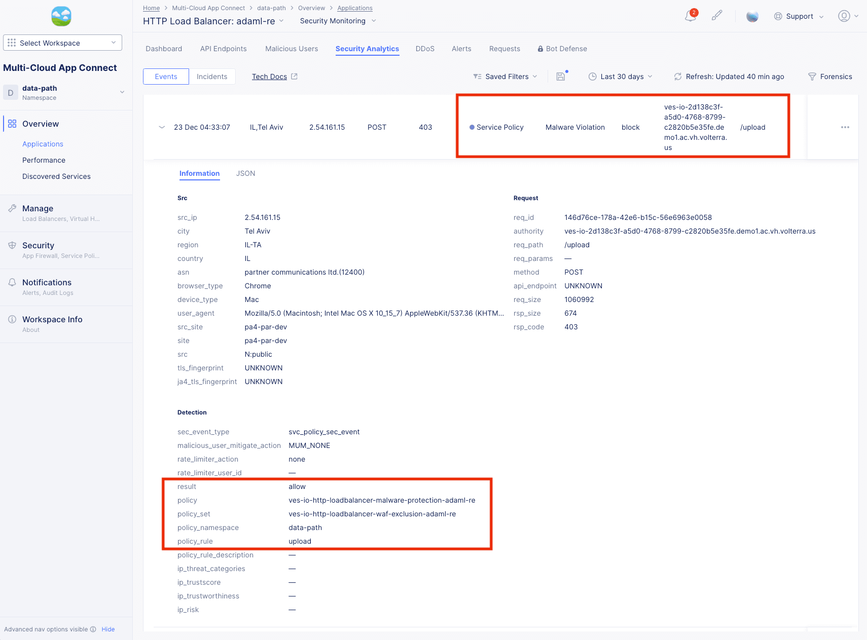
Figure: Security Events Malware Details
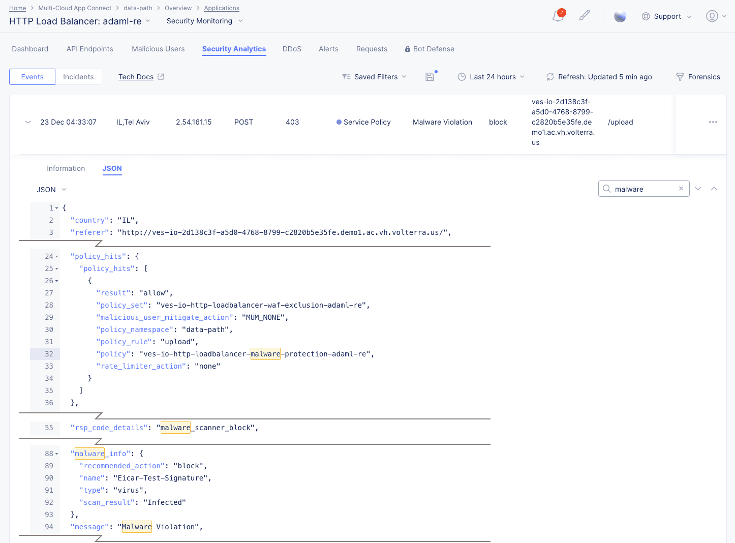
Figure: Malware Event JSON
Note: Malware Protection needs support requested to show Enabled option. Select blue star icon > select Go to Malware Protection link > request in Catalog page.
-
Enable Malware on load balancer > enter form details > select Apply.
Note: File limitation is 1, 5 MB size. Only first 5 MB will scanned and analyzed. Compressed files are not supported.

Figure: Enable Malware Load Balancer
-
-
Select ... in the Actions column of a list item to create a WAF exclusion rule or to add the client (source IP) to either the Blocked Clients list or Trusted Clients list.
-
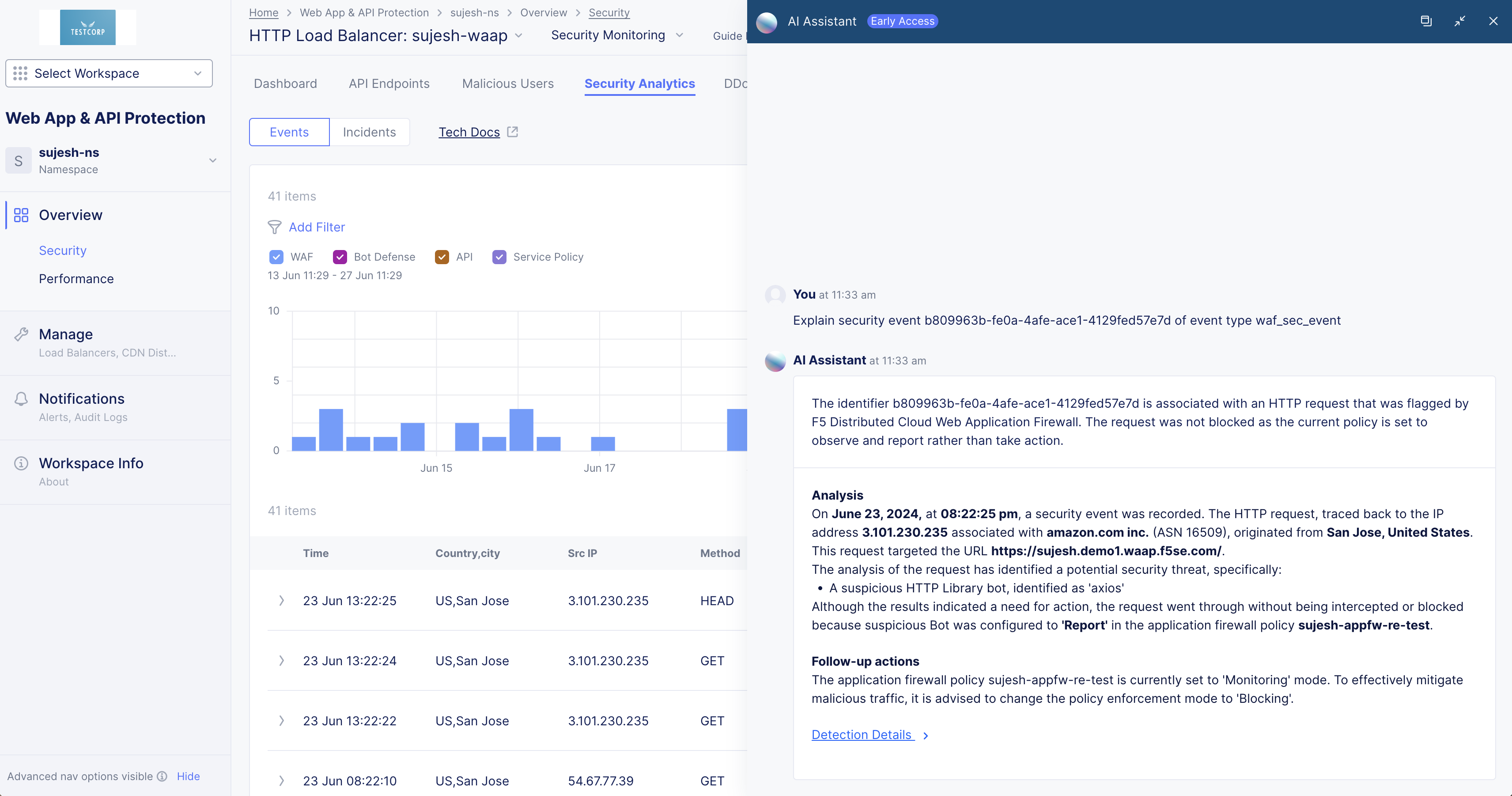
Select ... > Explain with AI to get an explanation of the event, the violation, information on the action(s) taken, and potential further actions.

Figure: Security Analytics AI Assistant Explanation


Note: See Attack Signature States for information on the states of signatures displayed on the Security Analytics view.
Incidents
Security Incidents simplify the investigation of attacks by grouping thousands of events into a few incidents based on context and common characteristics. The Incidents view shows a list of security incidents in a table based on the time frame set above the view.
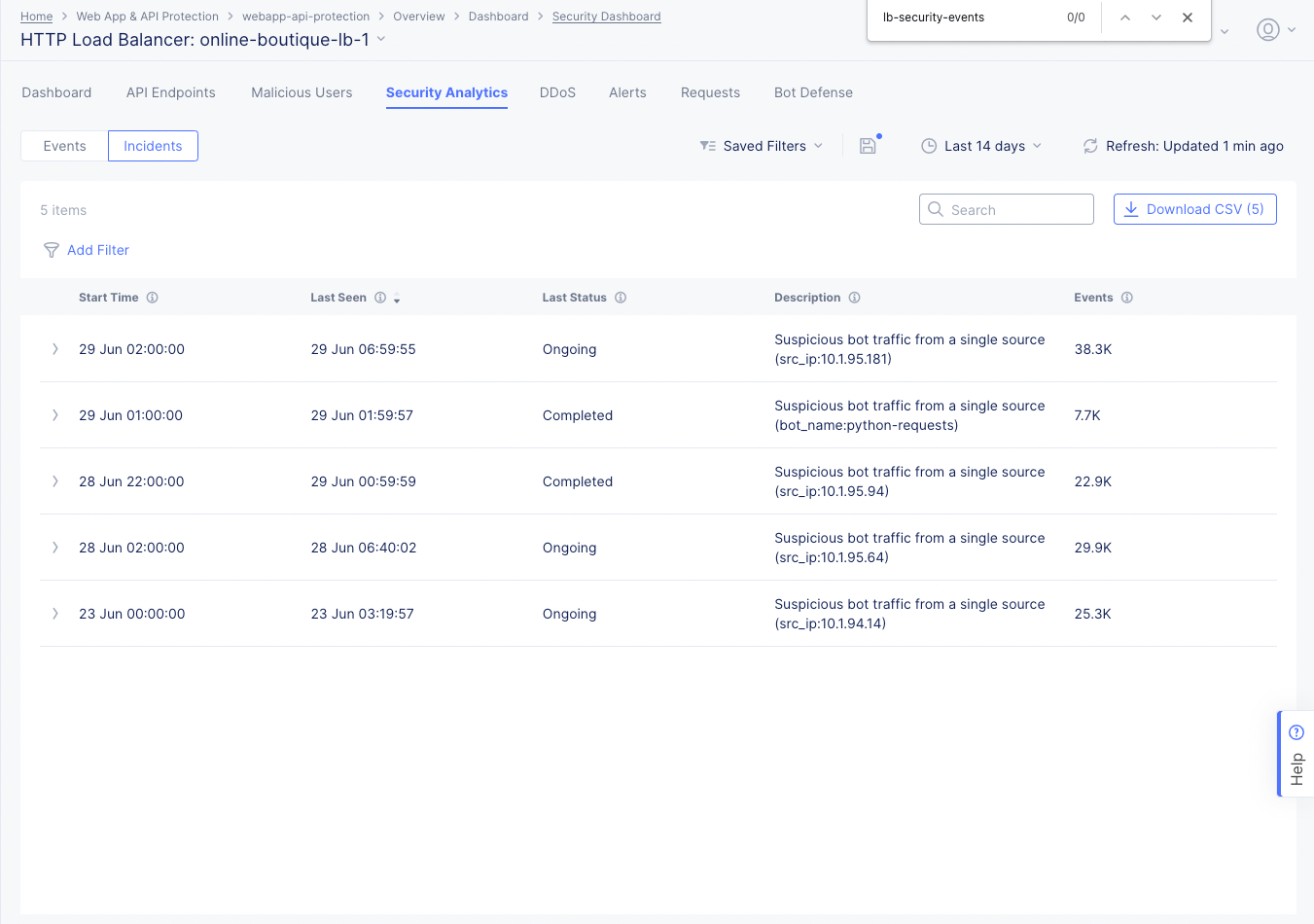
Figure: Security Incidents Page
-
Select the Add Filter option and select a key-value pair to apply specific filters. You can select available key-value pairs. You can also choose a custom entry. Type a key, select Select Custom Key, type a value, and select Select Custom Value to apply a custom filter.
-
Enter a Search value to see only incidents that contain that search string. For instance, enter ongoing to see all incidents that are listed as Ongoing in the Last Status column. The search string is not case-sensitive.
-
Select the Download CSV button to download a CSV file containing the full content of each incident record shown in the table. Using the Add Filter option will reduce the table contents and therefore reduce the size of the CSV file subsequently downloaded, as indicated by the row count shown in the Download CSV button. Using the Search option merely hides non-matching rows, so it does not affect the CSV download.
-
Select > at the left of a list item to display information of that incident in a fully expanded view, including a recommendation for resolving the incident. Select the JSON tab to obtain the information in JSON format.
DDoS
Select the DDoS tab to monitor the DDoS information for this load balancer. The DDoS view shows the information on DDoS events occurring over the default or selected time interval. The view shows a geographical map showing the event location(s). Hover the mouse pointer over the location to view attack score and location information.
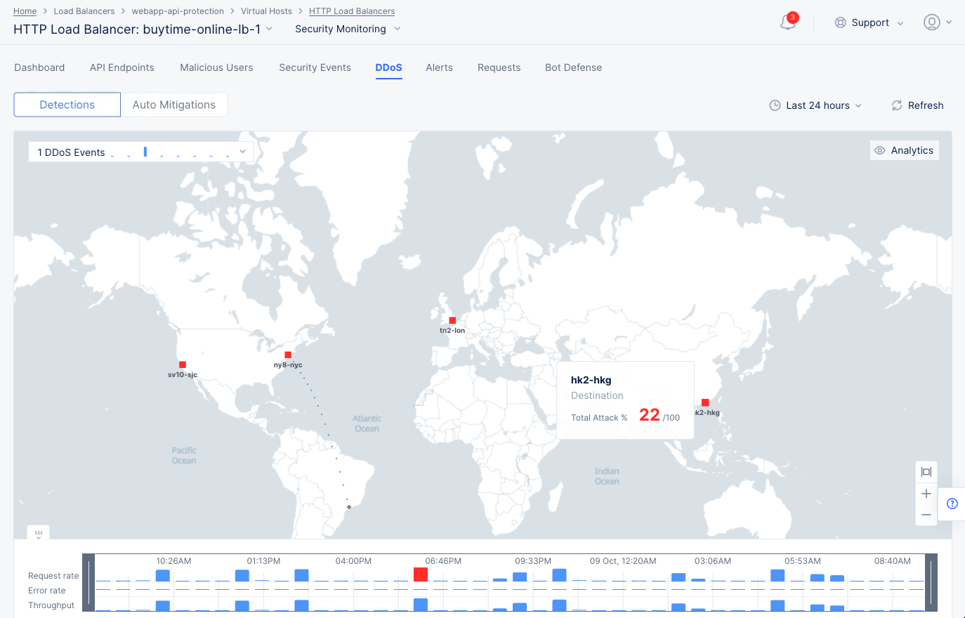
DDoS Events Map
Select the Timeline option at the bottom of the map to display the trend for request rate, error rate, and throughput. This indicates which metric is associated with the DDoS event.
Select the DDoS Events drop-down menu located at the top of the page to display the trend of DDoS events with list of events beneath the graph. Hover the mouse pointer over a graph bar to view the start time, end time, and number of events represented by that bar.
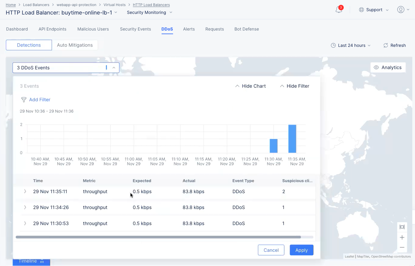
DDoS Events Graph
Select > for an entry to view detailed information in JSON format. The information includes IP addresses of users flagged as suspicious users.
Select Auto Mitigations above the graph to see rules created by the DDoS Auto Mitigation feature. See step 5.4 in the Create HTTP Load balancer guide for more details. Some rules are created for multiple IP prefixes, in which case you can select link in the IP Prefixes column to see the IP prefixes. The time columns show when the rule was created and when it will expire. You can delete the rule before it expires by selecting ... > Delete.
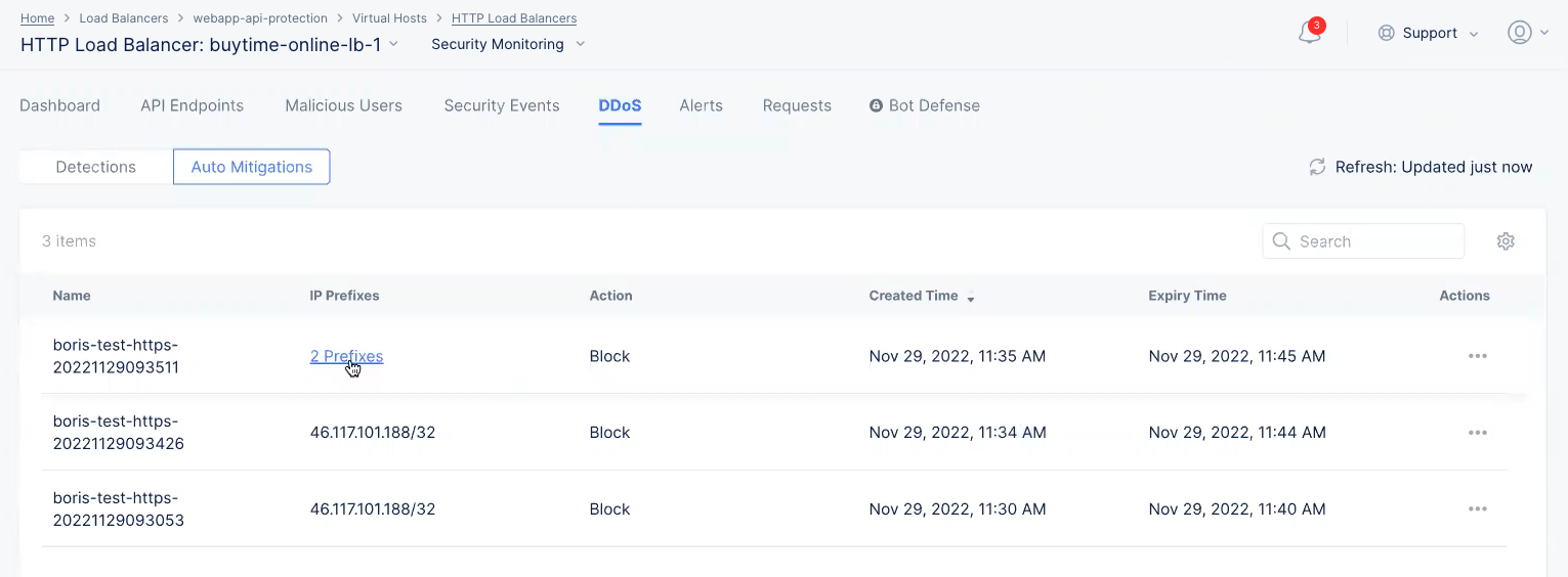
DDoS Auto Mitigations
Select Analytics on the top of the page to view DDoS statistics for top IP addresses, regions, ASNs, and TLS fingerprints. Select the downward arrow for any field such as Top IPs to view the member list of that field. You can select members of any field and select Apply to filter the display for the selected members.
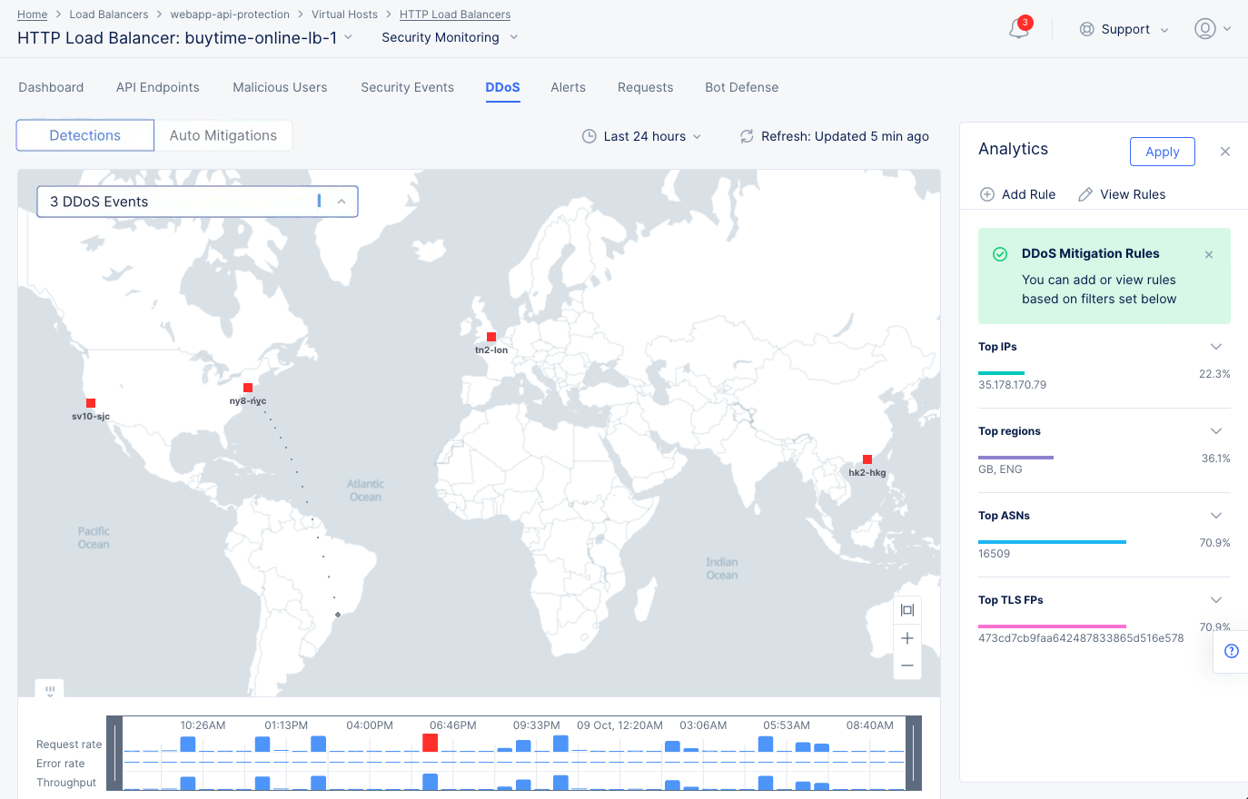
DDoS Analytics View
After selecting members, select Add Rule to create and apply a DDoS mitigation rule to the load balancer. This opens the load balancer configuration rule with the selected members.
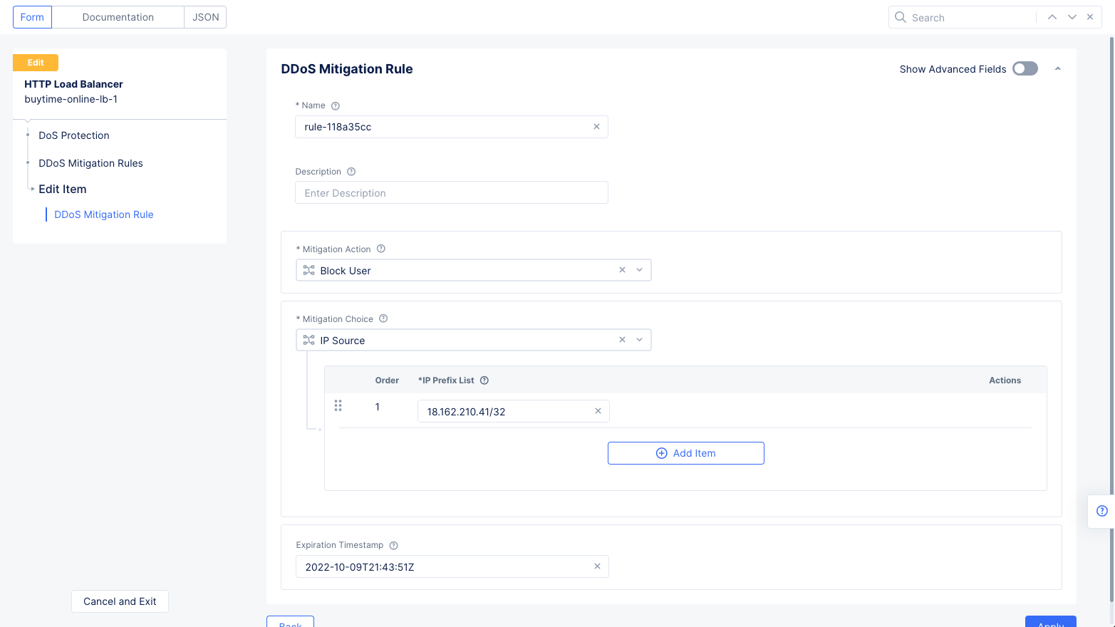
DDoS Mitigation Rules
For example, you can select an IP address and select Apply to filter the display for that IP address. Then selecting Add Rule opens the load balancer edit view with the DDoS rule populated with IP address as the source and blocking that IP address as the mitigation action. Select Apply and Save and Exit to apply the rule to load balancer.
Note: Select View Rules to open the load balancer DDoS rules configuration page and view the existing rules.
Alerts
Select the Alerts tab to view the alerts for your load balancer. The active alerts are displayed by default.
You can filter the display for alerts of a specific severity using the severity selection options. All severity types are selected by default. Select a severity selection checkbox to show/hide the alerts for that severity.
Note: Severity selection checkboxes are color-coded and located beneath the Add filter option.
Use the toggle selection and select All Alerts to view alerts. The All Alerts view shows graph for alerts over a specific period. The list of alerts is displayed beneath the graph.
Hover the mouse pointer over a graph bar to view the alerts information specific to the time interval for which the bar is generated. Selecting the bar updates the graph and the list beneath the graph for the interval for which the bar is generated.
Figure: Load Balancer Alerts
Note: You can also set a time interval in the All Alerts view to display alerts over a specific period of time.
Select > for any alert entry to display its details in JSON format.
Requests
Select the Requests tab to load the view for the trend of sampled HTTP requests.
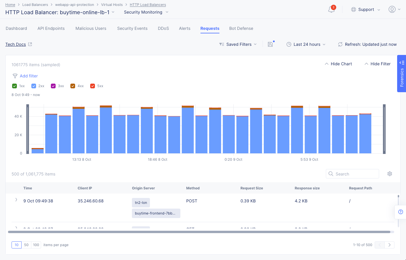
Figure: Load Balancer Requests
The requests are displayed in a graphical bar chart as well as in a list for the default or specific time interval. Select > for any listed request to display detailed information in either a human-readable format or JSON format. Use the Hide Chart option on the top right side of the page to hide the graph and display only list entries.
Note: The system performs rate adaptive sampling to guarantee that a fair number of logs are stored even when the traffic loads are high.
Note: A custom time frame must be within the last 7 days, which is the log retention limit.
You can apply filters to display the trend for specific HTTP codes. For example, de-select all and select only 2xx to display the requests for HTTP code 2XX.
Bot Defense
The Bot Defense tab provides information on Bot activity, including traffic types, the top automation type, Bot vs. human traffic, top malicious Bots, and top endpoints attacked.
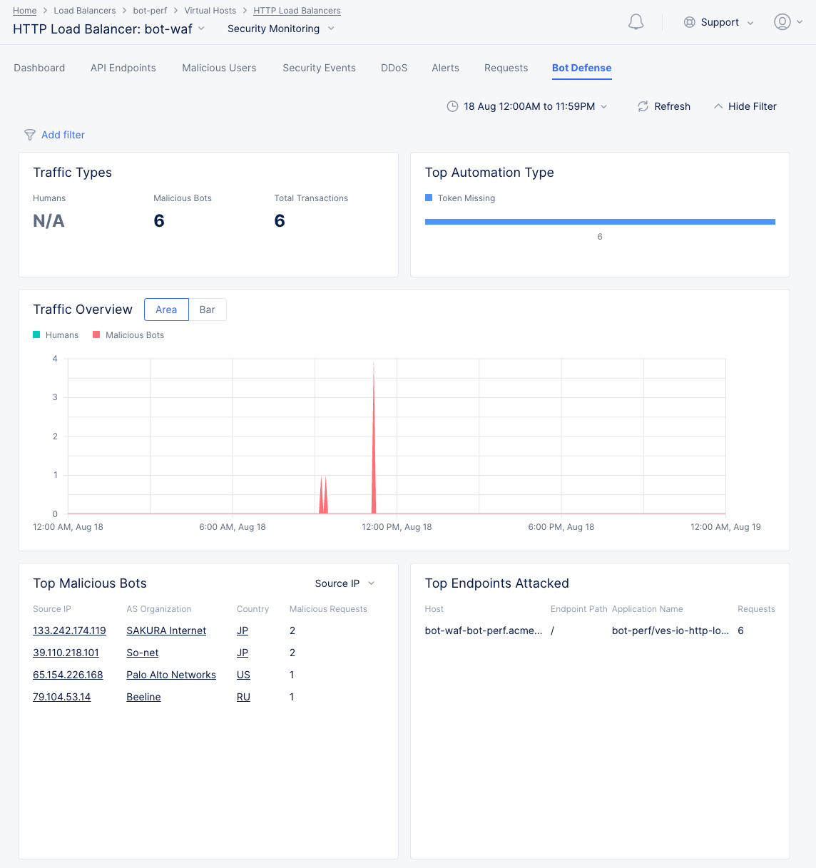
Figure: Bot Defense View
-
In the Top Automation Type section, hover over the value bar to see the percentage associated with that automation type.
-
Select Area or Bar in the Traffic Overview section to change the graph from an area chart to a bar chart.
-
Hover over the graph in the Traffic Overview section to get specific Humans/Malicious Bots values for that time point.
-
The Top Malicious Bots section shows a table of the top malicious Bots sorted first by malicious requests and then by the left column. Use the drop-down menu to select which information is in the left column, which also changes the following columns. Select a link element in the table to the security events associated with that item during that time frame.
-
In the Top Endpoints Attacked section, hover over a table entry ending in ... to see the full entry.
Note: You can see additional information about security, performance, and app traffic using the Web App and API Protection (WAAP) workspace. See WAAP Performance and Security Monitoring.