Monitor Customer Edge Site
Objective
This document provides step-by-step guidance for monitoring a Customer Edge (CE) Site using the F5® Distributed Cloud Console. It aims to help you effectively observe site health, network performance, and connectivity, ensuring operational visibility and quick troubleshooting across multi-cloud and edge environments.
Prerequisites
Before you begin monitoring a Secure Mesh Site v2 deployment, ensure the following requirements are met:
-
An active F5 Distributed Cloud Account. You must have an active account with access to the F5® Distributed Cloud Console. If you do not have an account, see Getting Started with Console.
-
CE sites and nodes: You must have deployed at least one CE Site. Refer to the Create Secure Mesh Site v2 guide for steps to deploy a CE Site. Ensure that all CE nodes are successfully registered and connected to Distributed Cloud Console.
-
Access permissions: You should have administrative or observability-level access rights to view dashboards and performance data in Console.
-
Site connectivity: Ensure that your CE Site has stable connectivity to the F5 Regional Edge (RE) sites.
Tenant-Level Customer Edge Site Monitoring
In the Multi-Cloud Network Connect workspace, select Overview > Infrastructure > Sites to see all your sites from different viewpoints. This page contains four tabs:
- Dashboard: A quick view of site health, alerts, and statistics, as well as a list of all your sites.
- Site Map: A map showing the location and health of all your sites.
- RE (Pop) Connectivity: A graph showing your sites, cloud providers, regional edges (REs), and connections.
- Fleets: A list of all your fleets and, indirectly, which sites are part of which fleets.
Sites Dashboard
The Sites dashboard provides an overview of the health, characteristics, and status of all your sites in aggregate.
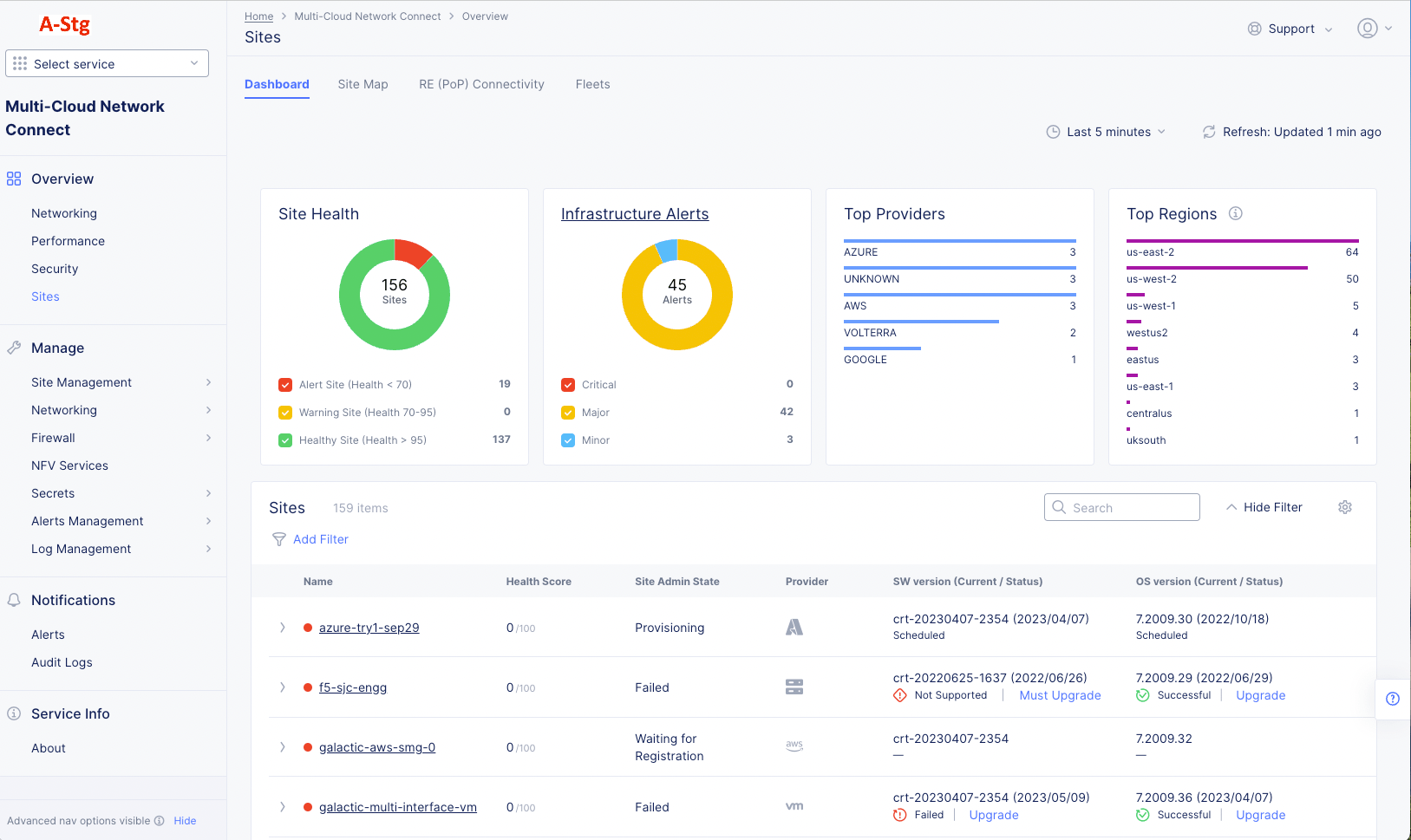
Figure: Sites Dashboard
Sites Dashboard Details
Dashboard Time Frame
The dashboard contents are dependent on the settings in the right-justified, top bar of options.
The time drop-down menu allows you to specify the time frame for the data shown, including both quick-pick options like Last 24 hours and the ability to specify a custom time frame. Custom time frames are limited to 24 hours within the last 30 days.
Click Refresh next to the time drop-down menu to update the contents of the dashboard manually.
Health and Alerts
Each health or alerts section shows a donut chart for a specific metric. The number at the center of the donut shows the total count for the time frame. The donut chart shows different colors representing subcategories of the metric, which correspond to the colored checkboxes below the donut. Click a checkbox to add or remove that subcategory from the donut. You can hover over a donut to see the actual quantities of the subcategories.
-
Site Health shows how many sites are in which health state.
-
Infrastructure Alerts shows how many and the kind of alerts you have had during the selected time frame. Click Infrastructure Alerts to see the alerts you have received.
Top Providers/Regions
- Top Providers ranks your cloud and edge providers by number of sites in each.
- Top Regions ranks your regions based on the number of sites deployed to that region.
Note: The region information is automatically sourced from cloud providers. For non-cloud sites, you can assign a region by applying the ves.io/region label to the site.
Sites
The Sites section shows an overview of all of your sites. Entries under the Name column with a circle next to them are the sites deployed by a provider, and those with a square next to them are regional edges. The color of each site circle represents the health of the site: Green is healthy, Yellow is degraded health, and Red is seriously degraded health. The Health Score column provides a numerical measure of health. The Site Admin State tells you the current state of a CE site and generally applies to all CE types and deployments.
The following states are available:
| Site Admin State | Description |
|---|---|
| Online | Indicates that the node is up and running successfully. CE Site registration successfully completed. For a multi-node CE Site, all nodes must register successfully for CE Site state to become Online. |
| Provisioning | Indicates that the node is being deployed and about to register with Distributed Cloud Services. Site is registered with Distributed Cloud Services and initial set up is in progress. |
| Upgrading | Indicates that the node software is upgrading to the latest version available. Upgrades can include node software (for example, crt-20250701-0199 (2026/01/01)) or operating system (OS) version (for example, 9.2025.17 (2026/01/01)). |
| Failed | Indicates that the node failed to deploy. Can be due to various issues. |
| Decommissioning | Indicates that CE Site decommissioning is scheduled and in progress. |
| Waiting for Registration | Indicates that the CE Site is waiting for node to be provisioned and registered. |
| Failed-Inactive | Indicates that the CE Site had a Failed state for 14 days or more and was automatically set to Failed-Inactive. |
For App Stack CE Site and legacy Secure Mesh Site, you must manually approve the registration. For Secure Mesh Site v2, registration is auto-approved.
Interact with the Sites table
- Use the Search and Add Filter fields above the list to know the list of sites shown.
- Click the gear icon (⚙) to see different columns of data in the table.
- Use the items per page selector below the list to set the maximum number of sites listed on a page, and use the page selector to see other pages.
- Click on a site name in the list to get an in-depth view of the site - see Explore a Site.
- In the Actions column, click ... > Analyze with AI to get more details on the listed site admin state as well as possible actions you can take to resolve any issues.
Site Map
The Site Map tab shows all your sites displayed on a world map, including some status information.
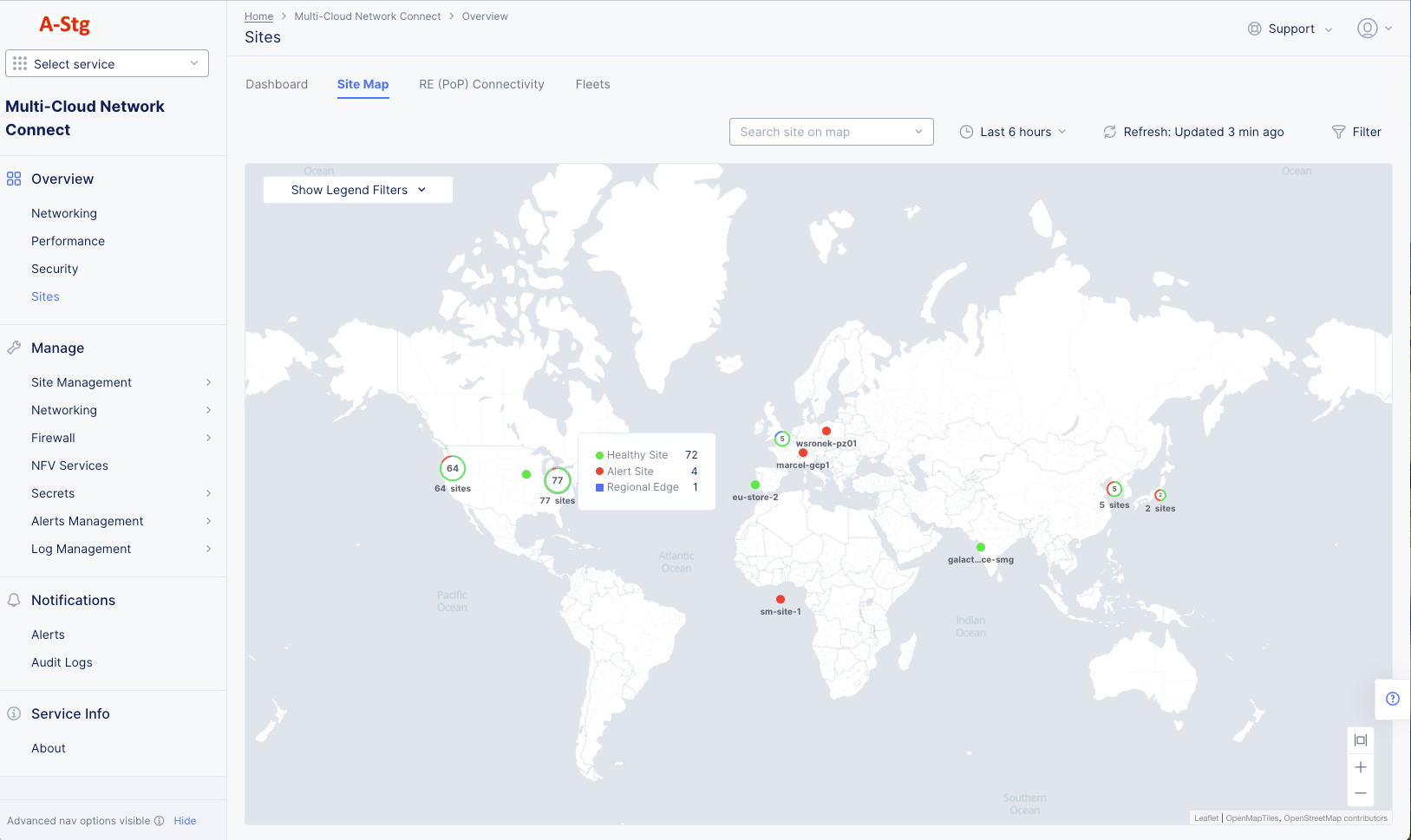
Figure: Sites Map
Site Map Details
The map shows your sites and regional endpoints as symbols on the map, giving both location information and health status.
| Map Symbol | Represents |
|---|---|
 Figure | Registration |
 Figure | Healthy Site |
 Figure | Warning Site |
 Figure | Alert Site |
 Figure | Regional Edge |
 Figure | An encircled number icon indicates quantity of sites and/or edges represented by the circle, and the circle colors indicate the statuses shown above in this table. This example represents two regional edges, one healthy site, and one warning site. |
To interact with the map:
- Use the Show Legends Filters dropdown menu to filter the symbols shown.
- Use the Search Site on map dropdown to find a specific site or regional edge. For sites, you also see the site details panel (shown below).
- Hover the cursor over a symbol to see details for that site or group of sites.
- Click on a numbered circle to zoom in and see the associated sites and/or regional edges.
- Click on a site to see the site details panel (shown below).
- Click Edit Site to make changes to the site configuration.
To see the Site details panel:
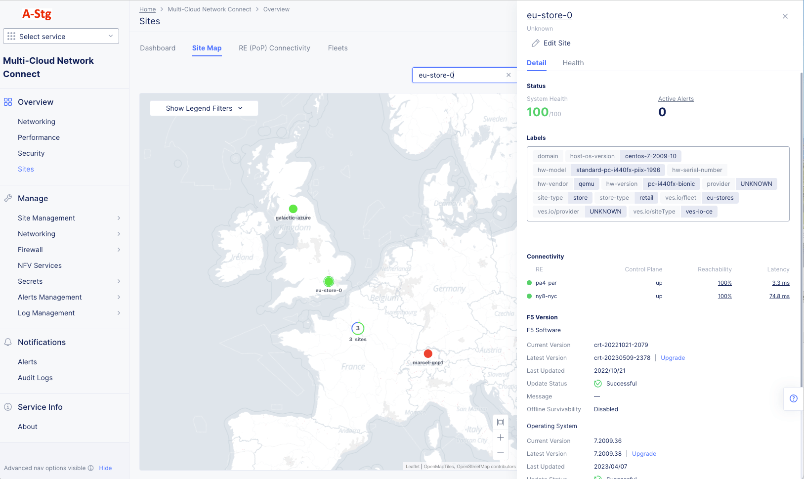
Figure: Site Detail Panel
The Detail tab provides some details about the site, and the Health tab provides an overview of the site's health. Click the site name in the side panel for an in-depth look at the site. See Explore a Site.
RE (PoP) Connectivity
The PoP (RE) Connectivity tab shows all your sites, REs, and cloud providers in a graph showing how they are connected to each other.
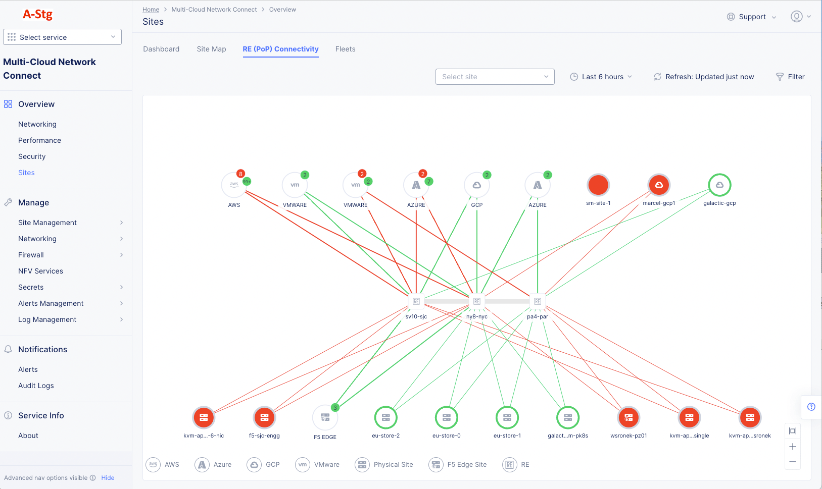
Figure: Site Connectivity Status
RE (PoP) Connectivity Details
- Hover over a thick link to see the number of connections it represents.
- Hover over a link to see details about the connection.
- Hover over a site to see details about the site.
- Hover over a cloud provider to see how many sites were provisioned by that provider.
- Click on a cloud provider to zoom into the connections for that provider. Click the Back or All Sites button in the upper left corner of the graph to return to the previous view.
- Click on a link or site and check the right pane for additional metrics and statistics. For example, the image below shows the site details for a selected node.
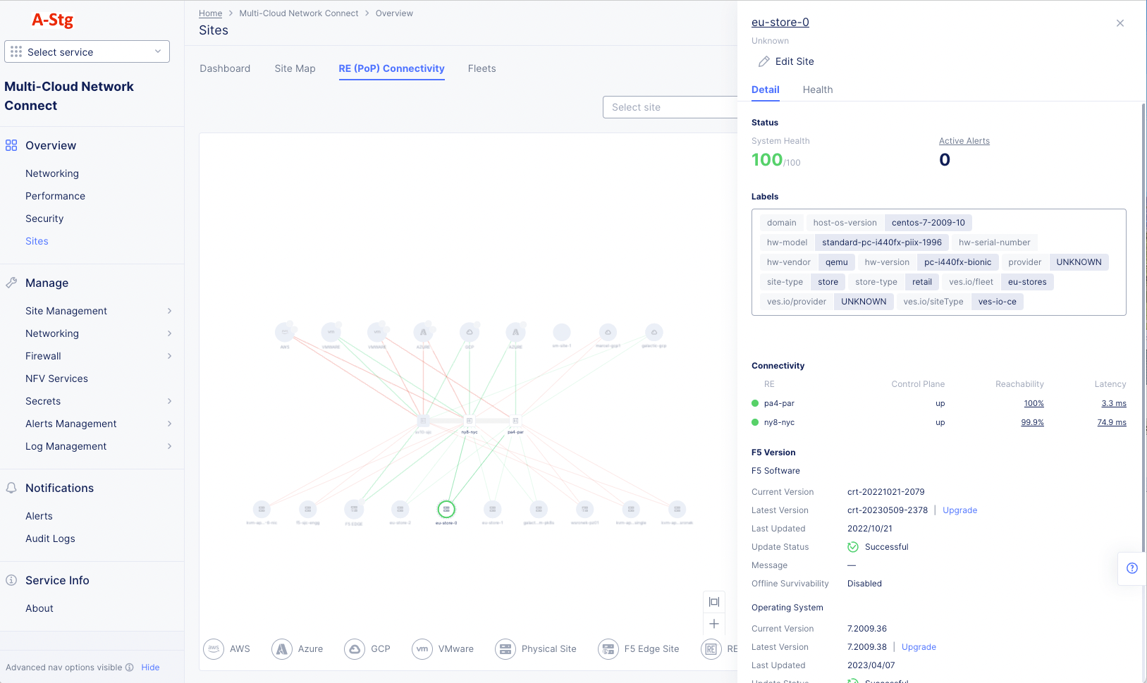
Figure: RE (PoP) Connectivity Details
Find a Site
There are a number of ways to find a site. To start, select the Multi-Cloud Network Connect workspace and navigate to Overview > Sites. To find a specific site, use one of the following methods:
Figure: Sites Dashboard
Site List
- From the Overview > Infrastructure > Sites page, go to the Dashboard tab.
- Scroll down to the Sites section, which provides a list of your sites.
- Use the Search and Add Filter capabilities at the top of the list to narrow the list.
- Click the name of the site you wish to explore.
Site Map
Figure: Site Detail Panel
- From the Overview > Infrastructure > Sites page, go to the Site Map tab.
- Find your site on the map. The following options help you find your site:
- Use the search drop-down menu to select your site.
- Use the Show Legend Filters menu to narrow the search by site type.
- Pan and zoom on the map to see more detail in an area.
- Click on a multi-site icon to see the sites in that area.
- Click on the site icon on the map to see the site details panel.
- Click on the name of the site in the panel.
Note: You can also edit the site from the site details panel.
Explore a Site
To explore a site, first use one of the methods in Find a Site above to open the site page for your site.
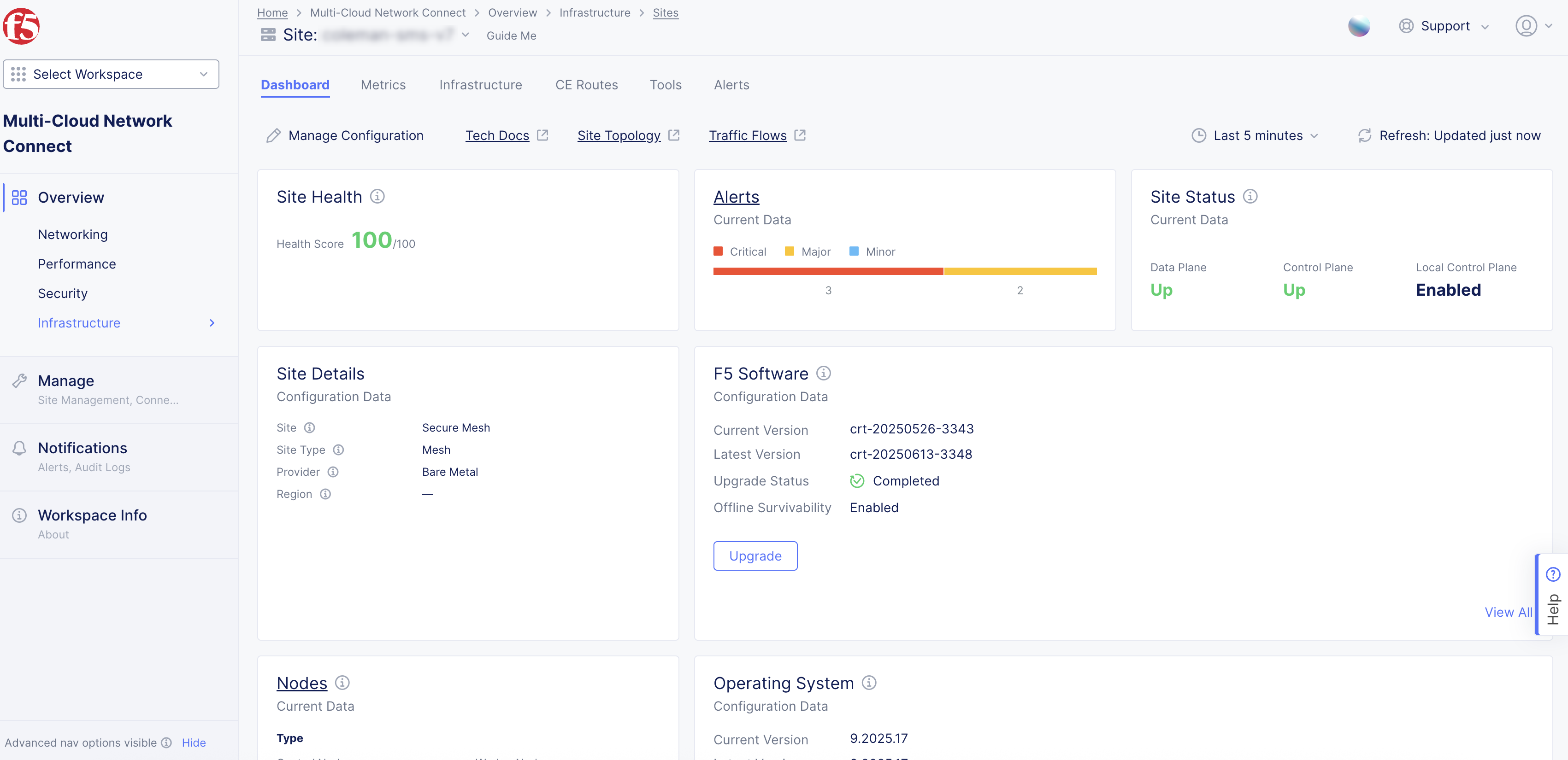
Figure: Site Dashboard
The Site page provides detailed information about a single site. The Site: drop-down menu at the top of the page shows you the current site being displayed, and it allows you to switch sites.
There are a number of tabs at the top of the page allowing you to see information by topic. Each tab is shown below.
Note: Some tabs are only available for sites with certain characteristics.
Most pages also use the time and refresh options near the top-right of the page.
-
The time drop-down allows you to specify the time frame for any time-frame-dependent data shown, including both quick-pick options like Last 24 hours and the ability to specify a custom time frame. Custom time frames are limited to 24 hours within the last 30 days. The selected time frame remains consistent across all tabs on the page, although some tabs and some data shown on the tab is current data and not time-frame dependent.
-
Click Refresh next to the time drop-down menu to update the contents of the dashboard manually.
Dashboard
The Site dashboard provides summary information about a single site across a broad number of categories. The Site: drop-down menu at the top of the page shows you the current site being displayed, and it allows you to switch sites.
Dashboard Details
Dashboard Quick Links
-
Click Manage Configuration to view and/or edit this site's configuration on the fly.
-
Click Tech Docs to open this document in a new tab explaining how to monitor a site.
-
Click Site Topology to see this site's connectivity on the Overview > Infrastructure > Sites page, RE (PoP) Connectivity tab. For more information, see RE (PoP) Connectivity.
-
Click Traffic Flow to see flows for this site on the Overview > Performance page, Flow Analysis tab. You can visualize traffic between this site and any other entities of interest. For more information, see Monitor Performance.
Health and Status Sections
-
Site Health displays a numeric value indicating overall system health for the selected time frame.
-
Alerts provide a snapshot of the current active alerts on your site, segmented by alert categories Critical, Major, and Minor. Hover over the bar to see the number of alerts in each category. Click on the Alerts title to see detailed information on the Alerts tab. The alerts shown are current and not affected by the selected time frame.
-
Site Status shows the current state of the Data Plane, Control Plane (Up or Down) and Local Control Plane (Enabled or Not Reported). Note that Local Control Plane only shows Enabled status when Site Offline Survivability is configured or the site is an App Stack site. Otherwise, the status field will display Not Reported. Also, all statuses shown are current and not affected by the selected time frame.
-
Site Details shows basic information about the site you are observing. These details shown are current and not affected by the selected time frame.
- Site: Shows what type of site was created: AWS VPC Site, Azure VNet, and much more.
- Site Type: Shows the site configuration: App Stack or Mesh.
- Provider: The cloud infrastructure in which the site is deployed (VMware, AWS, and GCP). This is only applicable to cloud sites.
- Region: Specifies the cloud provider's region. This is only applicable to cloud sites.
- Gateway Type: Ingress (single NIC) or Ingress and Egress (dual NIC).
-
F5 Software provides a snapshot of the current software configuration of the site. You can perform upgrades using the Upgrade button if an upgrade is available. You can see complete information about the software in JSON format by clicking See All in the lower right corner. The details shown are current and not affected by the selected time frame.
-
Nodes shows how many nodes are control nodes versus worker nodes, and how many of them are up. Click on the Nodes title to see detailed information in the Infrastructure tab. The node details shown are current and not affected by the selected time frame.
-
Operating System provides a snapshot of the Operating System information. You can perform upgrades using the Upgrade button if an upgrade is available. You can see complete information about the operating system in JSON format by clicking See All in the lower right corner. The details shown are current and not affected by the selected time frame.
Connection Throughput Chart
The Connection Throughput chart shows the incoming and outgoing throughput from this site to a particular connection, where that connection can be the regional edges (REs) as well as other customer edges (CEs) if directly connected via site mesh group or DC cluster group.
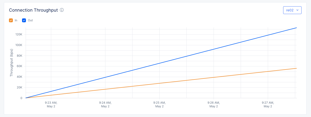
Figure: RE Connection Throughput
- Select a CE or RE in the upper right corner to see how much traffic is going in to and out of the CE/RE over time.
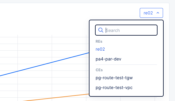
Figure: RE Connection Throughput Selector
- Toggle the In and Out checkboxes to view or hide the data line for that category. This can be useful if one category has significantly more traffic than the other, causing the lower traffic line to look flat at zero throughput.
Connectivity Table
The Connectivity table shows the connectivity to this site.
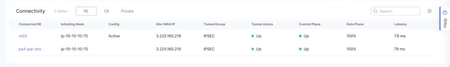
Figure: Site Connectivity Table
-
Use the edge-type selector to change what you want to see:
- RE to see Regional Edge connections.
- CE to see Customer Edge connections.
- Private to see CloudLink connections.
-
Click on the name of an RE to see detailed information for that site in JSON format.
-
Click on a link for a CE to see connectivity metrics for that link.
-
Enter a search string in the Search field to see only line items containing that string.
-
Click the gear icon ( ⚙ ) to see different columns of data in the table.
Metrics
The Metrics tab allows you to examine the trends of different aspects of your CE Site. Use the selector below the Metrics tab to choose what you want to examine. Each tab allows you to compare up to five items simultaneously.
Another feature of the Metrics tab is the ability to overlay CE alerts and events directly on metric visualizations. This enables you to correlate anomalies, incidents, and system behavior in a single view, improving root-cause analysis and operational visibility.
For any of the graphs, use the time drop-down menu to specify a time interval for the graph. You can customize the interval by selecting the Custom option and choosing a date range. This can also be set graphically by adjusting the controls (gray bars) beneath the main graph.
The dashboard also supports plotting multiple metrics side by side, allowing you to compare trends across different dimensions of your system.
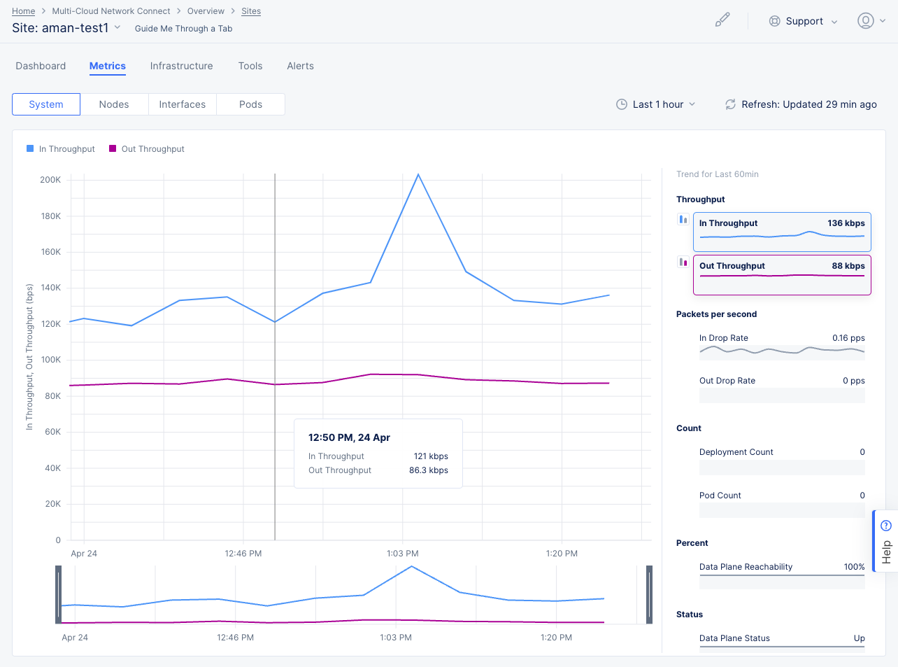
Figure: CE Site Metrics
SaaS Control Plane
The SaaS Control Plane metrics present an overall view for each node of your CE Site so that you examine trends for data plane status, control plane status, incoming throughput for RE tunnels, and outgoing throughput for RE tunnels. The metrics are displayed in graphs representing the trends over a period of time. You can select each metric heading for an in-depth look at that specific metric (with alerts and events).
Use the node selector menu to select multiple nodes to view and compare metrics simultaneously for the following:
- Data Plane Status: This metric indicates the status of data plane connectivity between the CE node and the RE. In a three-node CE, only two nodes establish IPsec/SSL tunnels to the REs and one node does not. Therefore, one of the nodes will have data plane status equal to 0 (Down) and this is acceptable behavior. A value of 1 indicates that data plane is Up and a value of 0 indicates data plane is Down.
- Control Plane Status: This metric indicates the status of control plane connectivity from the CE node. In proper conditions, all nodes should have connectivity to the control plane. A value of 1 indicates the control plane is Up, and a value of 0 indicates the control plane is Down.
Important: Ensure you are on the latest crt version for the Control Plane Status to show correctly. See the official releases notes guide for more information. To upgrade your CE, see the Manage CE Site guide.
- RE Tunnels Incoming Throughput: This metric indicates the throughput of traffic received by the CE node from the RE it is connected to. Measured in bits per second (bps). For a three-node CE, one of the nodes would have 0 bps as it does not have a tunnel to the RE.
- RE Tunnels Outgoing Throughput: This metric indicates the throughput of traffic sent from the CE node to its connected RE(s). Measured in bits per second (bps). For a three-node CE, one of the nodes would have 0 bps as it does not have a tunnel to the RE.
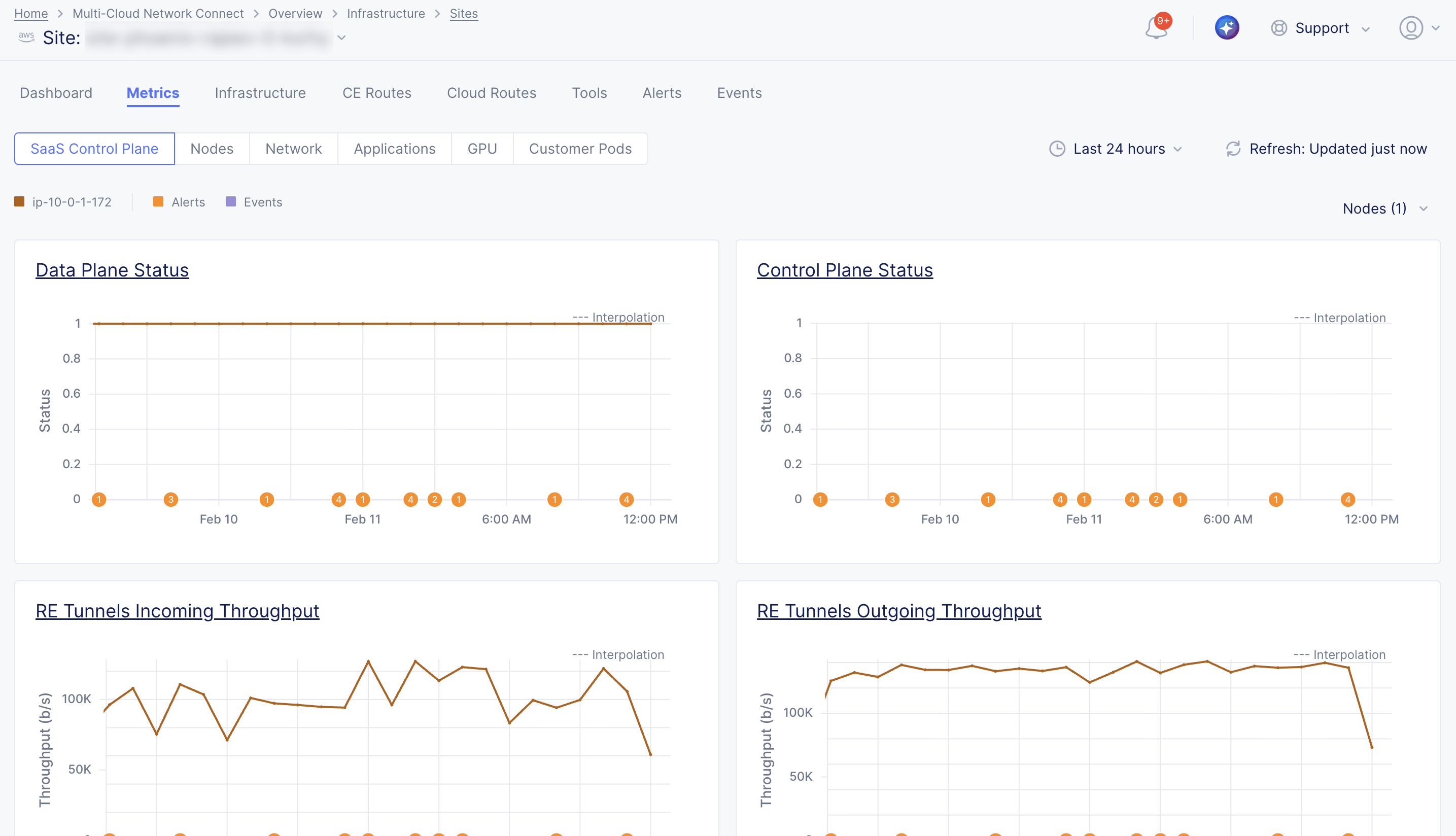
Figure: SaaS Control Plane Metrics
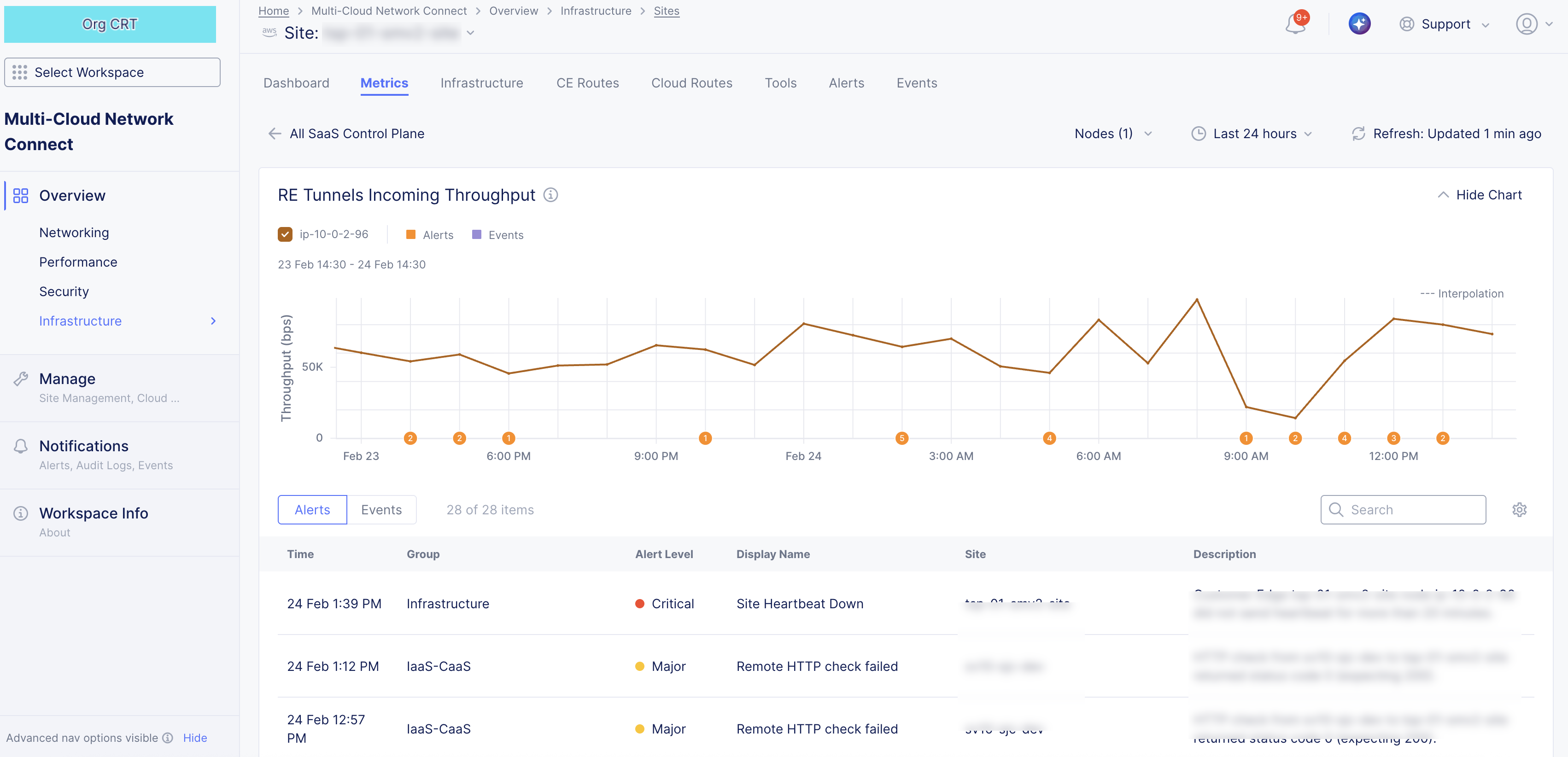
Figure: SaaS Control Plane Metric Specific
Nodes
The Nodes metrics present an overall view for each node of your CE Site so that you examine trends focused on the health and resource utilization of CE nodes, including node status and availability, CPU utilization, memory utilization, and disk usage. The metrics are displayed in graphs representing the trends over a period of time. You can select each metric heading for an in-depth look at that specific metric (with alerts and events).
Use the node selector menu to select multiple nodes to view and compare metrics simultaneously for the following:
-
Node Status: This metric provides a historical view of each node's availability. A value of 1 indicates the node is Up, and a value of 0 indicates the node is Down.
-
Total CPU Usage: This metric provides the percentage of CPU utilized on each node.
-
Total Memory Usage: This metric provides the percentage of memory utilized on each node.
-
Total Disk Usage: This metric provides the percentage of disk capacity utilized on each node.
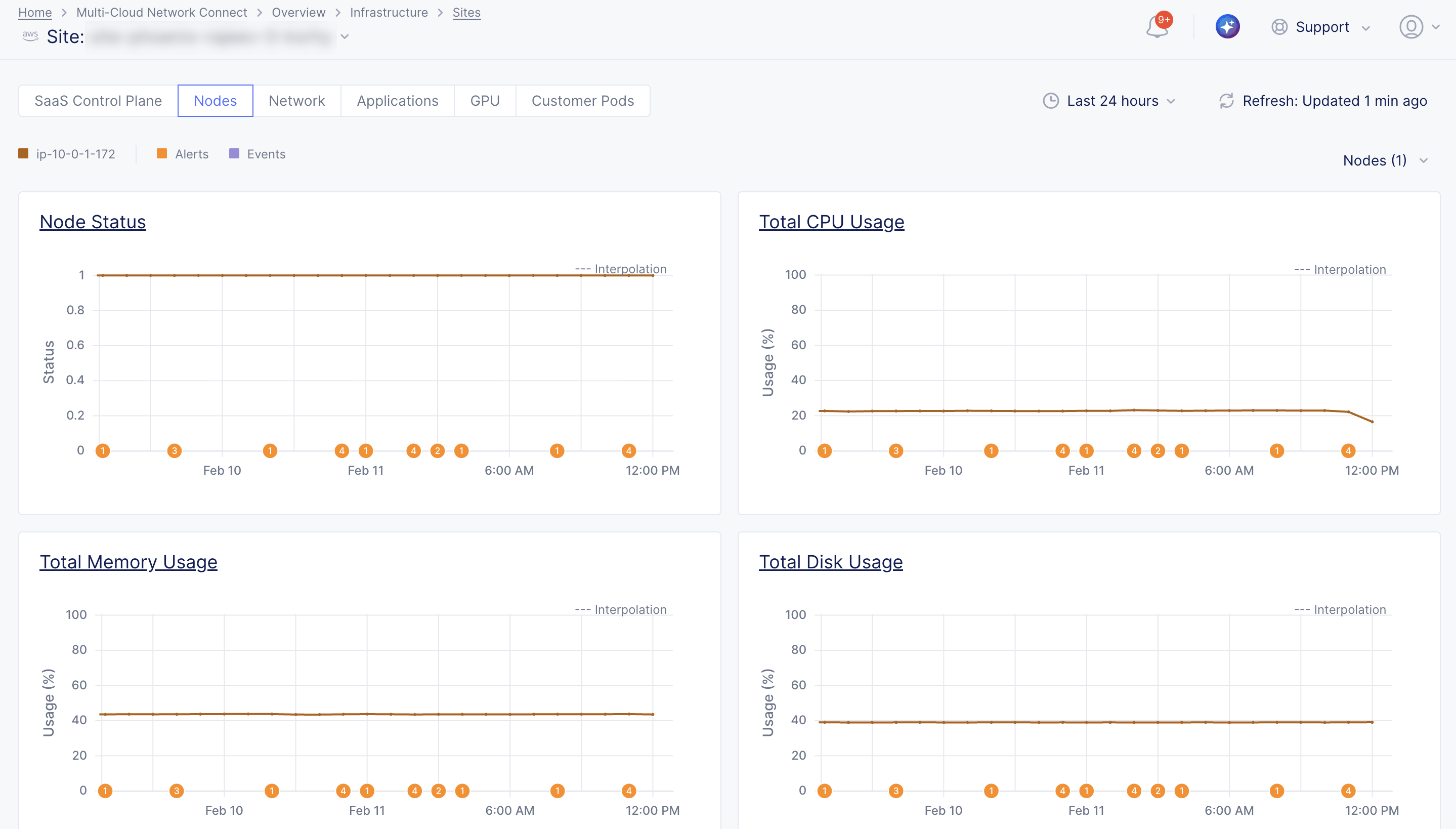
Figure: Node Metrics
Figure: Node Metric Specific
Network
The Network metrics present an overall view for each node interface of your CE Site so that you examine trends focused on throughput per interface, packet rates (ingress and egress), and dropped packets (ingress and egress). The metrics are displayed in graphs representing the trends over a period of time. You can select each metric heading for an in-depth look at that specific metric (with alerts and events).
Use the node selector menu to select multiple nodes and interfaces to view and compare metrics simultaneously for the following:
-
Incoming Throughput: This metric provides the incoming traffic rate per interface. Measured in bits per second (bps).
-
Outgoing Throughput: This metric provides the outgoing traffic rate per interface. Measured in bits per second (bps).
-
Incoming Packets: This metric provides the rate of incoming packets per interface. Measured in packets per second (pps).
-
Outgoing Packets: This metric provides the rate of outgoing packets per interface. Measured in packets per second (pps).
-
Dropped Incoming Packets: This metric provides the rate of dropped incoming packets per interface. Measured in packets per second (pps).
-
Dropped Outgoing Packets: This metric provides the rate of dropped outgoing packets per interface. Measured in packets per second (pps).
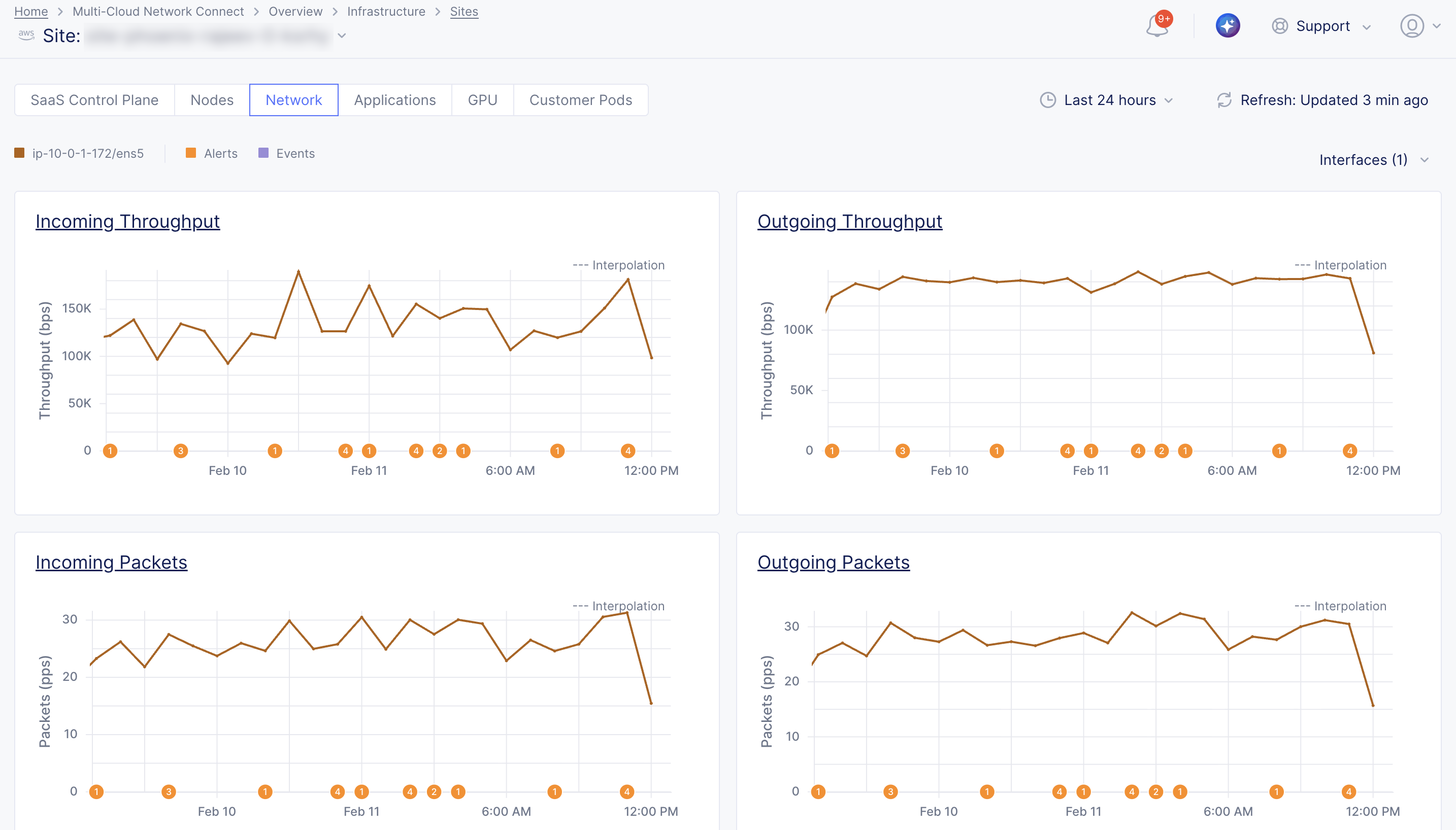
Figure: Network Interface Metrics
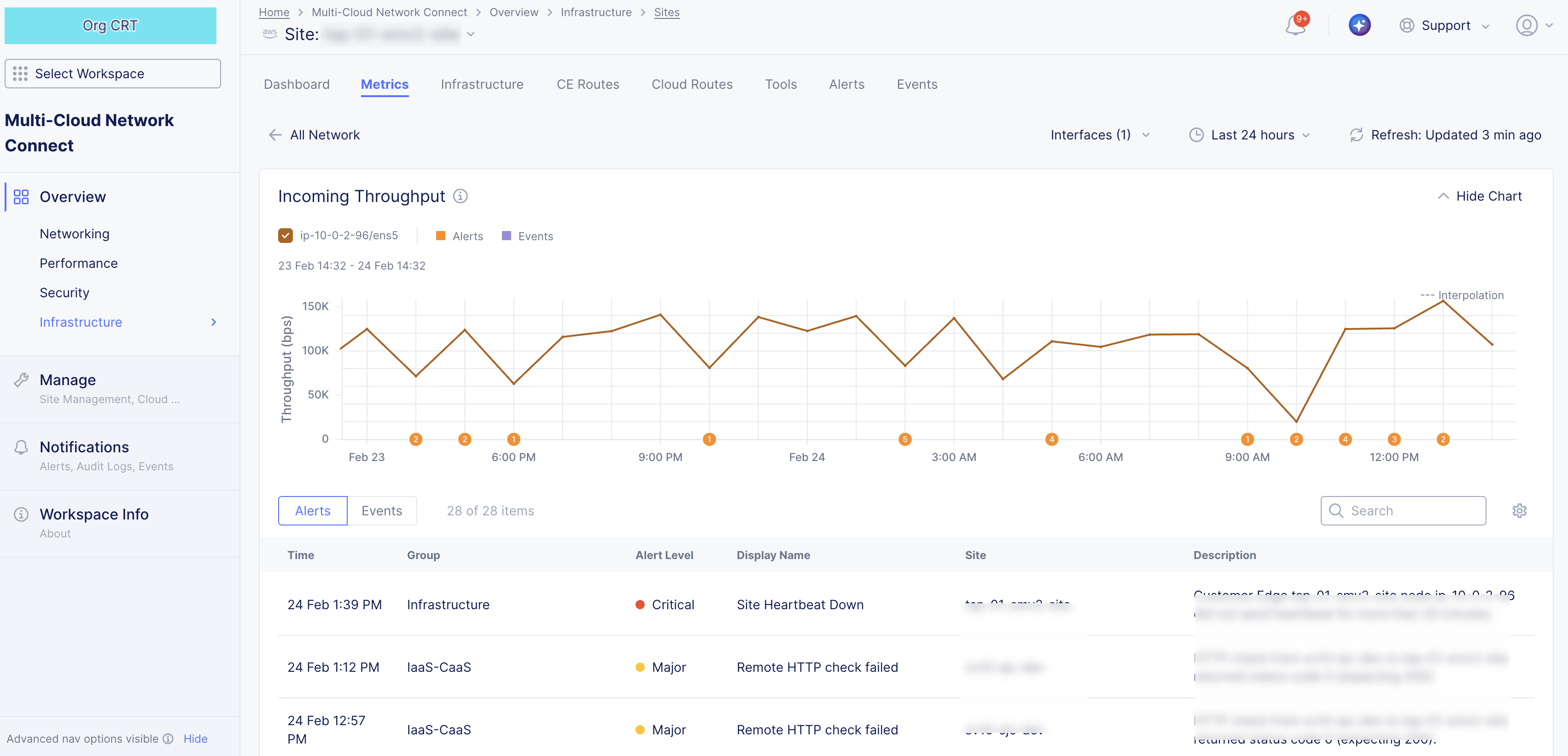
Figure: Network Interface Metric Specific
Applications
The Applications metrics present an overall view for each node when your CE Site is associated with one or more load balancers so that you examine trends focused on request and response rates and throughput and traffic patterns. These metrics help identify how traffic is distributed across nodes and whether one or more nodes stop receiving traffic. The metrics are displayed in graphs representing the trends over a period of time. You can select each metric heading for an in-depth look at that specific metric (with alerts and events).
Use the node selector menu to select multiple control nodes to view and compare metrics simultaneously for the following:
- Requests: This metric provides the rate of requests on a node. Measured in requests per second.
- Responses: This metric provides the rate of responses on a node. Measured in requests per second.
- Request Throughput: This metric provides the request throughput on a node. Measured in bits per second (bps).
- Response Throughput: This metric provides the response throughput on a node. Measured in bits per second (bps).
- New Connection Downstream Rate: This metric provides the rate of new downstream connections toward the client. Measured in packets per second (pps).
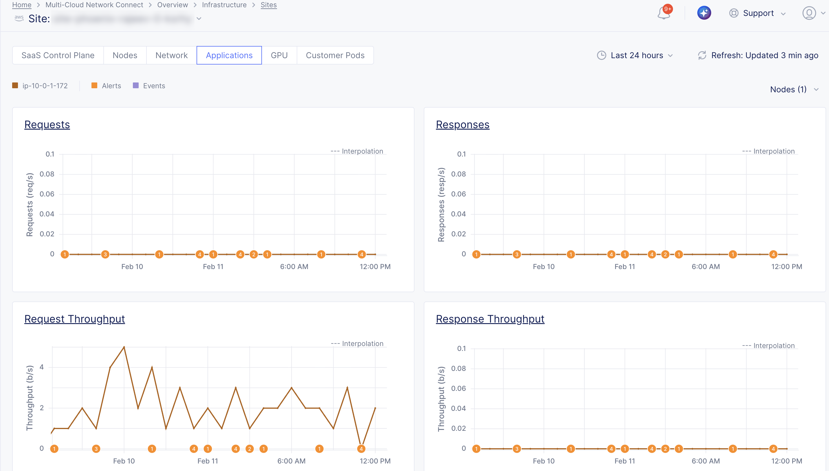
Figure: Node Application Metrics
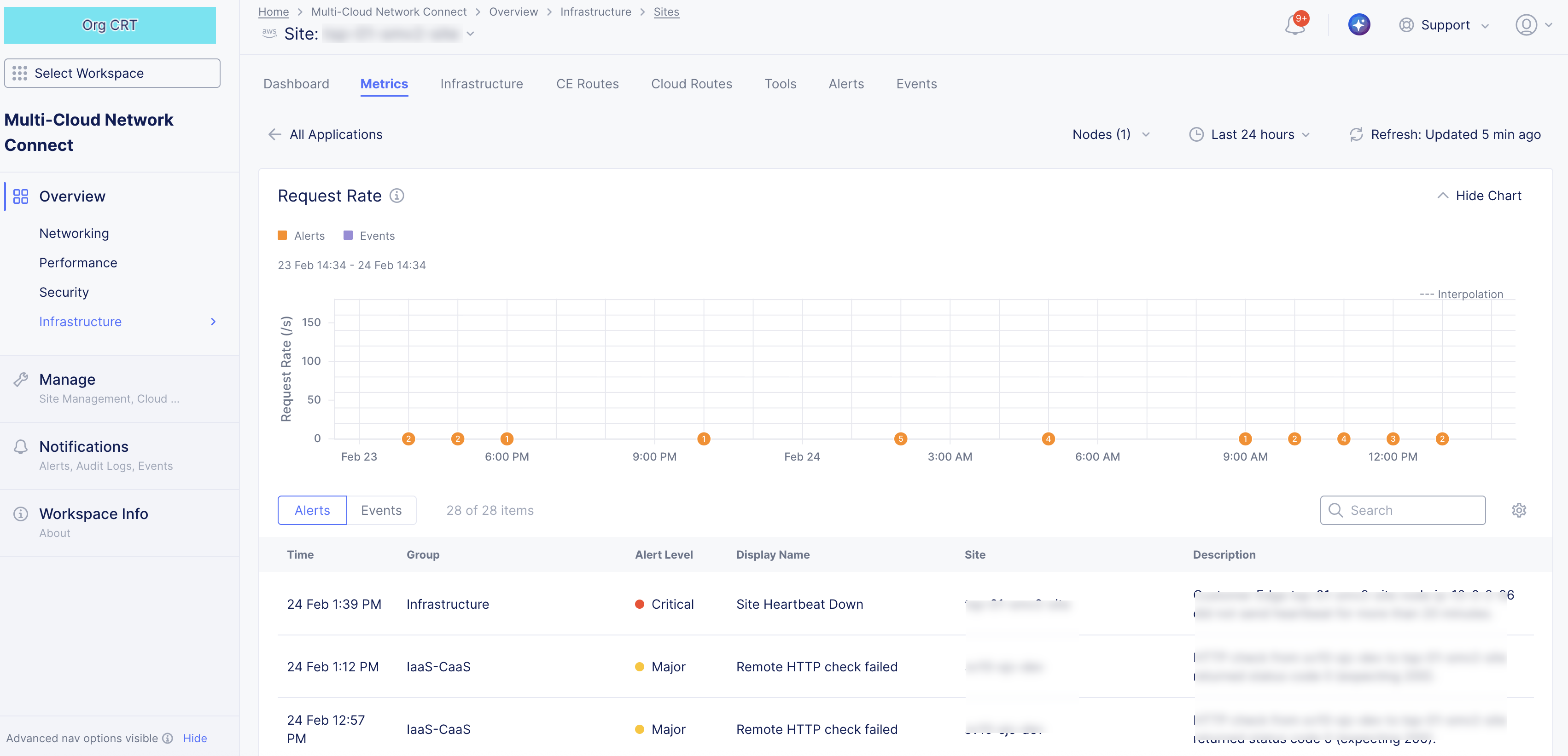
Figure: Node Application Metric Specific
GPU (App Stack CE Site only)
The GPU metrics present an overall view for each node of your App Stack CE Site so that you examine trends focused on GPU usage patterns. The metrics are displayed in graphs representing the trends over a period of time. You can select each metric heading for an in-depth look at that specific metric (with alerts and events).
Use the node selector menu to select multiple nodes to view and compare metrics simultaneously for the following:
- GPU Usage: This metric provides the percentage of GPU used on each node.
- GPU Temperature: This metric provides the GPU temperature on each node.
- GPU TX Throughput: This metric provides the GPU transmit throughput on each node.
- GPU RX Throughput: This metric provides the GPU receive throughput on each node.
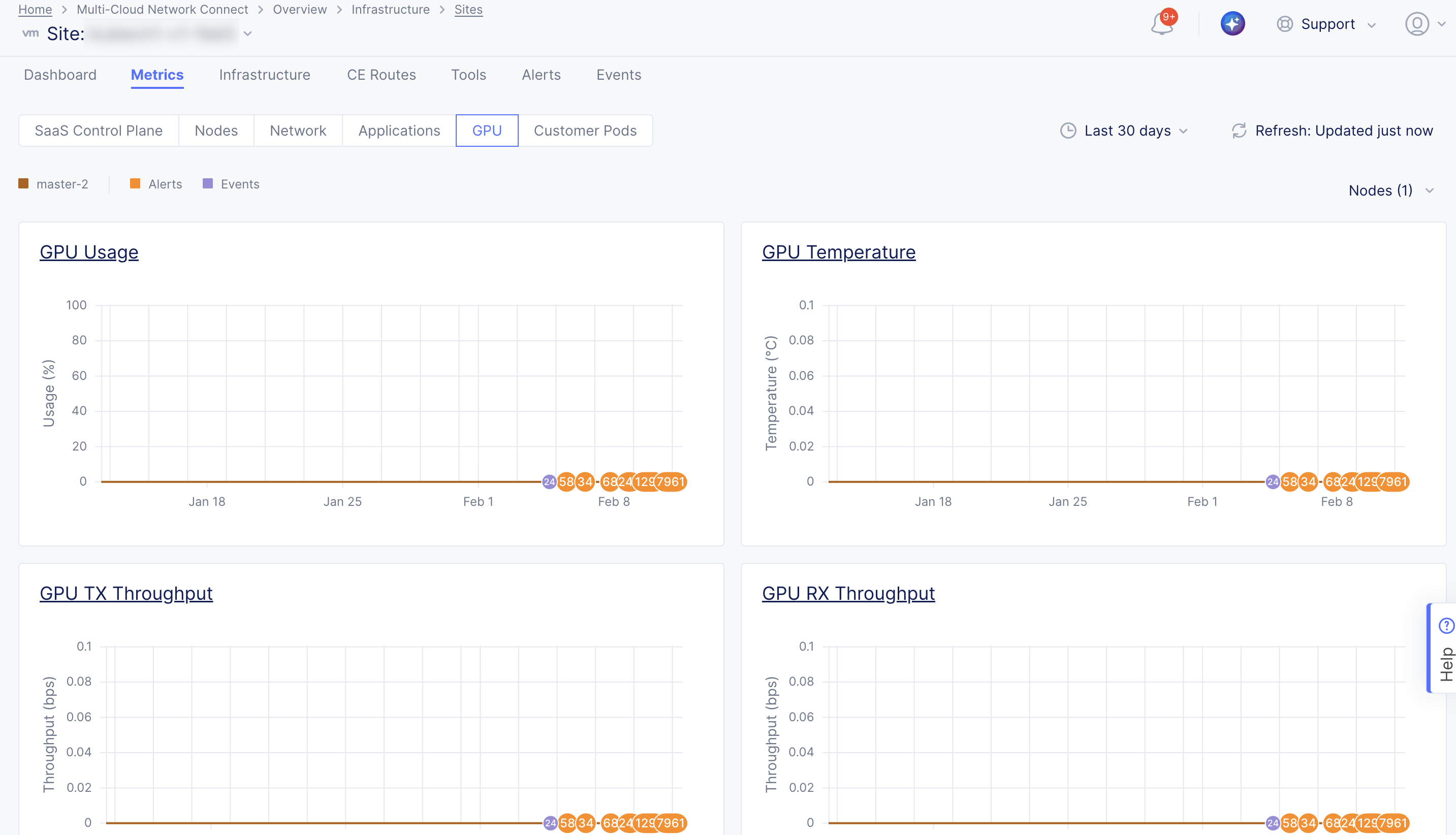
Figure: App Stack CE Node GPU Metrics
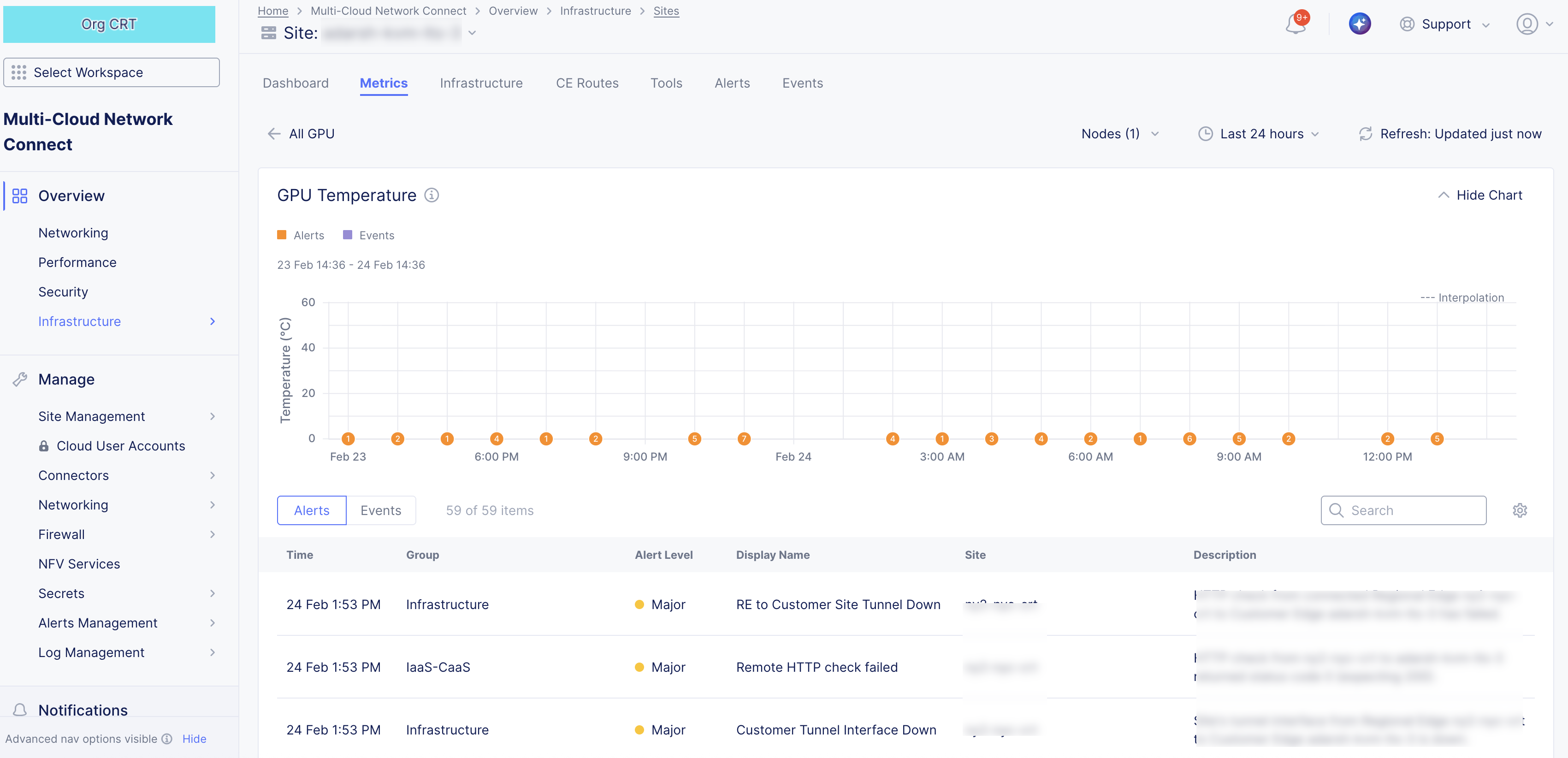
Figure: App Stack CE Node GPU Metric Specific
Customer Pods (App Stack CE Site only)
Note: Pods reference customer applications and are only available for App Stack CE sites.
The Customer Pods metrics present an overall view for each pod of your App Stack CE Site so that you examine trends focused on hardware resource usage patterns. The metrics are displayed in graphs representing the trends over a period of time. You can select each metric heading for an in-depth look at that specific metric (with alerts and events).
Use the pod selector menu to select multiple pods to view and compare metrics simultaneously for the following:
- CPU Usage: Provides the CPU usage of each pod. Measured in millicores (m).
- Memory Usage: Provides the memory usage of each pod. Measured in bytes.
- Disk Usage: Provides the disk usage of each pod. Measured in bytes.
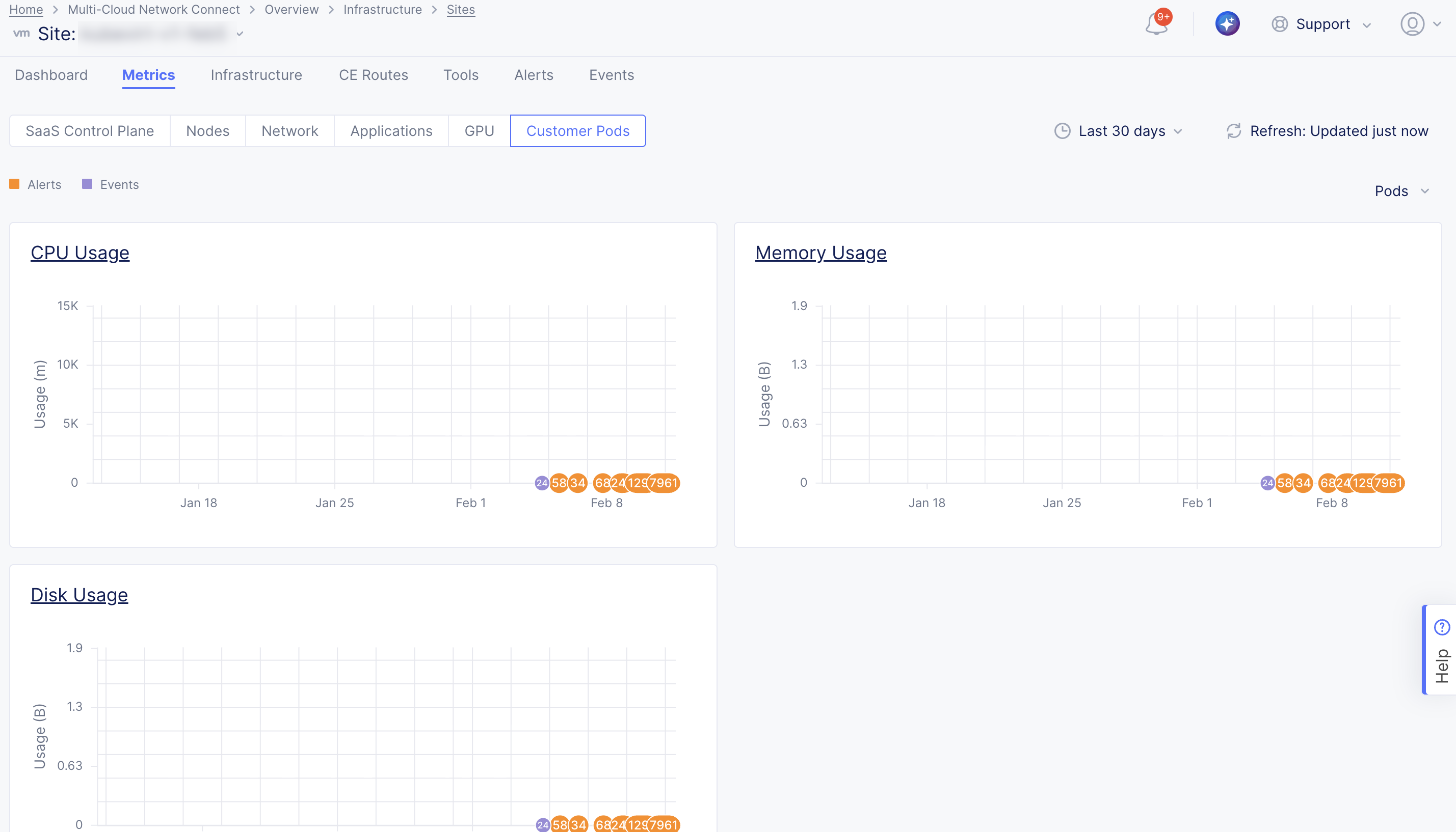
Figure: App Stack CE Pod GPU Metrics
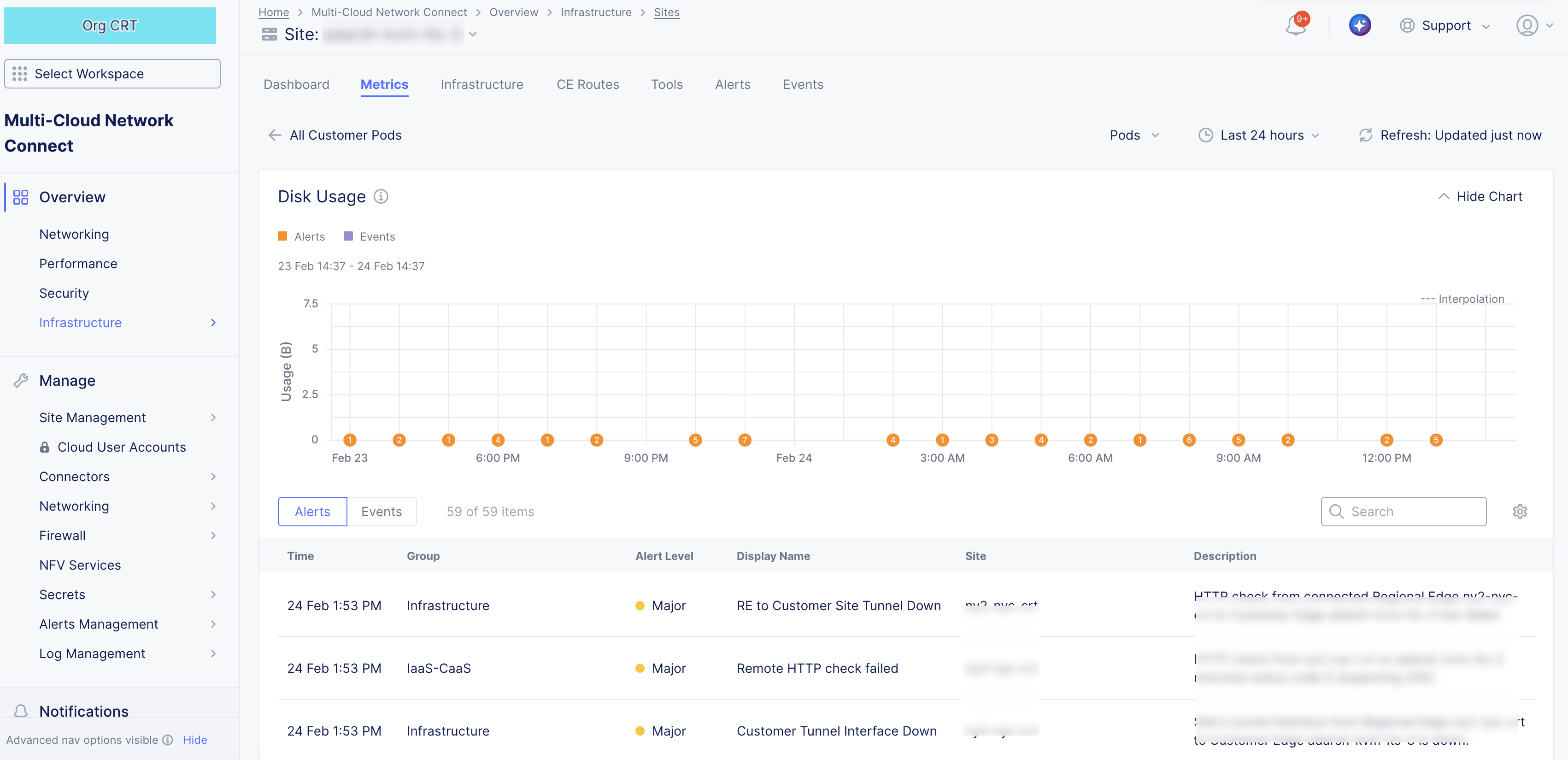
Figure: App Stack CE Pod GPU Metric Specific
Infrastructure
The Infrastructure tab provides an overview of your nodes and interfaces, and your DHCP configuration. Use the selector below the Infrastructure tab to choose what you want to examine.
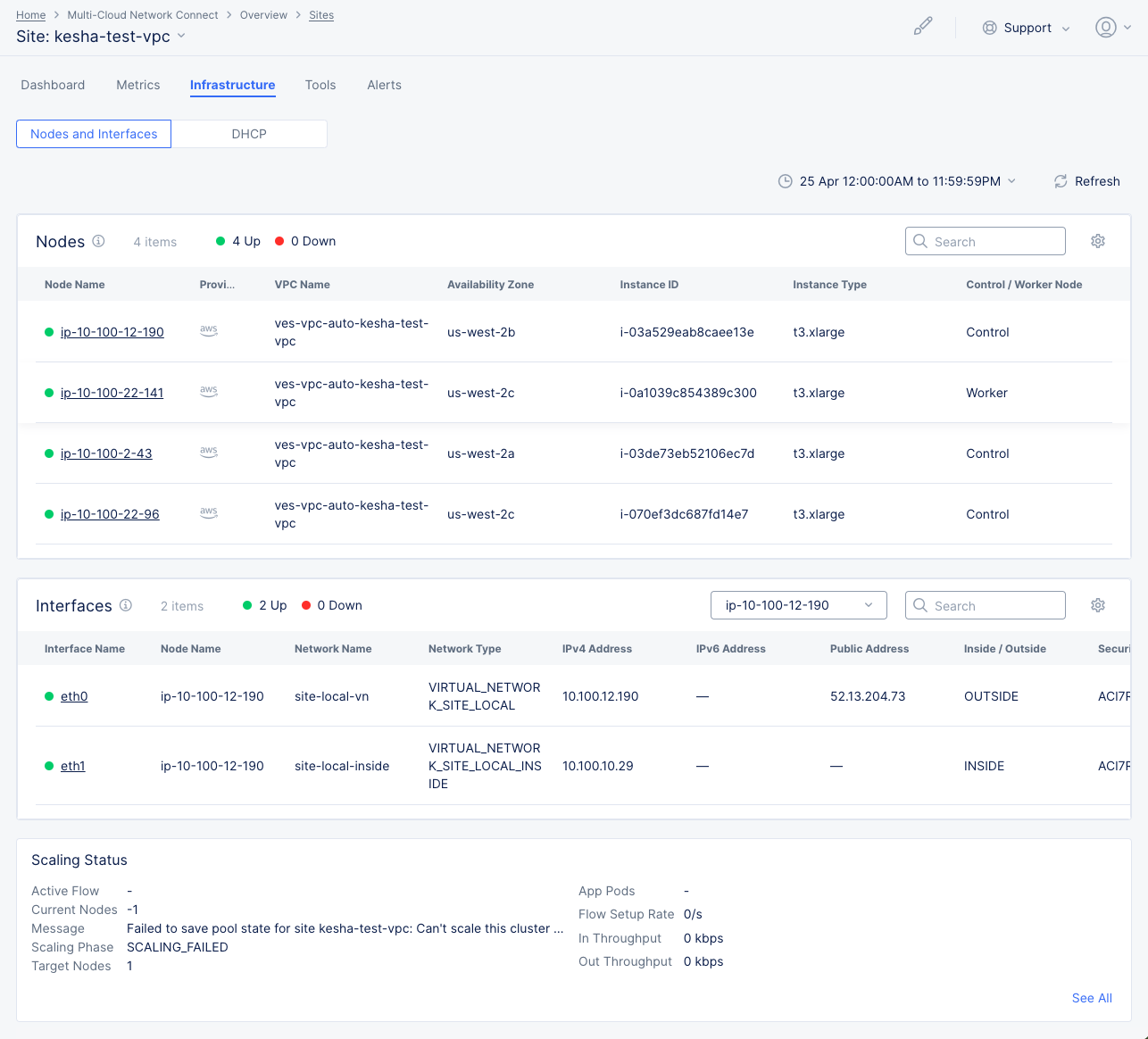
Figure: Site Infrastructure Nodes and Interfaces
Nodes and Interfaces
This page shows three sections of information: Nodes, Interfaces, and Scaling Status.
Nodes
-
The Nodes section shows a list of your current nodes (not time-frame dependent) with certain details shown for each node. Some key information shown is
- Node status (green/up versus red/down indicators),
- Control versus Worker Nodes,
- Infrastructure Provider,
- Availability Zone, and
- VPC details in which the node resides.
-
You can change the key details you see in the table by clicking on the gear icon ( ⚙ ) and selecting different fields.
-
Click on a node name in the table to see in-depth node information.
Nodes details
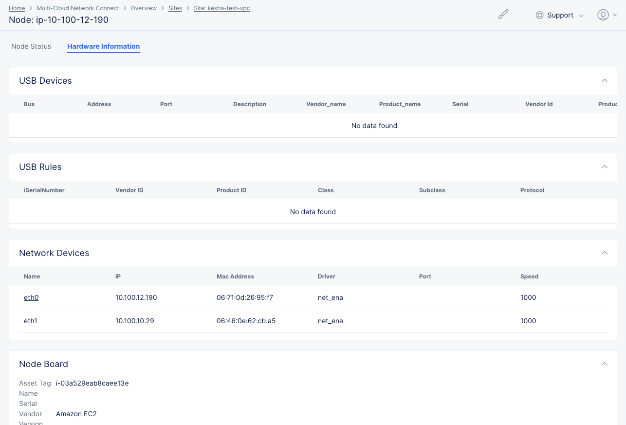
Figure: Site Infrastructure Nodes and Interfaces
Node Status
-
The Software Version section provides information about the software running on the node. Click Upgrade for either the F5 software or the operating system to upgrade the node to the latest version. Click Software Version for all the version information in JSON format.
-
The Node Status section shows details on the current state of the node. Click Nodes Status to see all the details in JSON format.
-
The GPU Status section shows details on the current state of the GPU.
-
The Interfaces section shows a list of the interfaces on this node with key details shown for each interface. You can change the key details you see in the table by clicking on the gear icon ( ⚙ ) and selecting different fields. Click on an interface name in the table to go to the Metrics tab for that interface.
Hardware Information
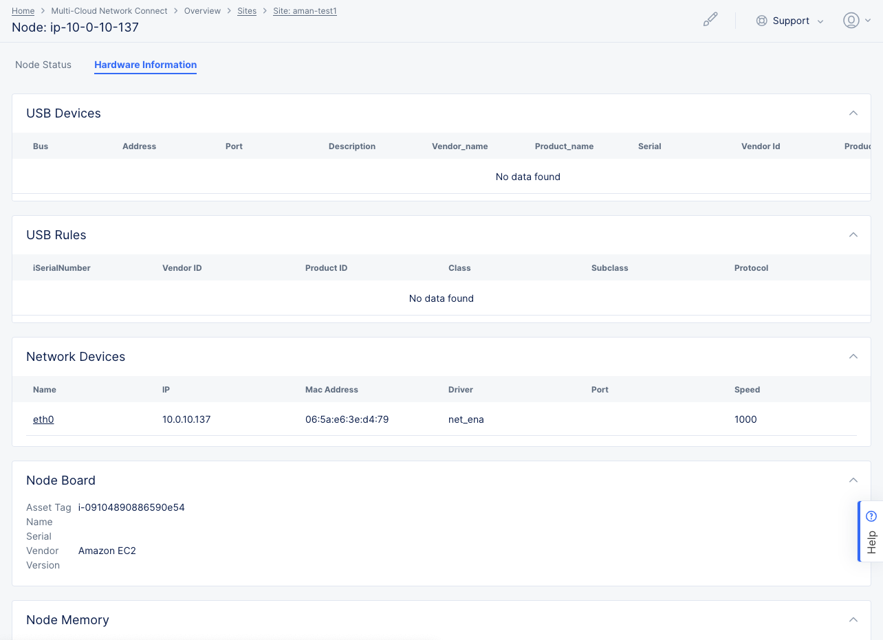
Figure: Site Infrastructure Nodes and Interfaces
The Hardware Information tab shows a number of sections providing hardware details for the node.
Interfaces
-
The Interfaces section shows a list of interfaces for a selected node (not time-frame dependent).
-
Use the node drop-down menu to select the node to view.
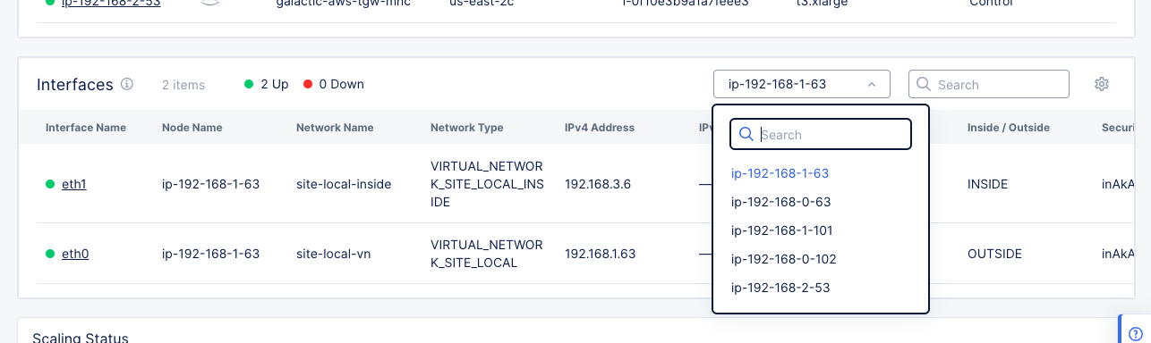
Figure: Site Infrastructure Nodes and Interfaces
-
All interfaces for the selected node are shown in the table. Some key information shown in the columns is
- Interfaces status (green/up versus red/down indicators),
- IPv4 and/or IPv6 address,
- and the public address.
-
You can change the key details you see in the table by clicking on the gear icon ( ⚙ ) and selecting different fields.
-
Select a node in the node name drop-down list at the top of the table to see interfaces for that node in the table.
-
Click on an interface name in the table to go to the Metrics tab for that interface.
Scaling Status
The Scaling Status section shows how well the node is scaling for the time frame selected at the top of the sections.
DHCP
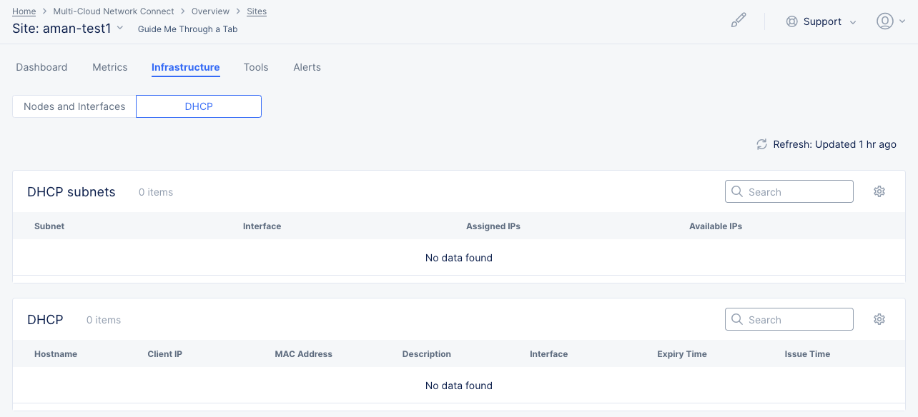
Figure: Site Infrastructure DHCP
This page shows this site's list of DHCP subnets and DHCP hosts. This section is not applicable to cloud sites (AWS, Azure, and GCP)
-
The DHCP Subnets section shows a list of your subnets with key details shown for each. You can change the key details you see in the table by clicking on the gear icon ( ⚙ ) and selecting different fields.
-
The DHCP section shows a list of your DHCP hosts with key details shown for each. You can change the key details you see in the table by clicking on the gear icon ( ⚙ ) and selecting different fields.
Cloud Connect
This content is now covered in Monitor Cloud Connects
Note: The Cloud Connect tab only appears if your selected site is an AWS TGW site. You can learn more about Cloud Connects in the Connectors document.
TGW
Note: The TGW tab only appears if your selected site is an AWS TGW site. To create a TGW Site, see Create AWS Site with TGW.
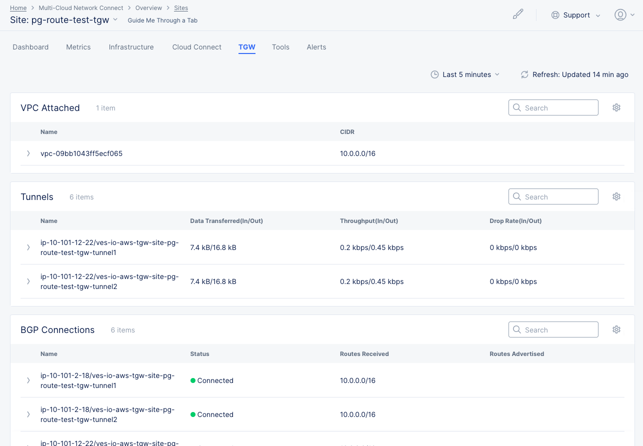
Figure: Monitor TGW Site
The TGW tab displays lists for attachments, route tables, tunnels, and BGP connections. Each list provides a name for the line item and key details. You can view each grouping of items using the Attachments and Route Tables and Tunnels and BGP Connections tabs.
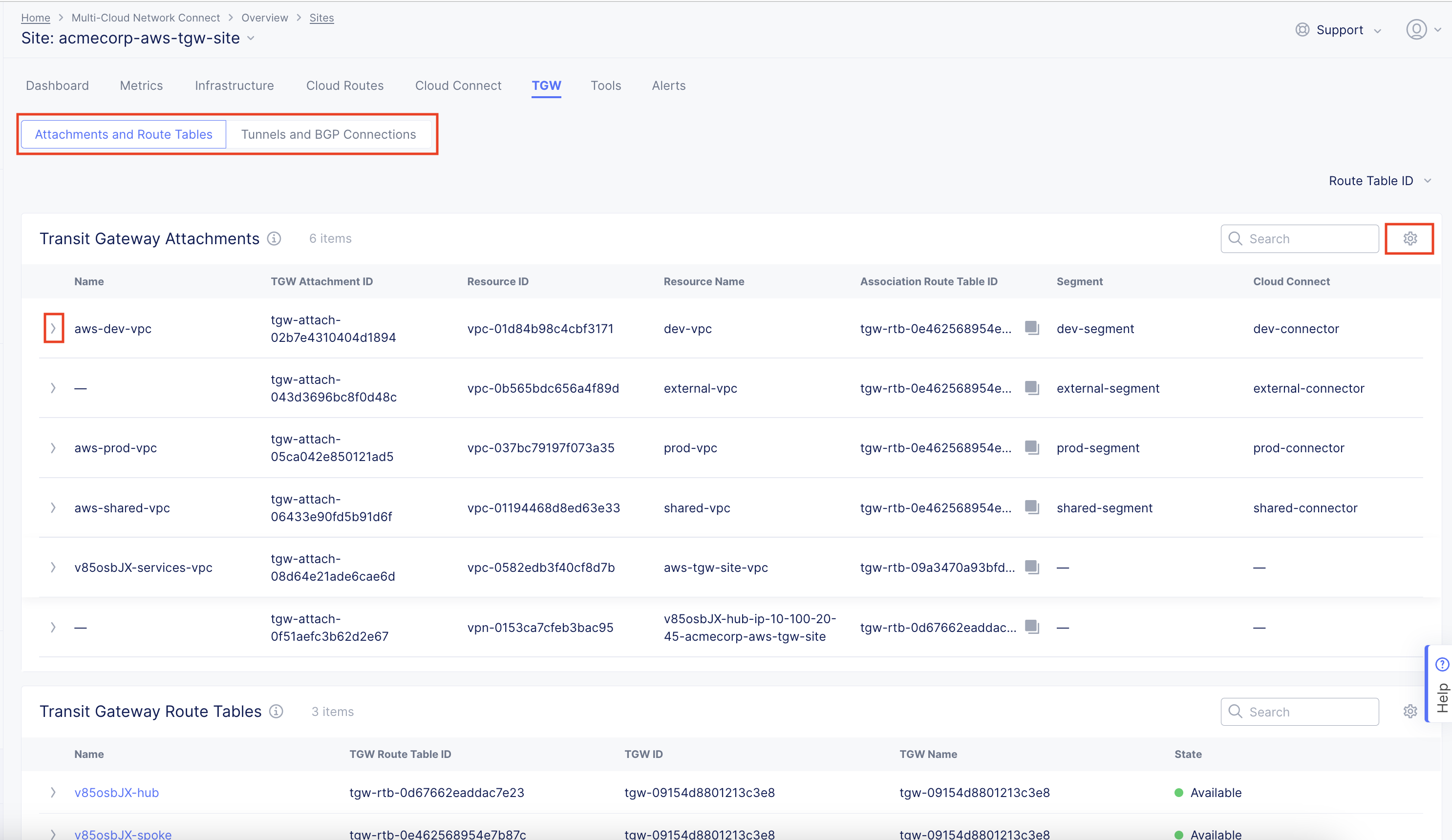
Figure: TGW Site Attachments and Routes
TGW Details
- Click the gear icon (⚙) to see different columns of data in the table.
- Click the arrow icon (>) to expand the line to show all the data for that line item in JSON format.
Hub VNet
Note: The Hub VNET tab only appears if your selected site is an Azure site. To create a Hub VNet Site, see Create Azure Site.
The Hub VNET tab displays information about the hub VNet, such as name, CIDR, and internal load balancer. Below is the general information with a list of attached VNets.
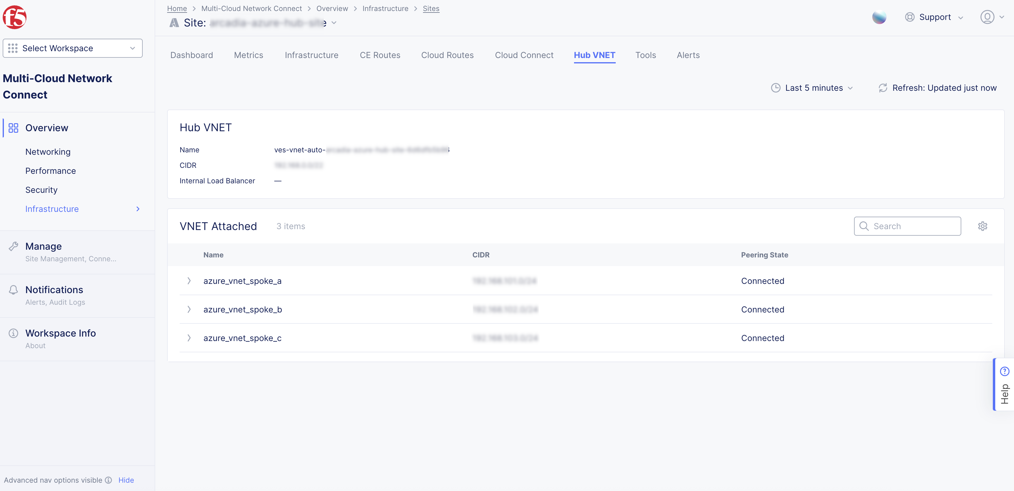
Figure: Azure CE Site VNet Tab
CE Routes
The CE Routes tab provides the enhanced Customer Edge (CE) routing table, which aims to simplify the routing table for you. You can simply look at the routing table to understand if the next hop is the Regional Edge (RE) or another CE, or you can directly distinguish a local route from a remote route. The available route types are BGP, static, local site route, and remote site route. Local route refers to routes that are directly connected, whereas the remote site routes are generally learned via other sites.
This tab is only available for CE sites running software version 9.2024.31 or greater.
The information provided in the route table includes the following:
-
Prefix: This is the route prefix, which can be IPv4 or IPv6.
-
Route Type: This can be the BGP-learned route from third-party connections, static routes that are added by the user, local routes that refer to directly connected subnets on the CE site, or remote site routes which are routes learned from other CE sites or even other REs.
-
Next Hop Name: Makes it simpler to understand the next hop of the particular route when the next hop is an element within the Distributed Cloud Services fabric (another CE site, another node, or REs).
-
Next Hop Address: The IP address of the next hop.
-
Interface: This is the outgoing interface to reach the prefix. For example, eth0 or eth1.
-
Originating Site: This is very useful when the route is going through the RE and you do not have visibility to the RE routing table. However, you can still see the originating CE site on which the route originated, to get an understanding of the end-to-end path.
In the Select Data pane, you can filter by node, network segment, and IP address format. The Node option is mandatory to be selected. However, you can select either the Site Local Network (SLI or SLO) or enter a Network Segment manually, but not both simultaneously. Optionally, you can enter a route IP address with a prefix for more granular filtering and also filter by IP address format.
This image provides an example of remote routes learned via the RE, remote routes learned via the CE, and local routes. In the example, the REMOTE SITE_ ROUTE with prefix 10.0.6.57/32 points to the ny8-nyc RE and an Originating Site of toi-aws-multinode. The REMOTE SITE_ ROUTE with prefix 172.31.0.0/16 points to the toi-tgw-multinode CE.
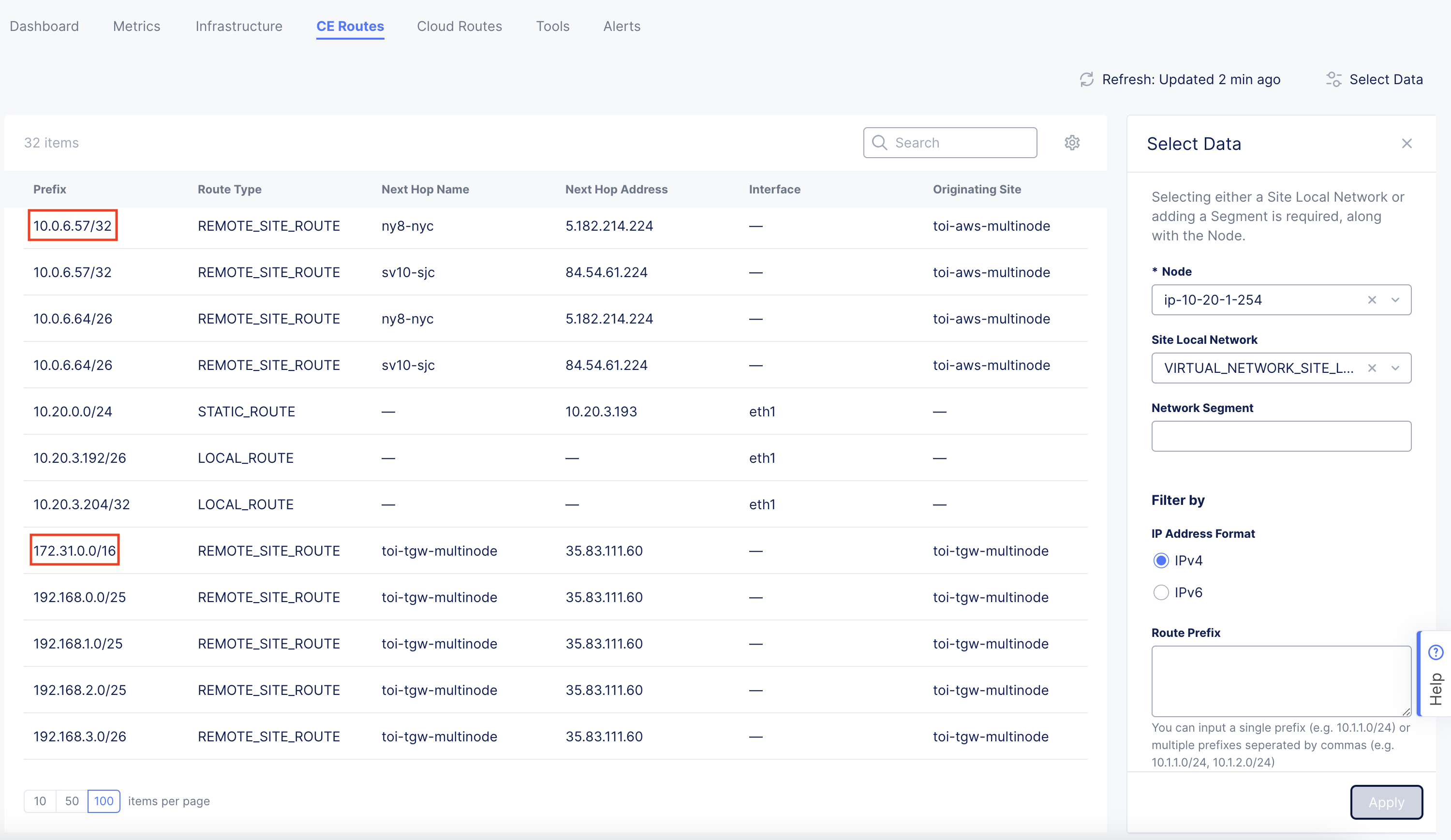
Figure: CE Routes
Cloud Routes
The Cloud Routes tab brings all the visibility to the route tables, routes, and their associated subnets within AWS, Azure and GCP. This enables customers to visualize and troubleshoot end-to-end routing without having to navigate into each cloud provider's console to view the routing information.
You can view the routing information by selecting the VPC/VNet and then filtering the information by Route Table or Subnet. The options marked with an asterisk symbol (*****) are required to filter the information. Route Table and Subnet are optional filtering mechanisms. See the AWS VPC Site example below for more information.
For hub sites (AWS TGW and Azure Hub VNet that connect to multiple spokes), you can see Spoke/Service VPCs.
Note: The Cloud Routes tab only appears if you deployed your AWS, Azure, or GCP site using the automated method from Distributed Cloud Console (where your credentials object was selected). The tab does not appear for non-cloud sites or cloud sites deployed using manual mode (as in ClickOps or non-F5 Terraform providers).
AWS VPC Site Cloud Routes
The default view provides the route table name in a condensed manner. You can see the route table name and its corresponding ID. Simply select the arrow to expand the view for more specific interface, subnet, and route information.
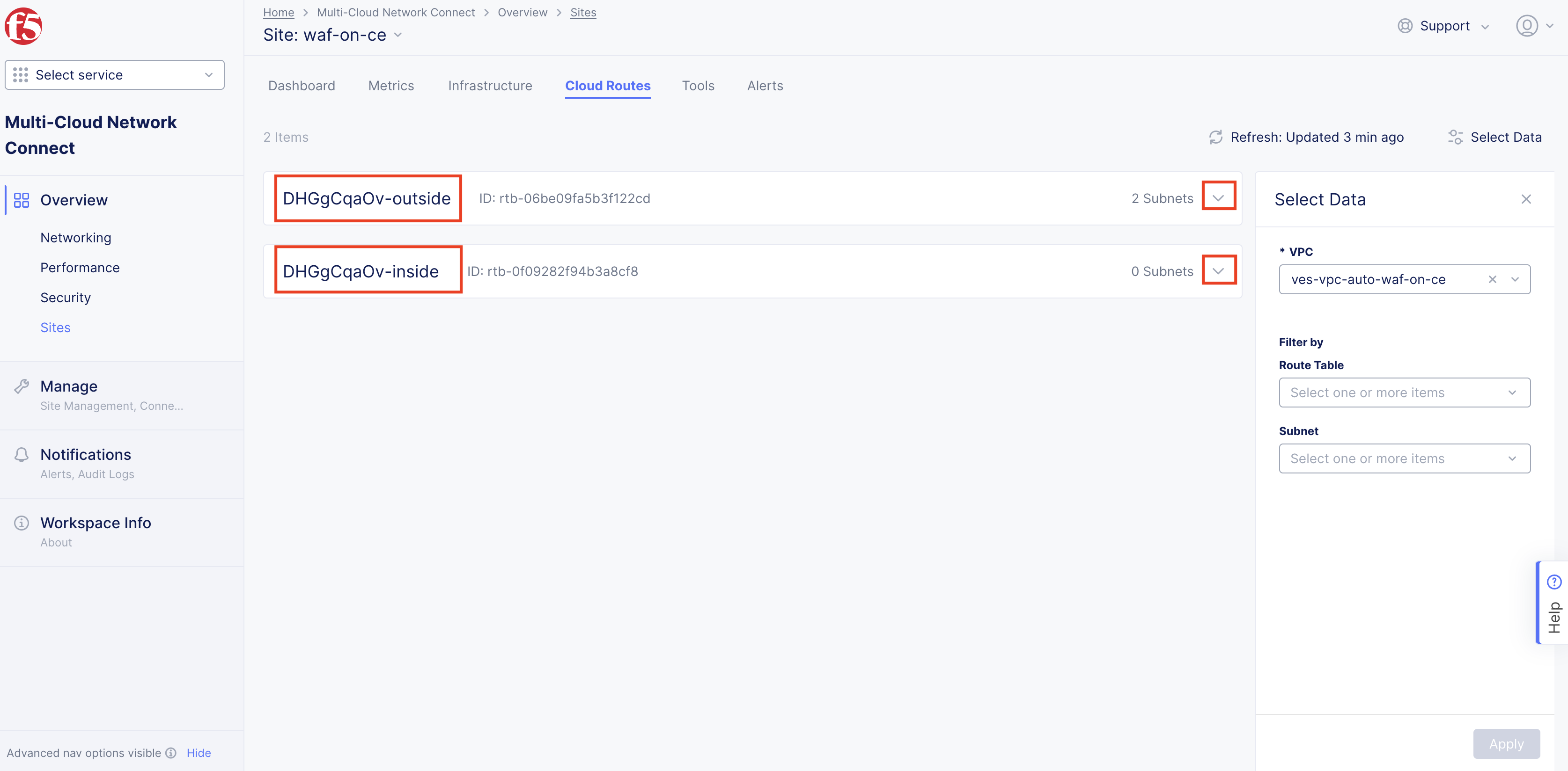
Figure: Cloud Routes for AWS Site
Under the Subnets heading, you can see the subnet name, corresponding subnet ID, and CIDR information. Use the arrow to expand the view.
Under the Routes heading, you can see the destination address and target, route status, and whether that specific route is propagated. Use the arrow to expand the view.
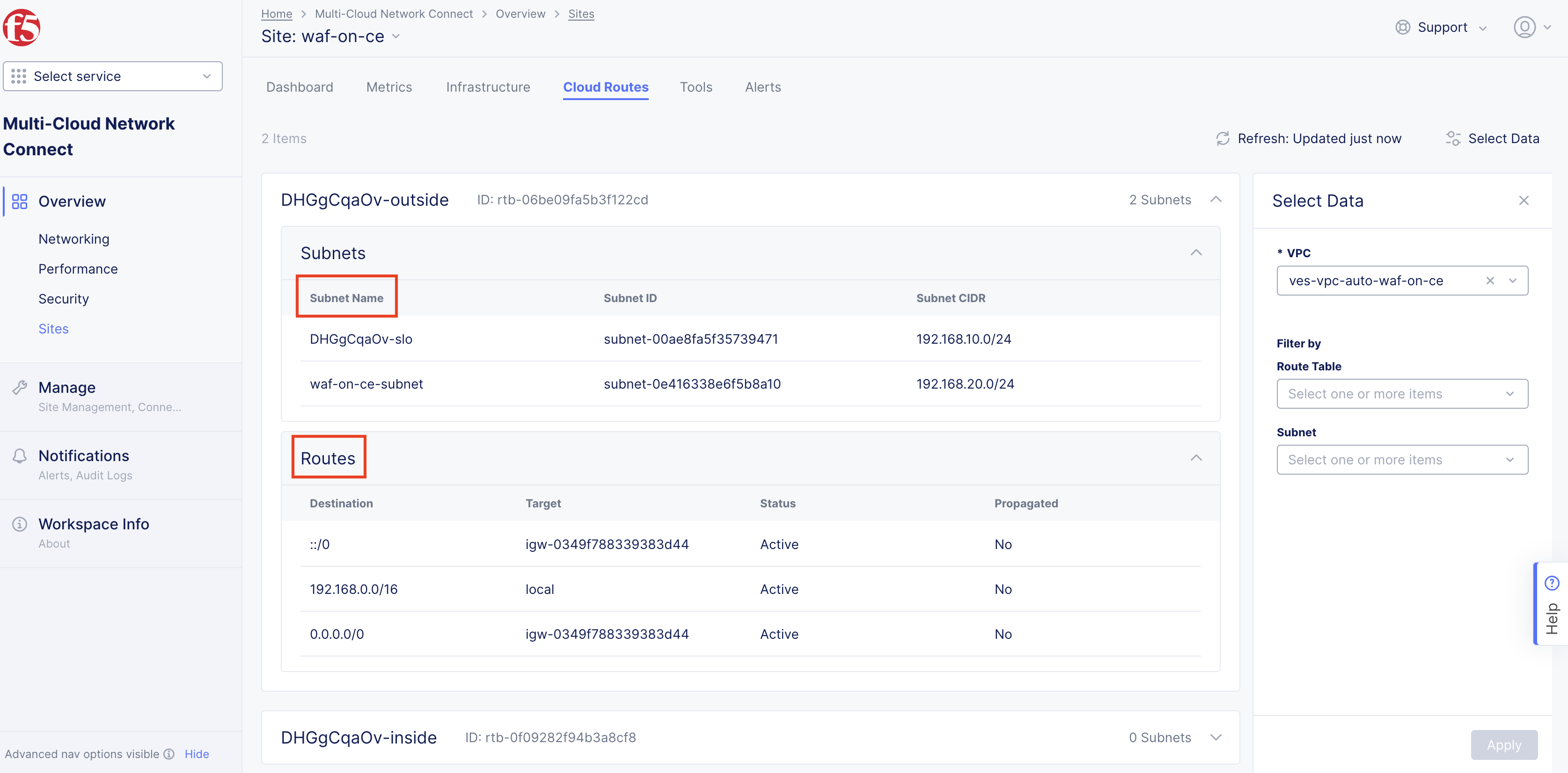
Figure: Cloud Routes for AWS Site - Expanded
The Select Data filter enables you to select your VPC, subnet, and route. Select the desired route table and subnet, and then click Apply. You can choose to filter by route table, subnet, or both at the same time.
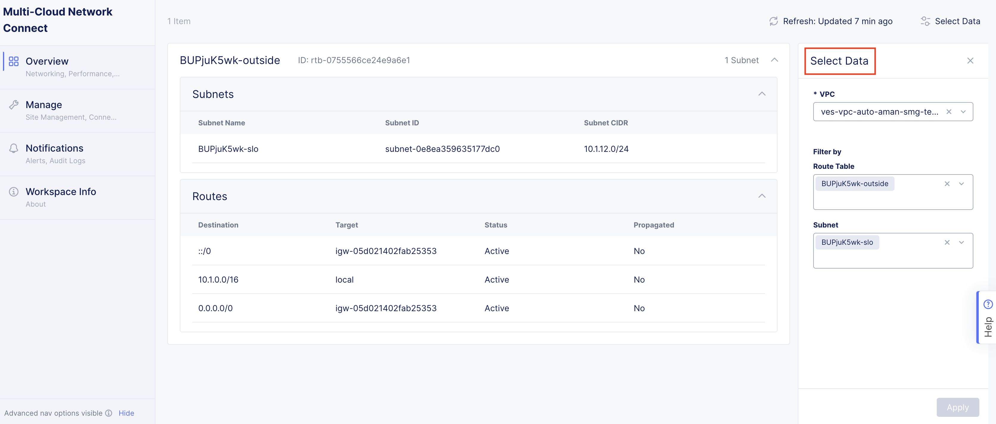
Figure: Cloud Routes for AWS Site - Filtered
AWS TGW Site Cloud Routes
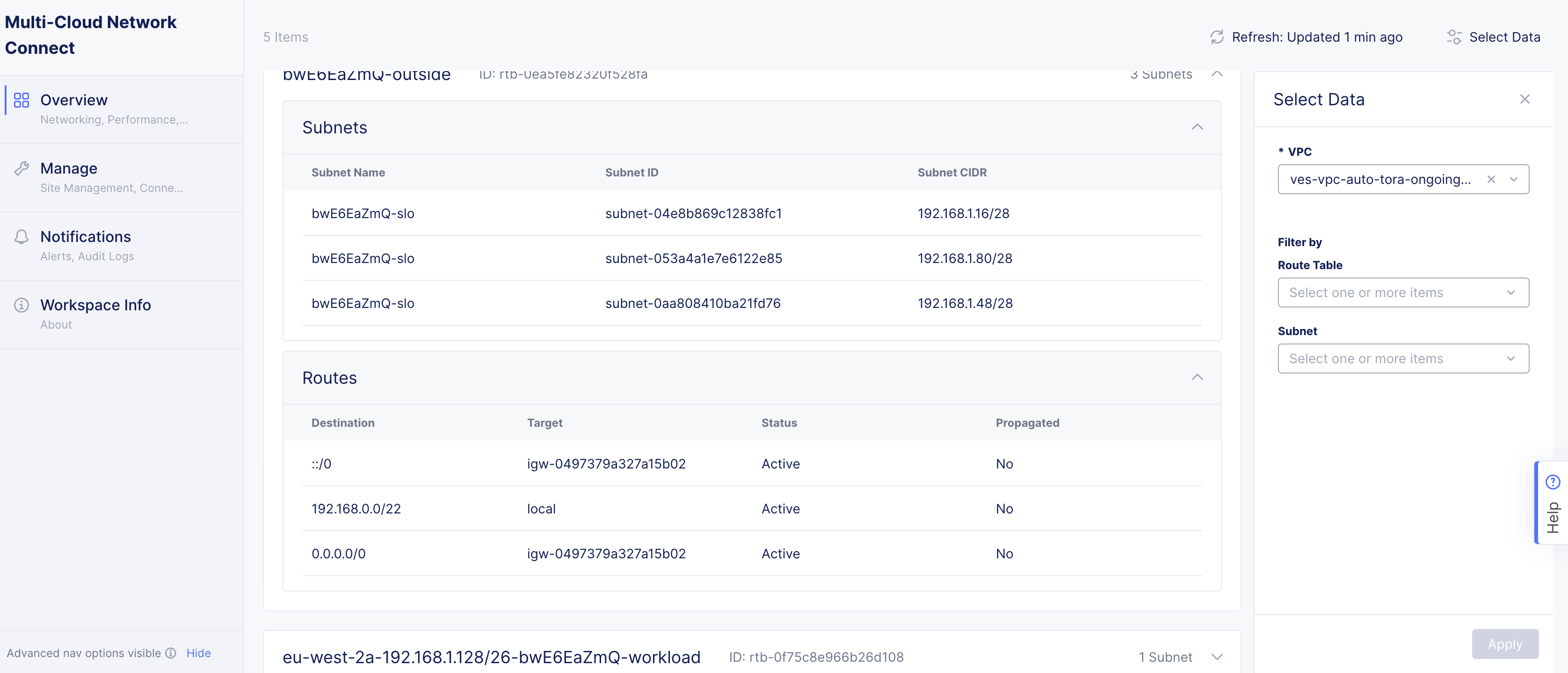
Figure: Cloud Routes for AWS Site - Expanded
Azure Site Cloud Routes
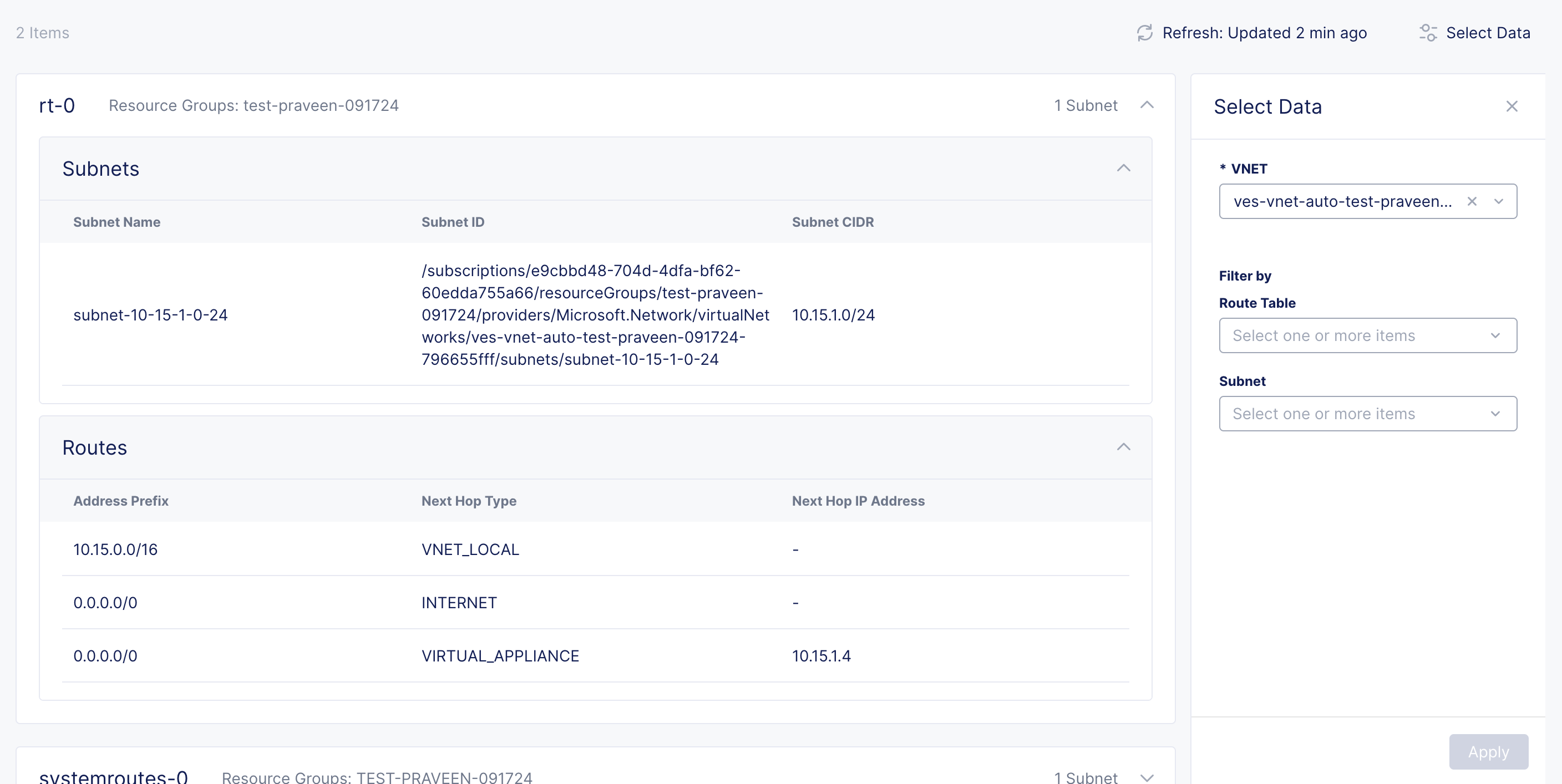
Figure: Cloud Routes for Azure Site - Expanded
GCP Site Cloud Routes
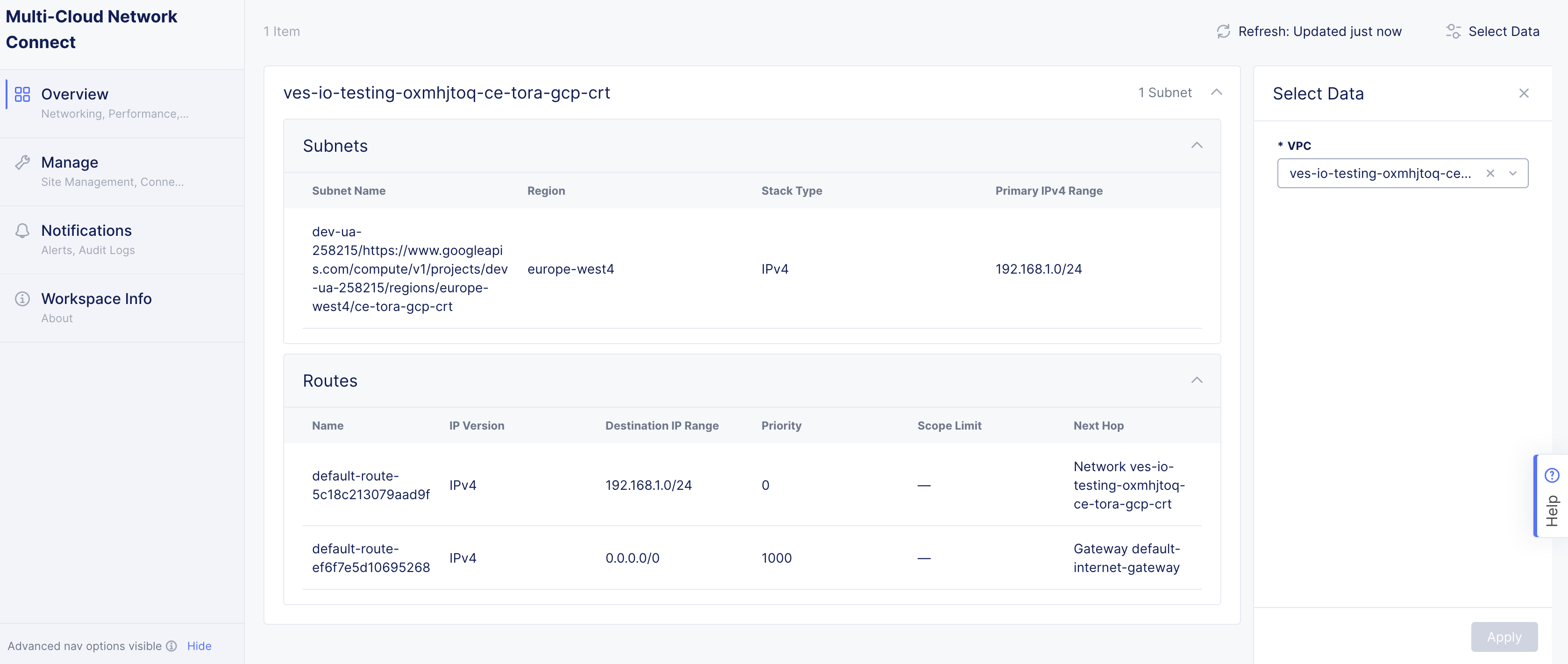
Figure: Cloud Routes for GCP Site - Expanded
Tools
The Tools tab provides a set of tools for more site exploration and device interaction.
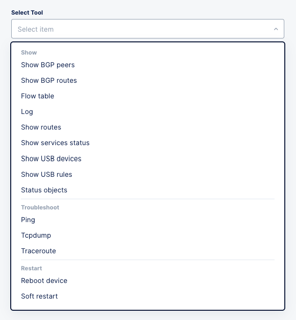
Figure: Site Tool Selection
- Select a tool from the drop-down list.
- In some cases, you may need to enter required or optional fields.
- Press the blue button at the bottom to run the tool.
Below are some examples.
Ping
- Select Ping from the tools drop-down list.
- Fill in the required field, Destination.
- Enter values for any desired optional fields.
- Click Call ping to run the tool. The results show at the bottom of the page.
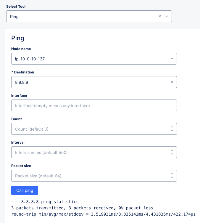
Figure: Ping Tool
Traceroute
- Select Traceroute from the tools drop-down list.
- Fill in the two required fields, Node name and Destination.
- Enter values for any desired optional fields.
- Click Call traceroute to run the tool. The results show at the bottom of the page.
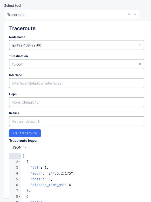
Figure: Traceroute Tool
Flow Table
- Select Flow table from the tools drop-down list to get more information on how data is flowing through your site. Each row of the table provides information such as source and destination IPs, ports, TCP flags, packet counts, and more.
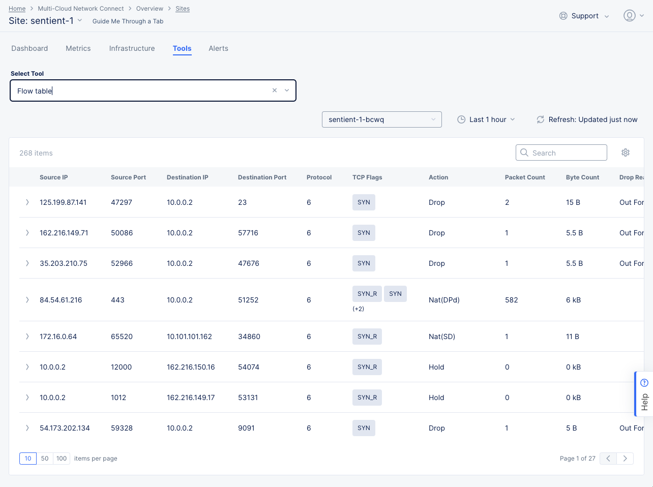
Figure: Flow Table Tool
-
Use the Select Node drop-down list to choose which node to see in the table.
-
Use the time frame drop-down menu to select the time frame covered for the data in the table. Use the Refresh button next to it to get the latest data.
-
Enter a search string in the Search field to see only line items containing that string.
-
Click the gear icon (⚙) to see different columns of data in the table.
-
Click the arrow (>) at the left of a row to see additional information for any flow between IP addresses in JSON or YAML format.
Alerts
The active alerts are displayed by default. Use the toggle selection to load all alerts. You can also set a time interval in the active alerts view to display alerts over a specific period of time. Click > for any alert entry to display details in JSON format.
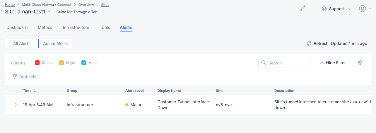
Figure: Site Alerts
Concepts
API References
On this page:
- Objective
- Prerequisites
- Tenant-Level Customer Edge Site Monitoring
- Sites Dashboard
- Dashboard Time Frame
- Health and Alerts
- Top Providers/Regions
- Sites
- Site Map
- RE (PoP) Connectivity
- Find a Site
- Explore a Site
- Dashboard
- Dashboard Quick Links
- Health and Status Sections
- Connection Throughput Chart
- Connectivity Table
- Metrics
- Infrastructure
- Nodes
- Node Status
- Hardware Information
- Interfaces
- Scaling Status
- Cloud Connect
- TGW
- Hub VNet
- CE Routes
- Cloud Routes
- Tools
- Alerts
- Concepts
- API References