Monitor Site Networking
Objective
This document provides instructions on how to monitor your site networking in F5® Distributed Cloud Console.
Using the instructions provided in this document, you can look at an overview of the networking for your tenant and get details for any or all the tunnels and interfaces used.
Prerequisites
-
An F5 Distributed Cloud Account. If you do not have an account, see Getting Started with Console.
-
One or more cloud or edge locations with a Site. Install the node or cluster image in your cloud or edge location. See Create a Site for more information.
Activities of Monitoring
In the Multi-Cloud Network Connect workspace, select Networking in the Overview section of the left navigation pane. This page defaults to the Dashboard, which provides an overview of key networking metrics. Alternatively, you can view the different mesh groups by using the Topology tab, or you can monitor your CloudLinks using the CloudLinks tab. You can also select Overview > Performance to see how your network is performing. The performance page also defaults to a dashboard with tabs to go more in depth with links, Interfaces, Flow Analysis, and Metrics.
Networking
The Networking page has three tabs:
-
The dashboard tab shows an aggregation of all networking activity related to all your apps running on all your sites. Various information is presented in different sections within the dashboard.
-
The Topology tab shows a list of all mesh configurations and/or DC cluster groups.
-
The CloudLinks tab presents a high-level status of all of your CloudLinks.
Networking Dashboard
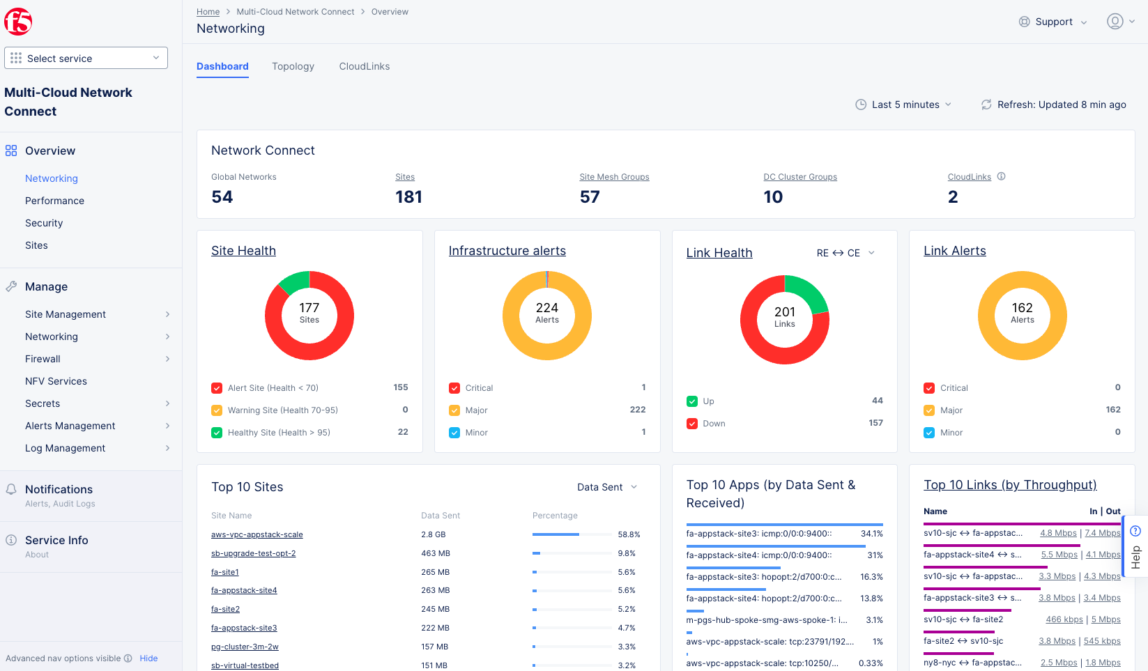
Figure: Site Networking Dashboard
Dashboard Time Frame
The dashboard contents are dependent on the settings in the right-justified, top bar of options.
- The time drop-down allows you to specify the time frame for the data shown, including both quick-pick options like Last 24 hours and the ability to specify a custom time frame. Custom time frames are limited to 24 hours within the last 30 days.
- Click the Refresh button next to the time drop-downs to update the contents of the dashboard manually.
Network Connect
The Network Connect section gives a quick, numerical overview of your networking configuration. Except for Global Networks, each category title is also a link to more detailed information on that category. For instance, the Site Mesh Group header is a link to the Topology tab with the Site Mesh Group filter enabled.
Health and Alerts
Each health or alerts section shows a donut chart for a specific metric. The number at the center of the donut indicates the total count for the time frame. The donut chart will show different colors representing subcategories of the metric, which correspond to the colored check-boxes below the donut. Click a checkbox to add or remove that subcategory from the donut. You can hover over a donut to see the actual quantities of the subcategories.
-
Site Health shows how many sites are in which health state. Click Site Health to see more site-specific information on the sites page.
-
Infrastructure Alerts shows how many and the which kind of infrastructure alerts you've had during the selected time frame. Click Infrastructure Alerts to see the alerts you've received.
-
Link Health shows how many links are up versus down. Use the RE↔CE drop-down menu to see links between regional edges and customer edges or links between only customer edges. Click Link Health to see a list of your links with more information for each.
-
Link Alerts shows how many and the which kind of link alerts you've had during the selected time frame. Click Link Alerts to see the alerts you've received.
Top 10s
The next row of data sections shows your most active sites, apps, and links.
- Top 10 Sites ranks your sites by data sent or received. Use the Data Sent/Received drop-down menu to choose between sent and received. Lick a site name to see the site dashboard for that site.
- Top 10 Apps ranks your apps by total traffic.
- Top 10 Links ranks your links by throughput. Click a value in the In | Out column to explore the performance of that link.
Topology
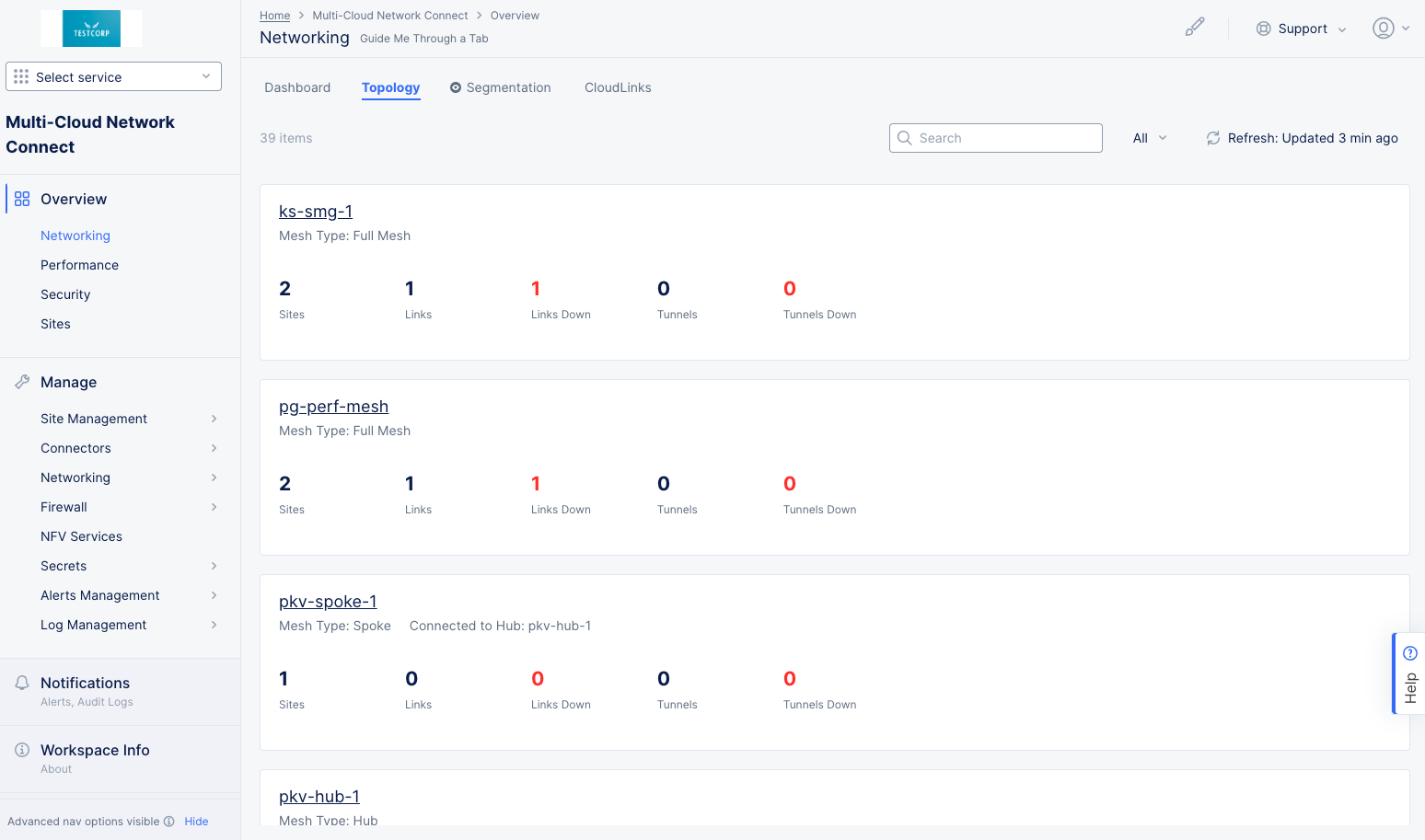
Figure: Site Networking Topology
The networking topology page shows a list of all mesh configurations and/or DC cluster groups.
-
Use the Search field and/or the All drop-down menu to narrow down the list.
-
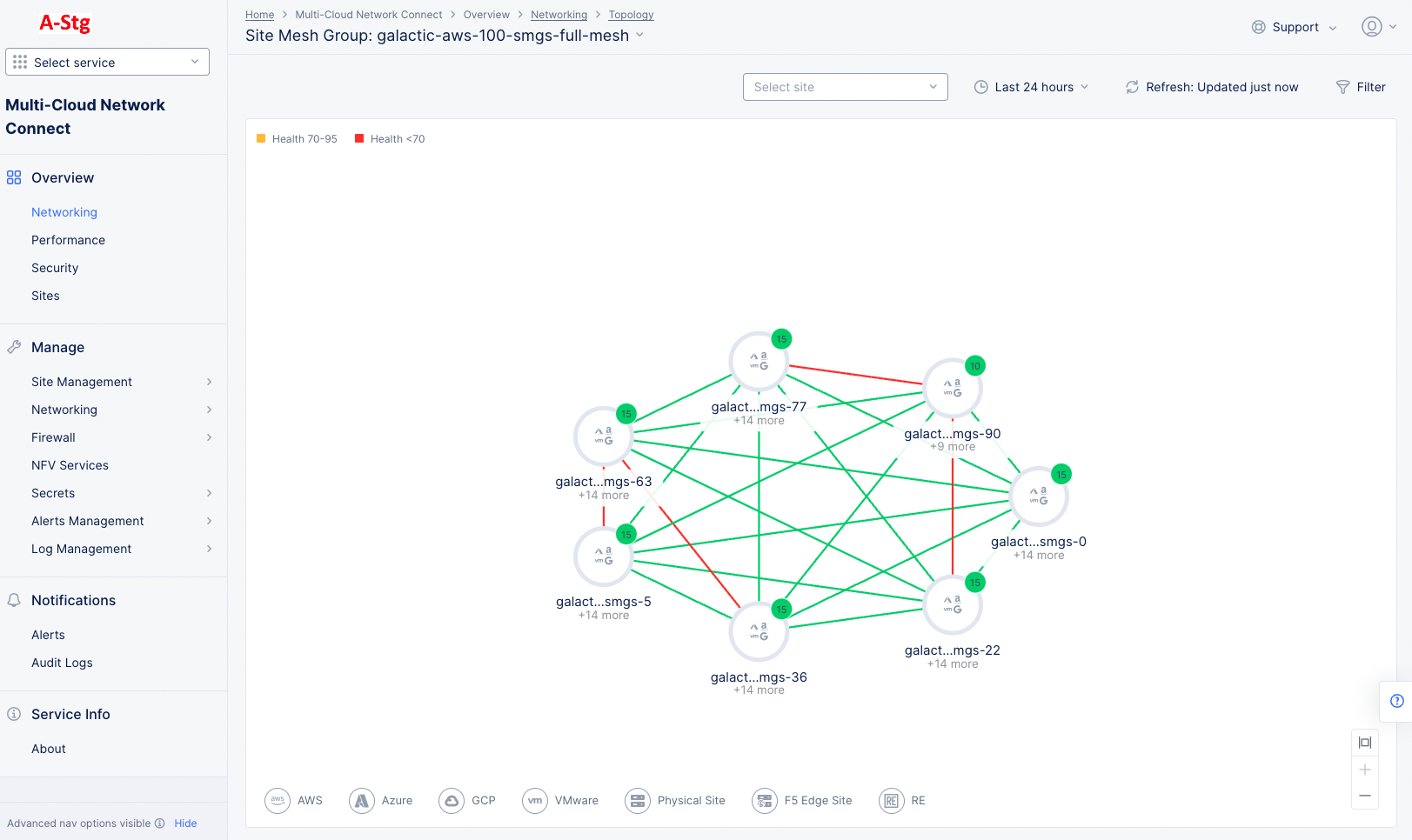
Click on a mesh or DC cluster group name to see the site mesh group or DC cluster group for that name. The example below shows a mesh, but a DC cluster group looks and acts similarly.

Figure: Site Networking Mesh Group
- This graph shows a number of nodes with lines between them. The nodes represent sites or groups of sites, and the lines represent the links between the nodes. Nodes with a number in a green circle represent that number of sites. Nodes with three vertical dots in a gray circle represent a regional edge (RE). Thick lines represent a group of links, and thin lines represent a single link. Red lines indicate that one or more of the links is down.
- Hover over a node in the graph to see summary information for that node.
- Click on a numbered node to see the internal connectivity for that node.
- Click on a RE node to go to the RE (PoP) Connectivity tab on the Sites page showing that RE and its connections.
- Hover over a thick line between nodes to see the number of links represented by that line.
- Hover over a thin line to see the REs it connects and the status of the connection.
- Click on a line between nodes to see the link group and each links status.
-
The graph below shows a DC Cluster group, similar to the mesh group above. In general, the actions discussed above work for this graph as well. Click on a node to see the right sliding pane showing detail and health for the site, as shown below.

Figure: Site Networking DC Cluster Group
- The Detail tab displays details for the site: current status, labels, connectivity, version information, and throughput.
- The Health tab displays more health-related details.
- The Infra-Details tab displays details for the site's environment.

Segmentation
The networking segmentation page shows how you have segmented your networking. The page has a selector allowing you to view the segmentation information in either a graph or a table.
Use the time dropdown above the graph/table for specifying a time interval for the data shown. The default for this is five minutes and the maximum allowed interval is 24 hours. You can customize the interval by selecting the Custom option and choosing date/time range (up to 24 hours).
Graph View
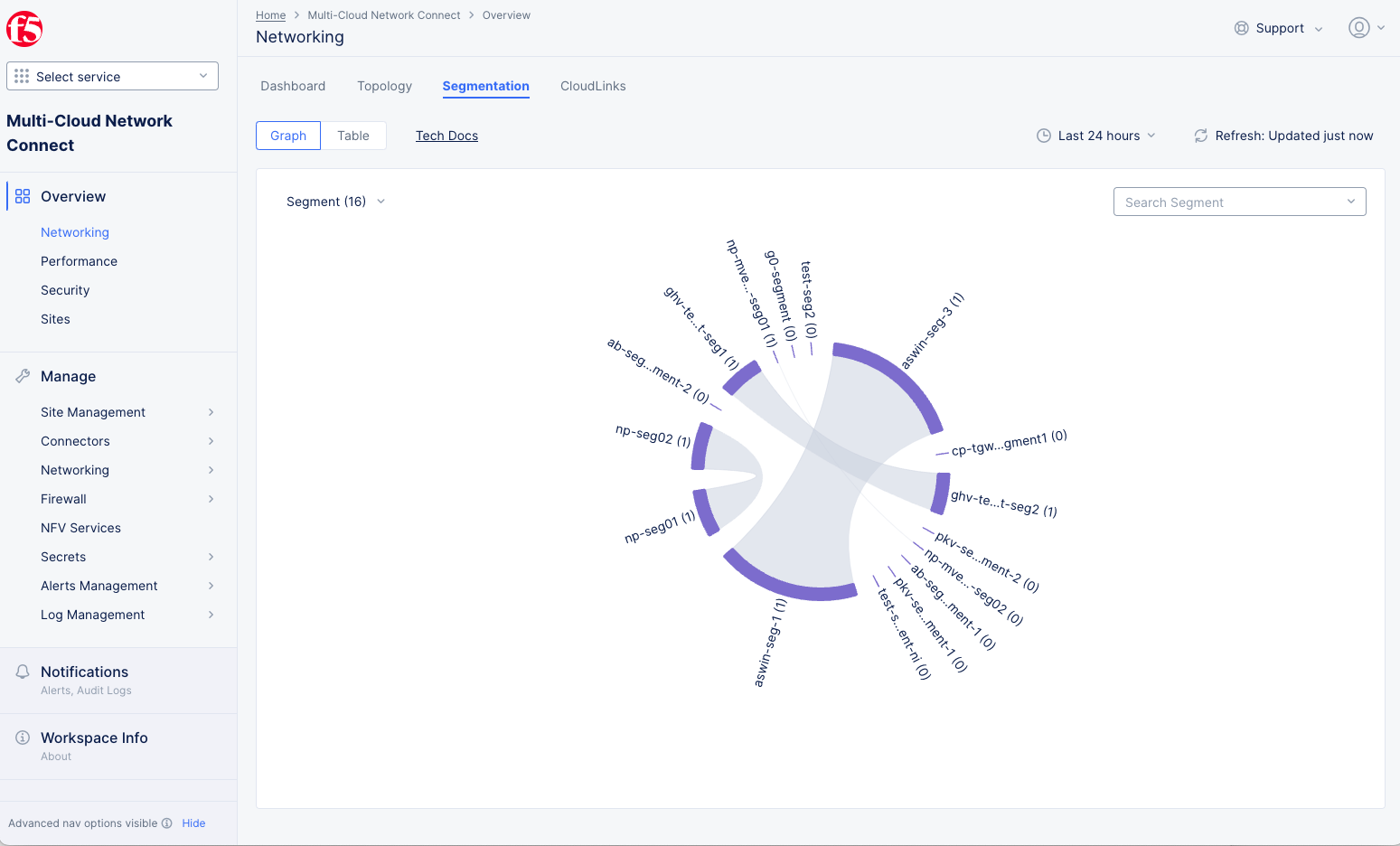
Figure: Site Networking Segmentation Graph
The Graph view displays the segmentation information in a chord diagram. Below are some characteristics of the chord diagram.
- The segments are arranged radially around the circle.
- The number next to the segment name shows the number of connections to the segment.
- Each segment has its volume represented as a purple arc on the circle. A larger arc indicates greater segment volume.
- A gray inner arc shows a connection between two segments with traffic flowing between them.
- The diagram can display a maximum of 20 segments.
How to interact with the graph.
-
Use the filter drop-down menu (in the upper left corner of the graph) to choose which segments are displayed in the chord diagram.
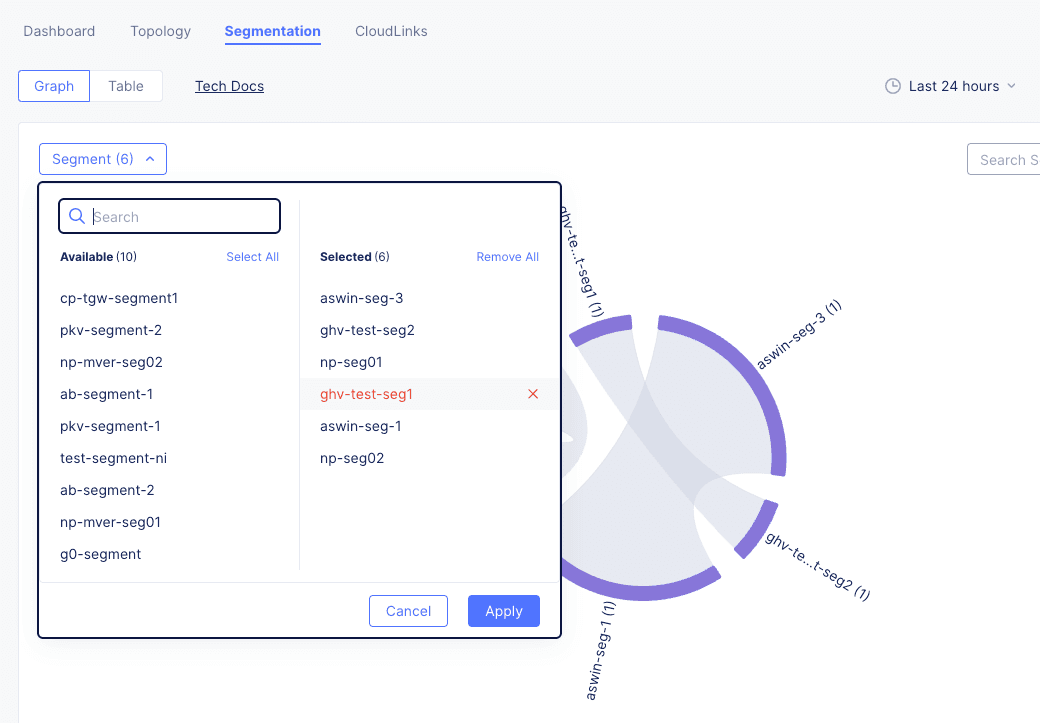
Figure: Site Networking Segmentation Graph Filter
-
Click a segment name in the Available column to add it to the diagram.
- Click a segment in the Selected column to remove it from the diagram.
- Use the Search field to filter the Available column.
- Click Select All to add all available segments to the diagram.
- Click Remove All to remove all segments from the diagram.
- Click Apply to see your changes in the diagram
-
Hover over the segment name or purple arc highlight the connected segments and to see a popup containing the full segment name, the total data transferred, and the number of attachments.
-
Click a segment name or purple arc to see more details on the segment's attachments and connected segments. See Segment Details
-
Hover over an inner gray arc to highlight that connection and the associated segments in the diagram.
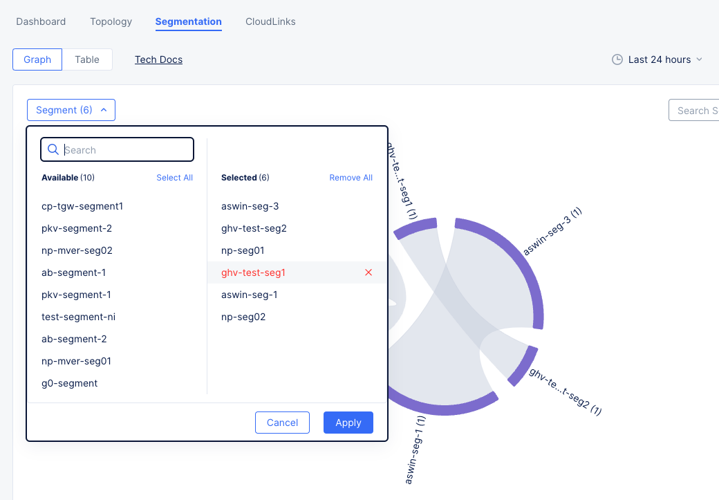
Table View
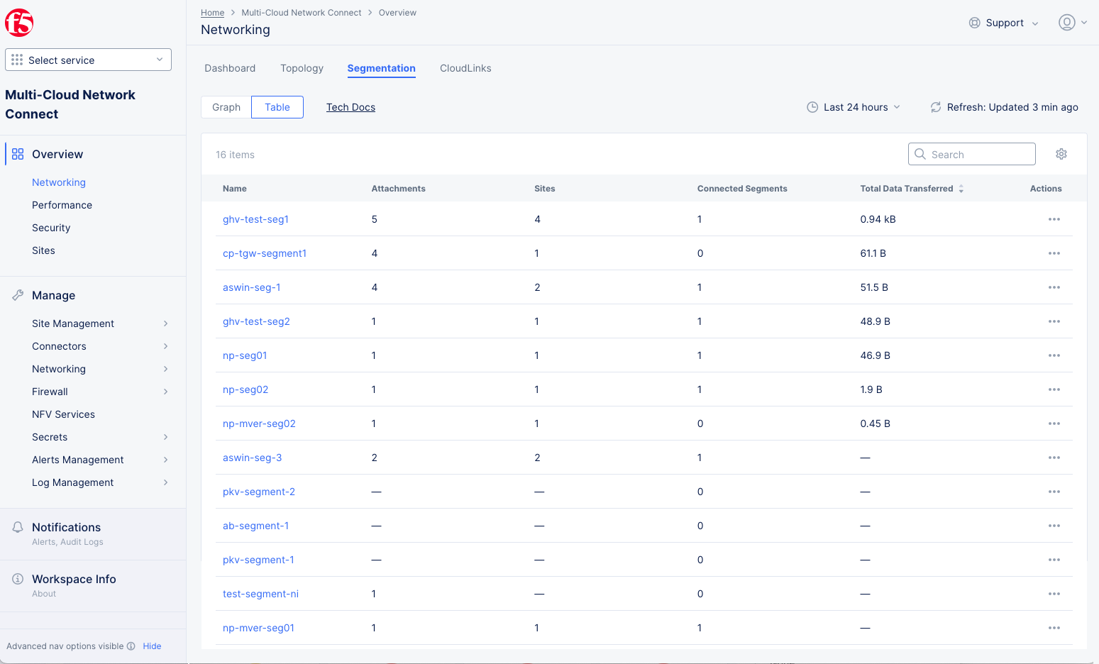
Figure: Site Networking Segmentation Table
The Table view shows a list of all your segments with key details shown for each segment.
How to interact with the table.
-
You can change the key details you see in the table by clicking on the gear icon ( ⚙ ) and selecting different fields.
-
Click on a segment name in the table to see more details on the segment's attachments and connected segments. See below.
Segment Details
- Click a segment name or purple arc in either the graph view or the segment view to see more details on the segment's attachments and connected segments.
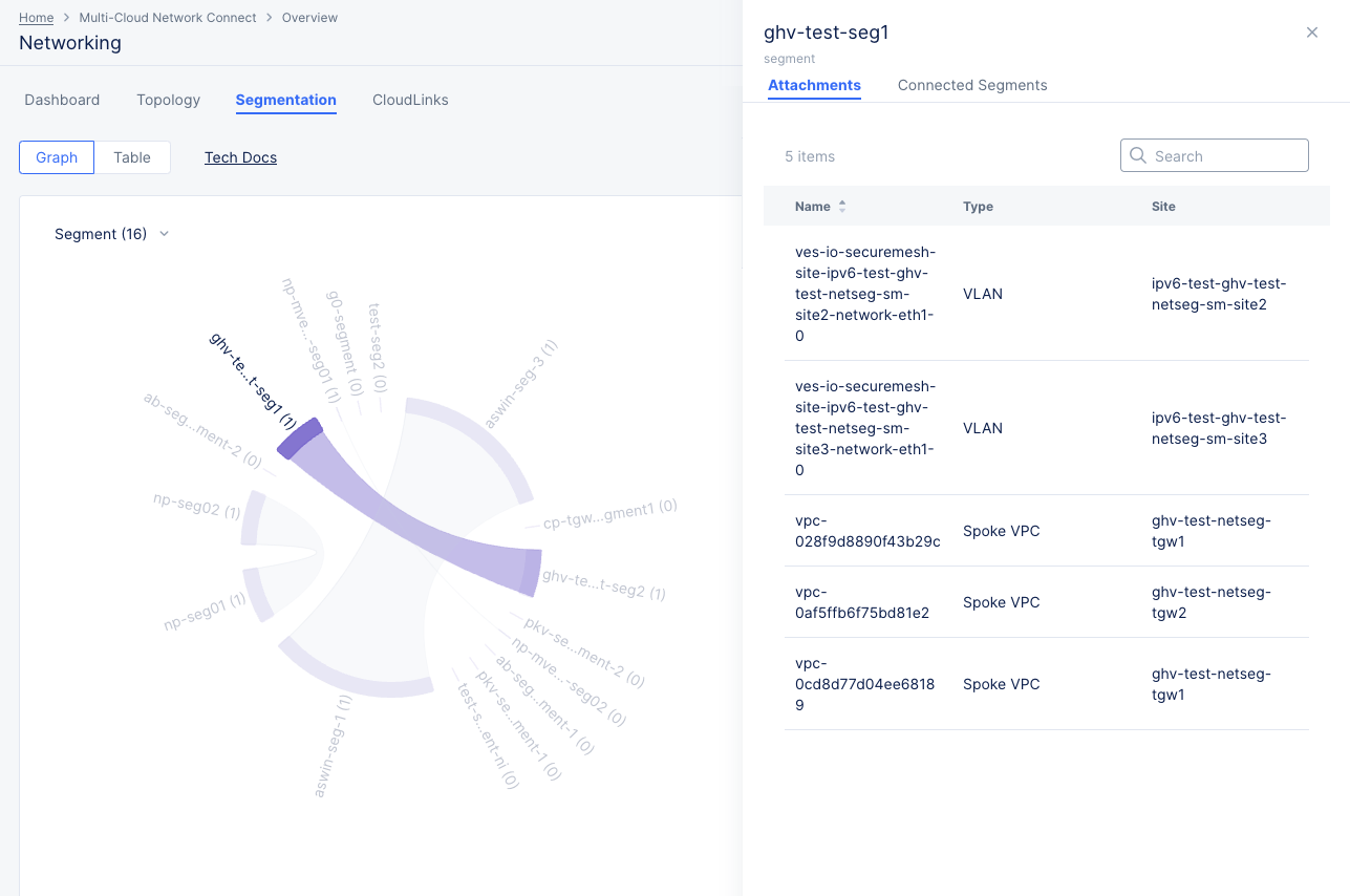
Figure: Site Networking Segmentation Graph Attachment Details
- The Attachment tab shows a table of attachments. Each row represents an attachment showing the name, type, and site.
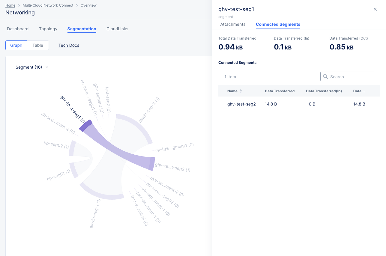
Figure: Site Networking Segmentation Graph Connected Segment Details
-
The Connected Segments tab shows the total data transfer information at the top and a table of connected segments below. Each row represents an attachment showing the name data transfer information for diagram's selected time frame.
-
While looking at the segment details, you can click a different segment name in the graph view or table view to change which segment details are shown.
CloudLinks
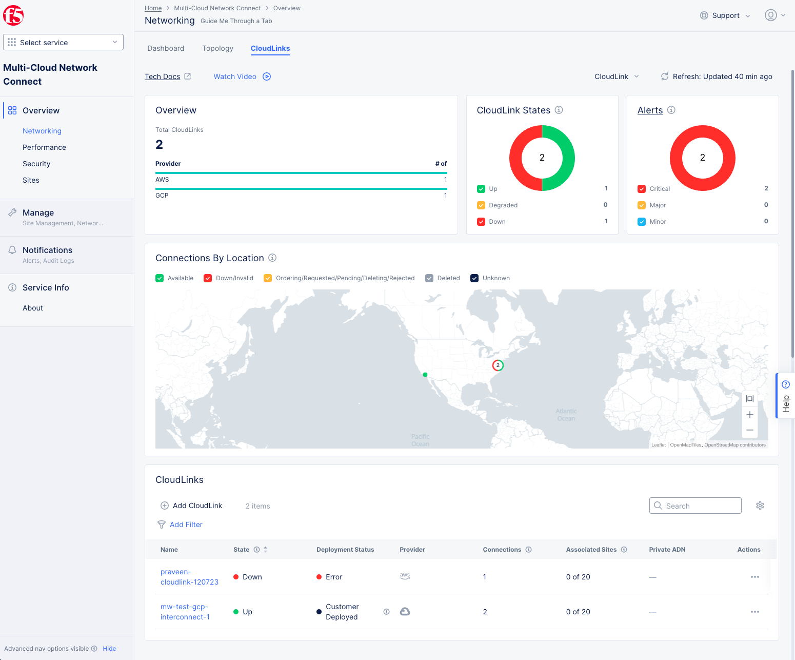
Figure: CloudLink Dashboard
The networking CloudLinks page provides a high-level view of the state of your CloudLinks. In the upper right, use the CloudLink drop-down menu to only show CloudLinks you specify, and use the Refresh button to get the latest status information.
-
The Overview section shows how many CloudLinks you have for each provider.
-
The CloudLink States provides a health overview of your CloudLinks. The donut colors indicate the percentage of CloudLinks that are Up (all connections are up), Degraded (some but not all connections are up), and Down (all connections are down). Click on the colored check boxes to show or hide different states represented in the donut graph.
-
The Alerts section shows all of your current alerts in a donut graph categorized by Critical, Major, and Minor alert levels. This section will not be affected by the CloudLink filter at the top. Click on the colored check boxes to show or hide different alert classes represented in the donut graph. Click the Alerts title to go to the Alerts page to see your alerts in more detail.
-
The Connections By Location sections shows your connections on a map. Click on the colored check boxes to show or hide connections of different states.
-
The CloudLinks section shows your individual CloudLinks in a table. You can create new CloudLinks by clicking Add CloudLink. If you have many CloudLinks in the table, you can click Add Filter to focus on specific CloudLinks. You can also use the Search box to find specific CloudLinks by entering a name or partial name. Within the table, click a CloudLink name to see details for that CloudLink.

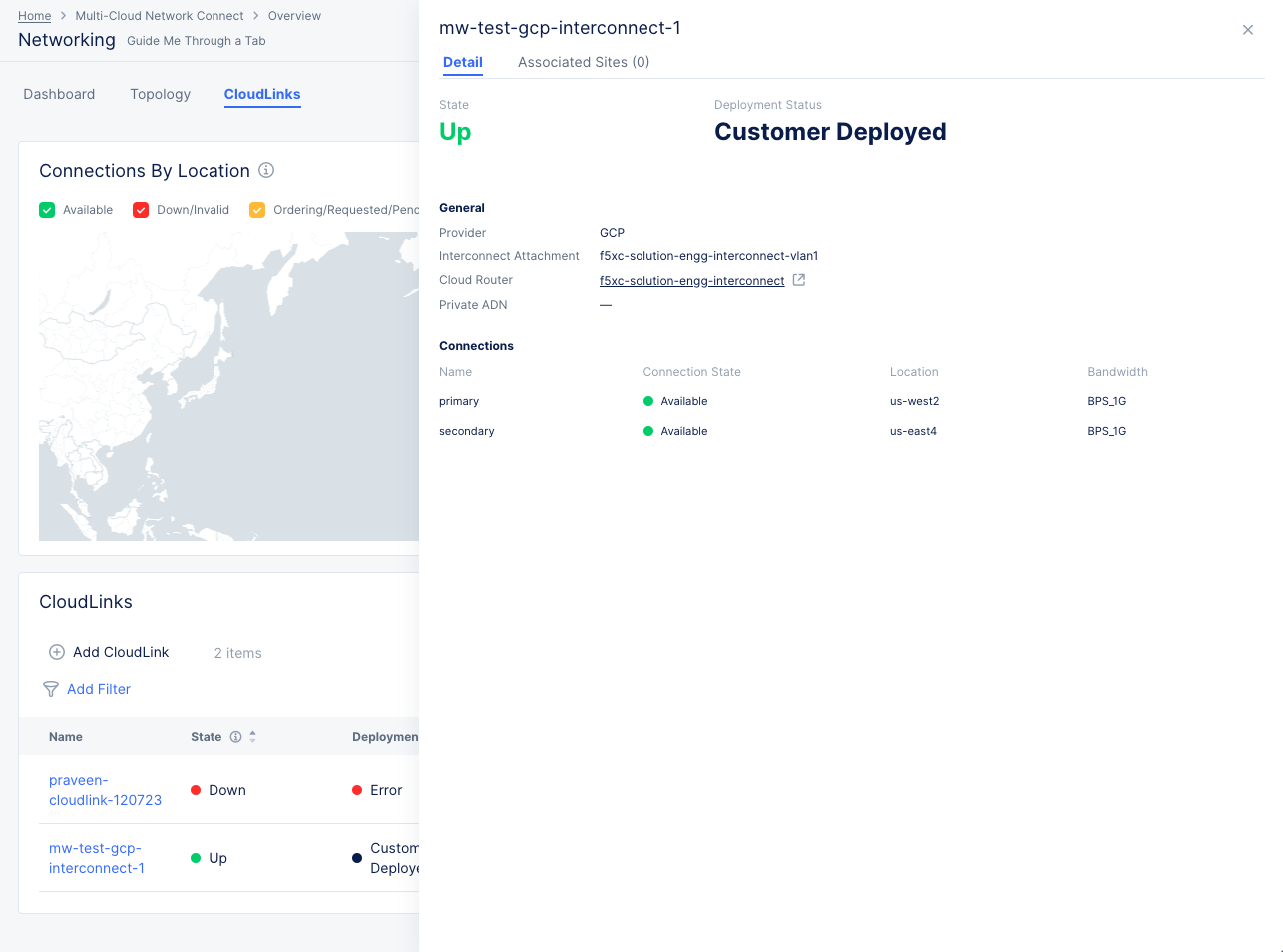
Figure: CloudLink Detail
Performance
In the Multi-Cloud Network Connect workspace, select Overview > Performance to get an overview of how your configuration is performing. The Performance page has five tabs allowing you to drill down into specific areas.
Performance Dashboard
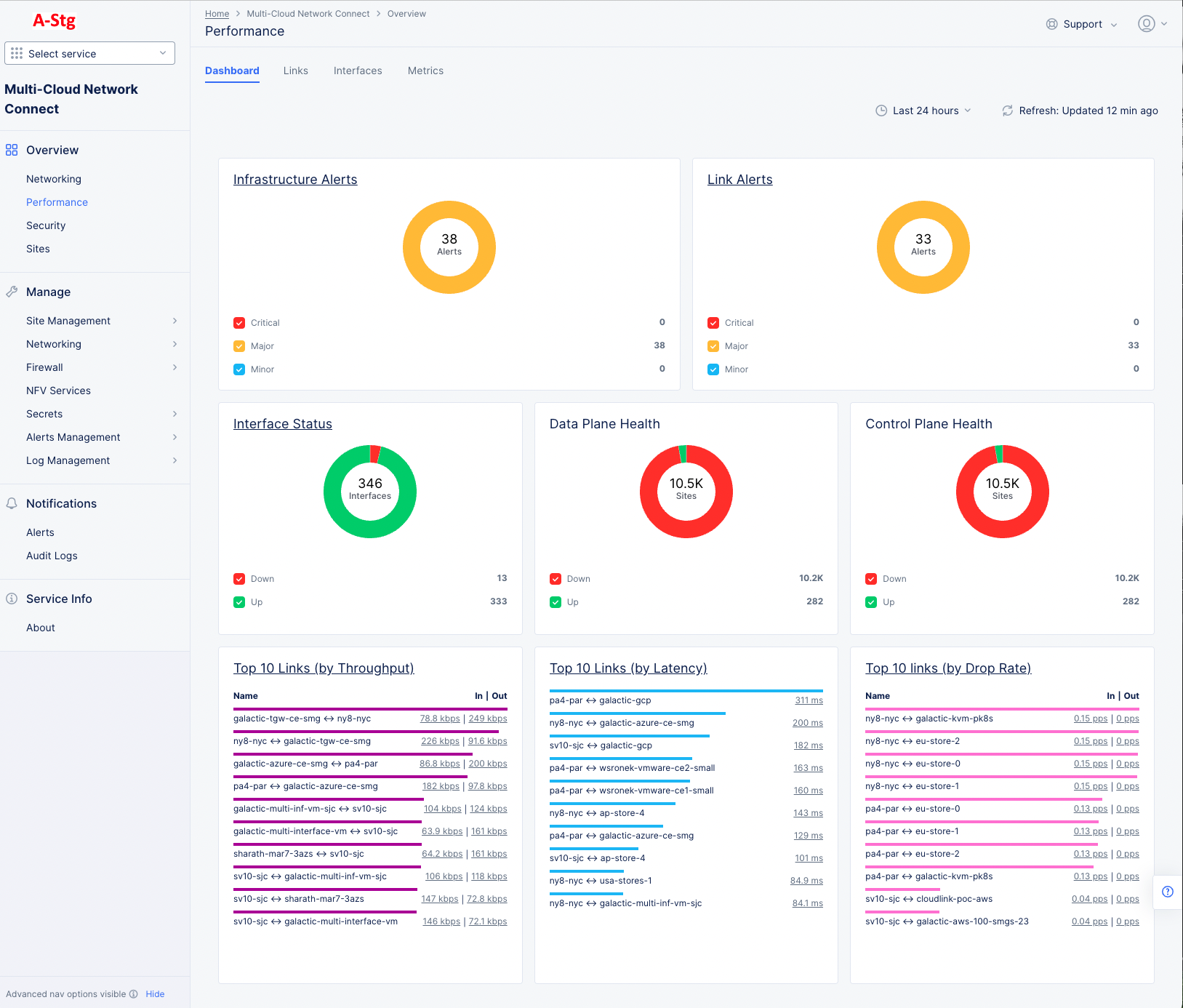
Figure: Site Performance Dashboard
The top of the dashboard has a group of donut charts giving you clear picture of alerts, interface status, and the health of your dana and control planes. The donut is a percentage view of each of the categories shown next to the colored checkboxes. The colors in the donut graphic correspond to the categories in the section. The number within the donut provides the 100% count. The category counts are to the right of the checkboxes. The following actions are available in the donut chart sections:
- Click on an underlined title, like Infrastructure Alerts, to get more details on that topic. The Alerts links will take you to the alerts page with a list of the individual alerts with. The Interface Status link will take you to the Interfaces tab to see a list of your interfaces. In both cases, the lists will provide more detail available.
- Click a colored checkbox to show or hide that category in the donut graph.
Below the donut charts are the Top 10 Links graphics providing a sorted list of the topic links by category. The following actions are available in the Top 10 sections:
- Click on an underlined title, like Top 10 Links (by Throughput), to see all of the links sorted by that category in the Links tab.
- Click on a value in the In | Out column to see that value for that specific link shown in the Metrics tab.
Flow Analysis
The Flow Analysis tool provides a graphical way to visualize the volume of data flow between your workloads across the F5 Distributed Cloud fabric. You can choose to view flows based on individual entities, Anomalies, or get a top ten list based on the amount of data transferred. By default, you will see the flow displayed in a Sankey graph. You can gain additional insights using the metadata provided on the tooltip on every node in the graph and the amount of data transferred on the link connecting them. Additionally, you can view and search through individual records in a tabular format. This feature is currently only supported for AWS, Azure, GCP, KVM, VMware, baremetal, and K8s CE sites.
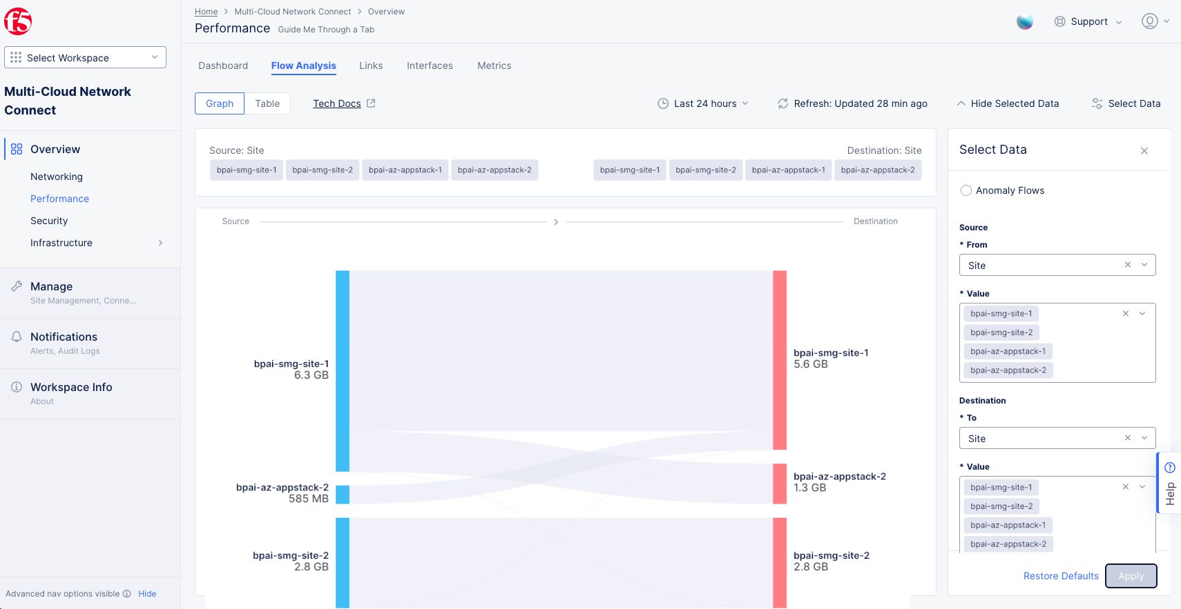
Figure: Flow Analysis
The flow records are not collected unless you explicitly enable the feature. The tab will state Flow Record Collection not configured. You can click the link or navigate to the Administration workspace manually.
To enable flow collection:
- Navigate to Administration > Tenant Settings > Tenant Overview.
- Scroll down to the Flow Analysis Configuration section and click Manage Flow Analysis.
- In the slide-out pane, make sure the Enable Flow Record Collection checkbox is checked. If you want to look at anomaly flows, also make sure the Enable Network Anomaly Detection checkbox is checked. Note that anomaly detection will require 5 days of data collection before anomalies will be detected and reported.
- Click Save changes.
After the feature is enabled, the Flow Analysis tab will display a graph for provider-to-provider by default.
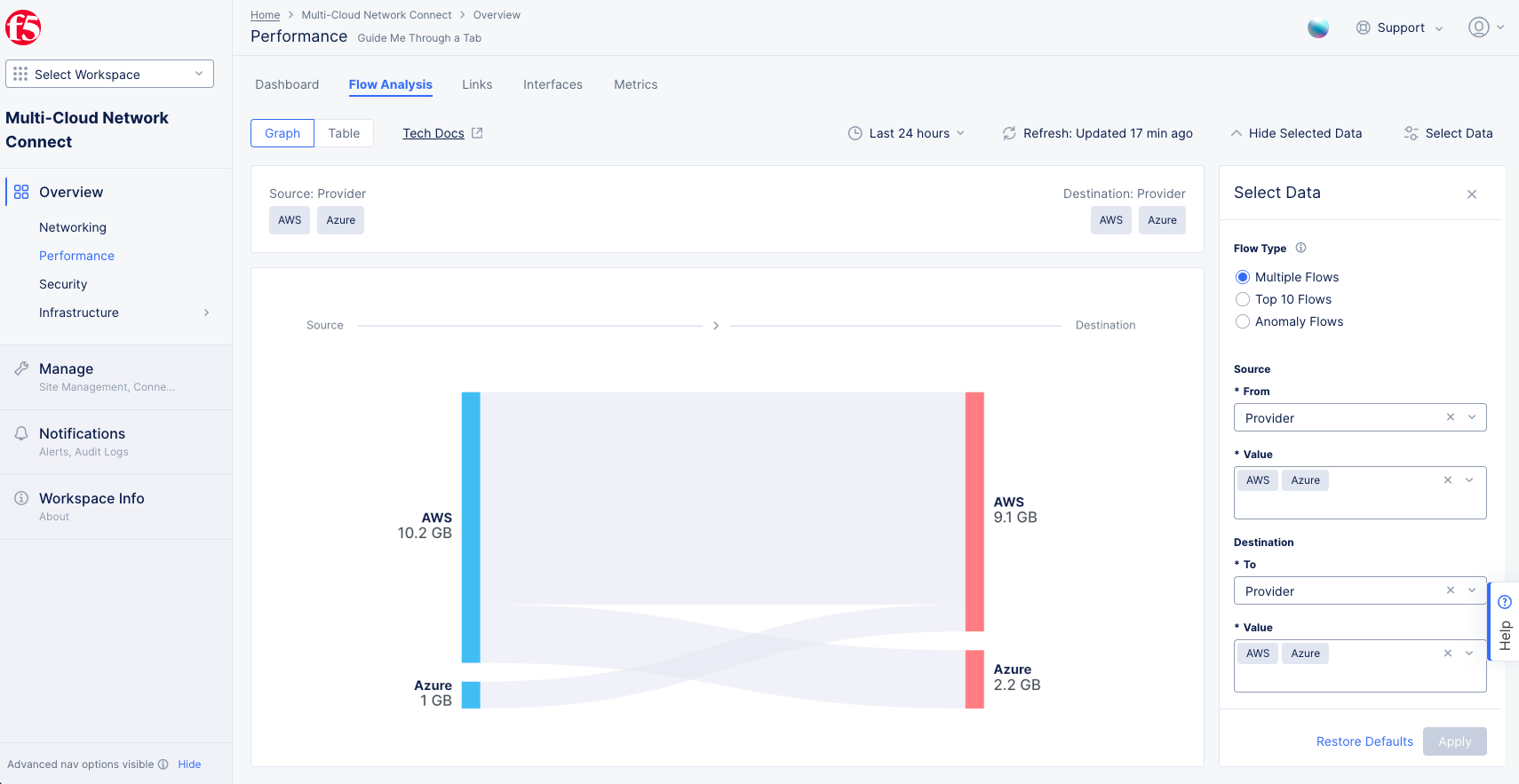
Figure: Default Graph
The Select Data widget on the right side allows you to filter by Provider, Site, Subnet, or IP Address as the type. There are two ways to filter the data: Multiple Flows and Top 10 Flows.
The time window allows you to select a time frame to view on the graph or table. You can select up to a 24-hour window within the last 30 days to view any historic data. This is useful to check and debug past incidents.
Multiple Flows
Use this option if the source and destination are known entities, and you can select them directly as source and destination. For example, to check data moving out between public cloud providers: from AWS, Azure to AWS, Azure, or to see data moving from a known IP to individual sites.
Note: If there are no records for a filtered entity, it will not show on the graph. This may happen if there is no traffic from or to that entity. Additional metadata for every node is available using the mouseover tooltip. You can only select a maximum of five values each for source or destination.
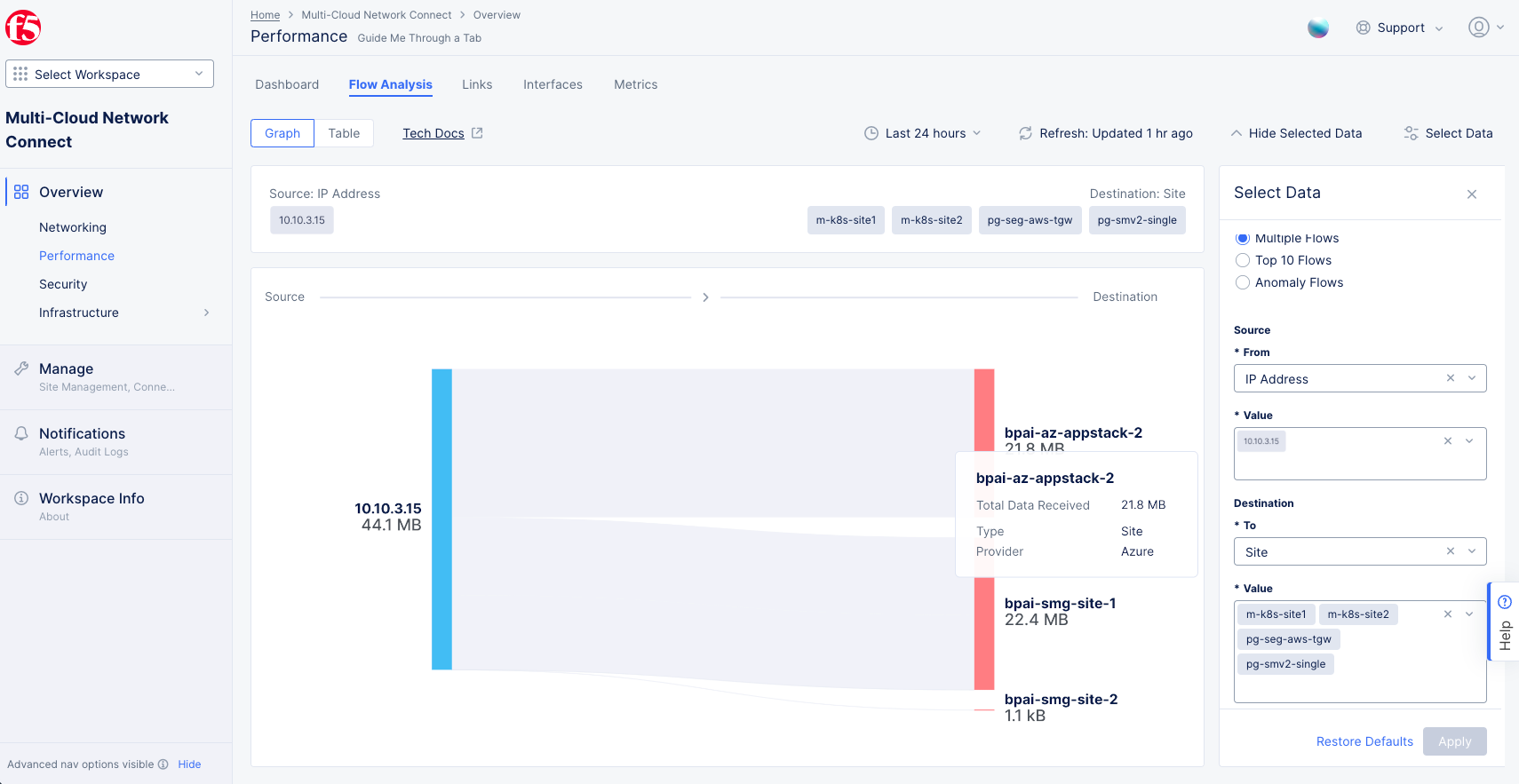
Figure: Multiple Flows
Top Ten Flows
Use this option to check the top ten talker sources/destinations for a given entity.
For example, to check top ten client IP address sources for destination on a deployed Azure site:
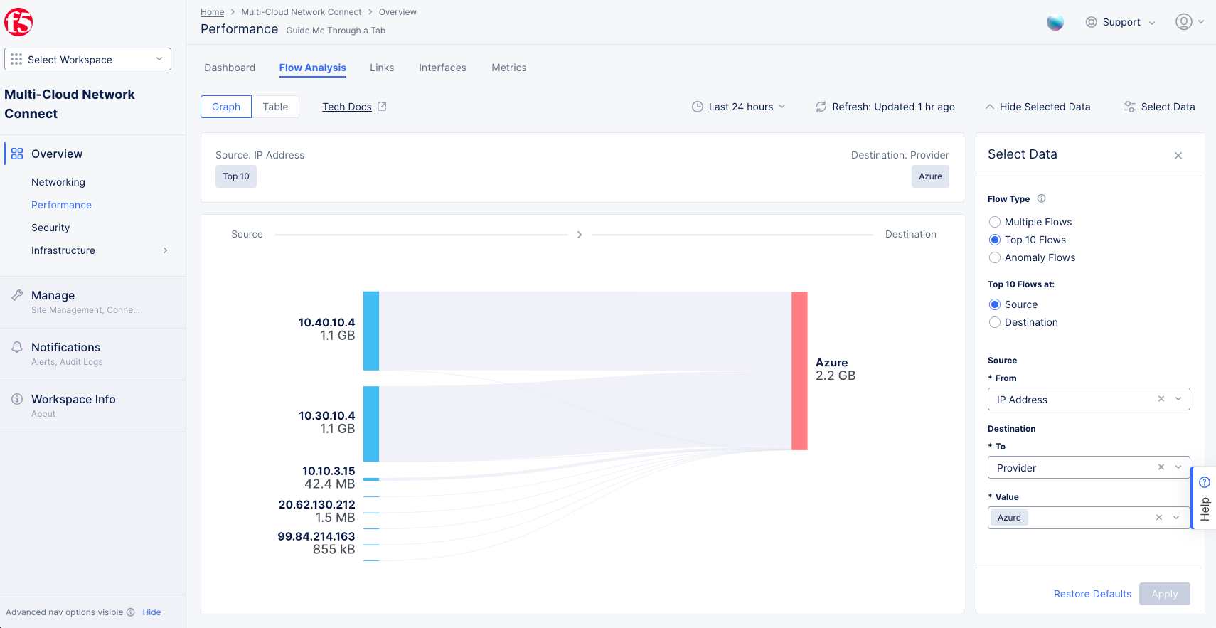
Figure: Top Ten Flows for Azure Site
This example provides the top ten destination sites for a given site:
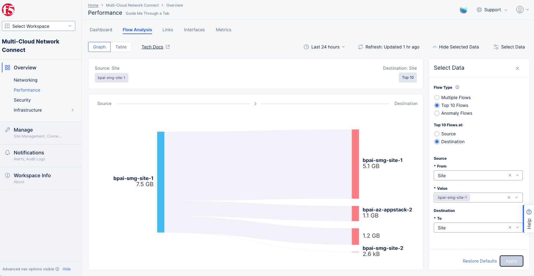
Figure: Top Ten Destinations for Given Site
Anomaly Flows
Use this option to see flows that deviate their normal patterns. A flow's normal patterns are determined by dividing traffic into clusters over a period of time and analyzing those clusters to find commonalities. For instance, if clusters are generally long-lived for the sampling time span, then clusters that only exist for a short period of time would be considered outliers and therefore anomalous. The anomaly level is then determined by how different the cluster is from the flow's typical clusters. Anomalies can also come from changes in octets, reverse octets, packets, and reverse packets, and other metrics.
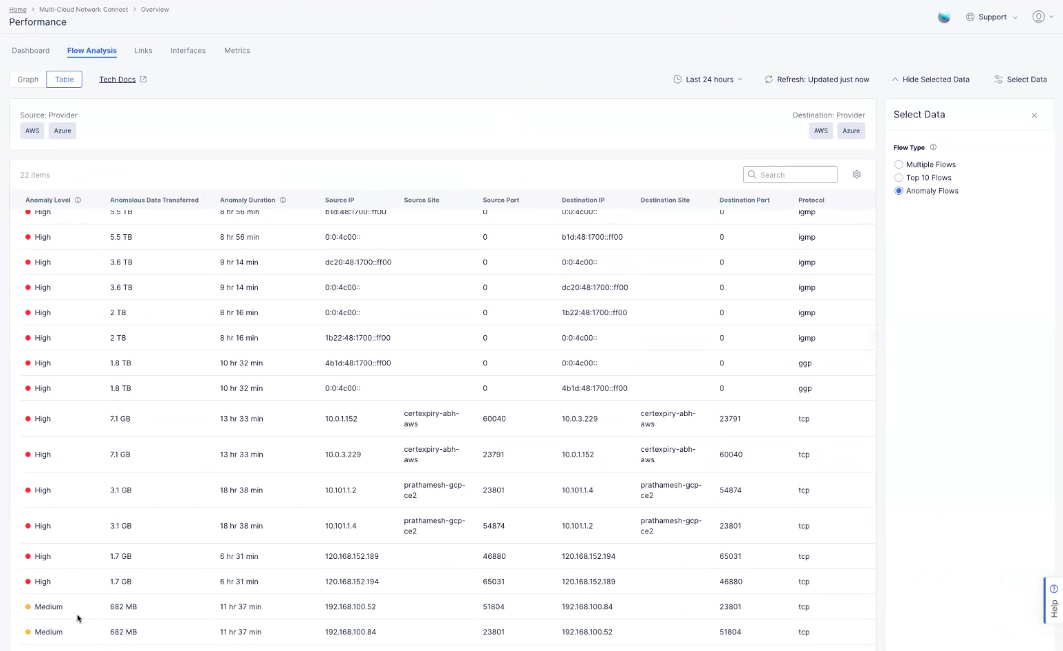
Figure: Anomaly Flows
Table actions and details:
- Enter a string in the Search field to only show links with that text in the table row.
- You can change the key details you see in the table by clicking on the gear icon ( ⚙ ) and selecting different column data.
- Click on a column name to sort by that column's values. Click the same name again to reverse the sort. By default, rows are sorted first by Anomaly Level (High, Medium, Low) and then by Anomalous Data Transferred (descending).
To disable the flow record collection:
- Navigate to Administration > Tenant Settings > Tenant Overview.
- Scroll down to the Flow Analysis Configuration section and click Manage Flow Analysis.
- In the slide-out pane, uncheck the Enable Flow Record Collection checkbox.
- Click Save changes.
Note: The collected flow data is retained for 30 days. The feature must be enabled to view available historic data.
Links
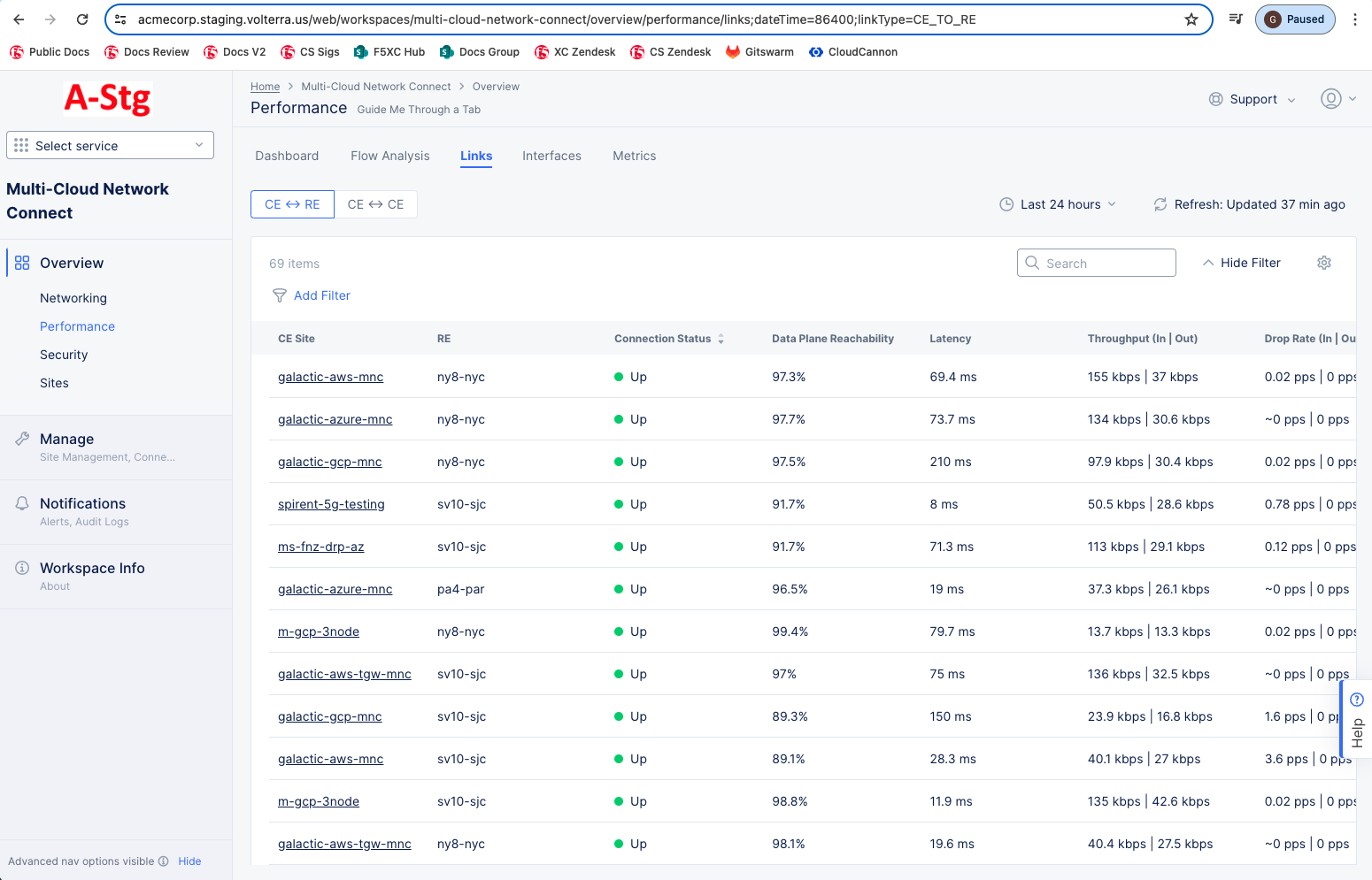
Figure: Site Performance Links
The Links tab shows a list of the links between edge sites. Below are the actions available on the links tab:
- Use the selector above the table to choose between viewing RE ↔ CE (Regional Edge linked to Customer Edge) and CE ↔ CE (links between two Customer Edges).
- Use the Add Filter option to narrow down what you see based on the link name or the connection status.
- Enter a string in the Search field to only show links with that text in the table row.
- Click on a column name to sort by that column's values. Click the same name again to reverse the sort.
- Click on an entry in the Link Name column to see the trend for that specific link in the Metrics tab.
Interfaces
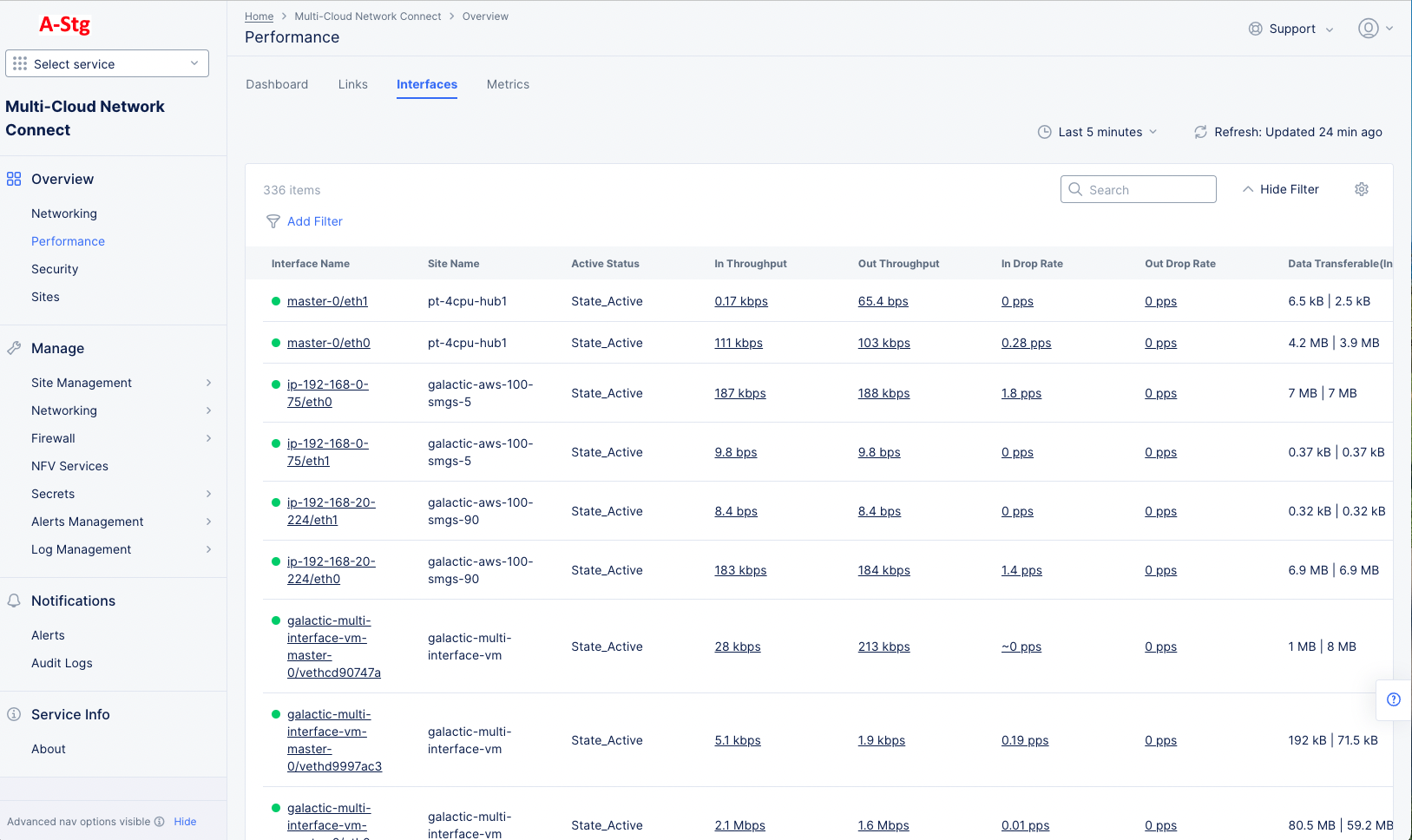
Figure: Site Performance Interfaces
The Links tab shows a list of your interfaces. Below are the actions available on the links tab:
- Use the Add Filter option to narrow down what you see based on the interface name, the site name, or the active status.
- Enter a string in the Search field to only show links with that text in the table row.
- Click on a column name to sort by that column's values. Click the same name again to reverse the sort.
- Click on an entry in the Interface Name column to see the trend for that interface.
- Click on an underlined value one of the throughput or drop rate columns to see the trend for that metric.
Metrics
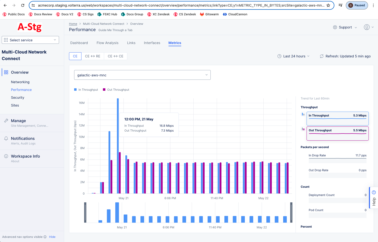
Figure: Site Performance Metrics
-
The Metrics tab allows you to look at metrics for an individual Customer Edge (CE) site. Use the CE sites drop-down menu to select which CE you want to view. Above the graph area is a selector that allows you to choose whether to look at just the CE or the CE connecting to a Regional Edge (RE) or another CE:
- CE: Show trend data for the selected CE.
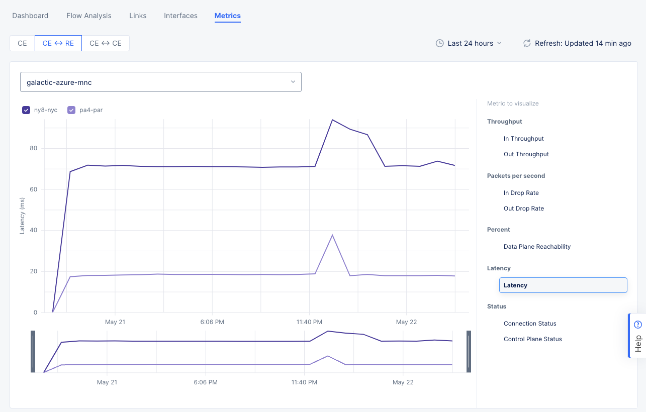
- CE ↔ RE: Show trend data for the selected CE to one or more connected REs. Choose which REs to show using the check-boxes below the CE site drop-down menu.

Figure: Site Performance Metrics CE-RE
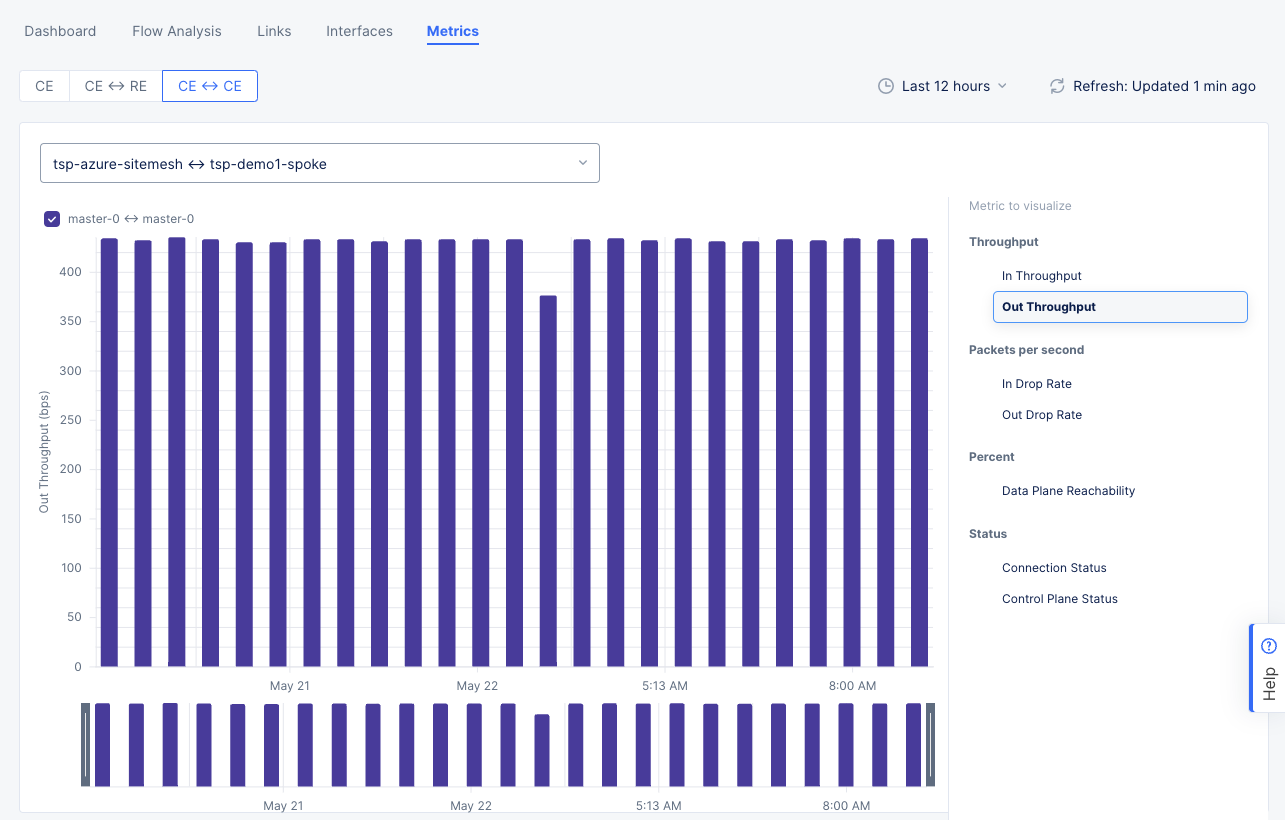
- CE ↔ CE: Show trend data for the selected CE-CE link. Choose which connection tunnels to show using the check-boxes below the CE-CE link drop-down menu.
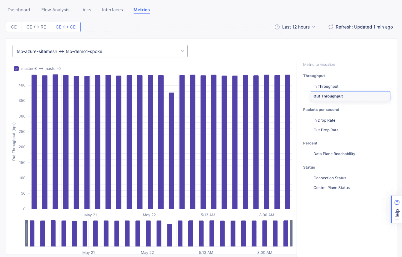
Figure: Site Performance Metrics CE-CE
-
The right scrolling area lists the metrics you can view in the bar graph on the left. The y-axis will be the metric you choose, meaning the height of a bar is the value for that time frame, and the x-axis will be the time frame you select in the time drop-down menu above the graph.
-
Use the time drop-down menu above the graph to selecting a time interval. You can choose a standard interval from the list, or you can specify a custom interval by selecting the Custom option and choosing date range. However, metric data is only stored for the last 30 days, so your date range is limited to that time frame.
-
You can narrow down your time interval by dragging the gray bars below the time axis be set graphically by adjusting the controls beneath the main graph.
-
Hover over a bar in the graph to see the value and time specifics for that bar.
-
A metric category may have more than one metric to view, for instance the Throughput category has two metrics: In Throughput and Out Throughput. You can view one or two metrics in the bar graph. To choose a metric, hover over the metric, and select the blue bar chart icon to the left. If you want to choose a second from that category, hover over the second metric and select the purple bar chart icon.
The metrics available are as follows:
-
Throughput
- In Throughput
- Out Throughput
-
Packets per second
- In Drop Rate
- Out Drop Rate
-
Count
- Deployment Count
- Pod Count
-
Percent
- Data Plane Reachability
-
Status
- Data Plane Status
- Control Plane Status
- Local Control Plane Status